
Typography is the art and technique of arranging type to make written language legible, readable, and appealing when displayed. The arrangement of type involves selecting typefaces, point sizes, line lengths, line-spacing (leading), and letter-spacing (tracking), and adjusting the space between pairs of letters (kerning). The term typography is also applied to the style, arrangement, and appearance of the letters, numbers, and symbols created by the process. Type design is a closely related craft, sometimes considered part of typography; most typographers do not design typefaces, and some type designers do not consider themselves typographers. Typography also may be used as a decorative device, unrelated to communication of information.

Times New Roman is a serif typeface designed for legibility in body text. It was commissioned by the British newspaper The Times in 1931 and conceived by Stanley Morison, the artistic advisor to the British branch of the printing equipment company Monotype, in collaboration with Victor Lardent, a lettering artist in the Times' advertising department. Although no longer used by The Times, Times New Roman is still very common in book and general printing. It has become one of the most popular and influential typefaces in history and a standard typeface on most desktop computers.
In typography, a serif is a small line or stroke regularly attached to the end of a larger stroke in a letter or symbol within a particular font or family of fonts. A typeface or "font family" making use of serifs is called a serif typeface, and a typeface that does not include them is a sans-serif one. Some typography sources refer to sans-serif typefaces as "grotesque" or "Gothic", and serif typefaces as "roman".

In typography, a typeface is a set of one or more fonts each composed of glyphs that share common design features. Each font of a typeface has a specific weight, style, condensation, width, slant, italicization, ornamentation, and designer or foundry. For example, "ITC Garamond Bold Condensed Italic" means the bold, condensed-width, italic version of ITC Garamond. It is a different font from "ITC Garamond Condensed Italic" and "ITC Garamond Bold Condensed", but all are fonts within the same typeface, "ITC Garamond". ITC Garamond is a different typeface from "Adobe Garamond" or "Monotype Garamond".
There are thousands of different typefaces in existence, with new ones being developed constantly.

Fraktur is a calligraphic hand of the Latin alphabet and any of several blackletter typefaces derived from this hand. The blackletter lines are broken up; that is, their forms contain many angles when compared to the smooth curves of the Antiqua (common) typefaces modeled after antique Roman square capitals and Carolingian minuscule. From this, Fraktur is sometimes contrasted with the "Latin alphabet" in northern European texts, which is sometimes called the "German alphabet", simply being a typeface of the Latin alphabet. Similarly, the term "Fraktur" or "Gothic" is sometimes applied to all of the blackletter typefaces.
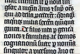
Blackletter, also known as Gothic script, Gothic minuscule, or Textura, was a script used throughout Western Europe from approximately 1150 to well into the 17th century. It continued to be used for the Danish language until 1875, and for German, Estonian and Latvian until the 20th century. Fraktur is a notable script of this type, and sometimes the entire group of blackletter faces is incorrectly referred to as Fraktur. Blackletter is sometimes referred to as Old English, but it is not to be confused with the Old English language, which predates blackletter by many centuries and was written in the insular script or in Futhorc.

AMS Euler is an upright cursive typeface, commissioned by the American Mathematical Society (AMS) and designed and created by Hermann Zapf with the assistance of Donald Knuth and his Stanford graduate students. It tries to emulate a mathematician's style of handwriting mathematical entities on a blackboard, which is upright rather than italic. It blends very well with other typefaces made by Hermann Zapf, such as Palatino, Aldus and Melior, but very badly with the default TeX font Computer Modern. All the alphabets were implemented with the computer-assisted design system Metafont developed by Knuth. Zapf designed and drew the Euler alphabets in 1980–81 and provided critique and advice of digital proofs in 1983 and later. The typeface family is copyright by American Mathematical Society, 1983. Euler Metafont development was done by Stanford computer science and/or digital typography students; first Scott Kim, then Carol Twombly and Daniel Mills, and finally David Siegel, all assisted by John Hobby. Siegel finished the Metafont Euler digitization project as his M.S. thesis in 1985.
The lexicon of a language is its vocabulary.
Arbitrariness is the quality of being "determined by chance, whim, or impulse, and not by necessity, reason, or principle".
Condensation or condensed may refer to:
Geometry is a branch of mathematics dealing with spatial relationships.

Papyrus is a widely available typeface designed by Chris Costello, a graphic designer, illustrator, and web designer. Created in 1982, it was hand-drawn over a period of six months by means of calligraphy pen and textured paper. Papyrus has a number of distinctive characteristics, including rough edges, irregular curves, and high horizontal strokes in the capitals.

A subscript or superscript is a character that is (respectively) set slightly below or above the normal line of type. It is usually smaller than the rest of the text. Subscripts appear at or below the baseline, while superscripts are above. Subscripts and superscripts are perhaps most often used in formulas, mathematical expressions, and specifications of chemical compounds and isotopes, but have many other uses as well.
Imprint or imprinting may refer to:

Catalaphyllia is a monotypic genus of stony coral in the family Euphylliidae from the western Pacific Ocean. It is represented by a single species, Catalaphyllia jardinei, commonly known as elegance coral. It was first described by William Saville-Kent in 1893 as Pectinia jardinei.
A blackboard is a reusable writing surface.

