Related Research Articles

Typography is the art and technique of arranging type to make written language legible, readable and appealing when displayed. The arrangement of type involves selecting typefaces, point sizes, line lengths, line-spacing (leading), and letter-spacing (tracking), as well as adjusting the space between pairs of letters (kerning). The term typography is also applied to the style, arrangement, and appearance of the letters, numbers, and symbols created by the process. Type design is a closely related craft, sometimes considered part of typography; most typographers do not design typefaces, and some type designers do not consider themselves typographers. Typography also may be used as an ornamental and decorative device, unrelated to the communication of information.

Palatino is the name of an old-style serif typeface designed by Hermann Zapf, initially released in 1949 by the Stempel foundry and later by other companies, most notably the Mergenthaler Linotype Company.
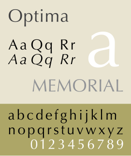
Optima is a humanist sans-serif typeface designed by Hermann Zapf and released by the D. Stempel AG foundry, Frankfurt, Germany in 1958.
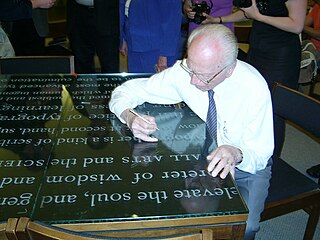
Hermann Zapf was a German type designer and calligrapher who lived in Darmstadt, Germany. He was married to the calligrapher and typeface designer Gudrun Zapf-von Hesse. Typefaces he designed include Palatino, Optima, and Zapfino.
Matthew Carter is a British type designer. A 2005 New Yorker profile described him as 'the most widely read man in the world' by considering the amount of text set in his commonly used fonts.
Zuzana Licko is a Slovak-born American type designer and visual artist known for co-founding Emigre Fonts, a digital type foundry in Berkeley, CA. She has designed and produced numerous digital typefaces including the popular Mrs Eaves, Modula, Filosofia, and Matrix. As a corresponding interest she also creates ceramic sculptures, textile prints and jacquard weavings.

AMS Euler is an upright cursive typeface, commissioned by the American Mathematical Society (AMS) and designed and created by Hermann Zapf with the assistance of Donald Knuth and his Stanford graduate students. It tries to emulate a mathematician's style of handwriting mathematical entities on a blackboard, which is upright rather than italic. It blends very well with other typefaces made by Hermann Zapf, such as Palatino, Aldus and Melior, but very badly with the default TeX font Computer Modern. All the alphabets were implemented with the computer-assisted design system Metafont developed by Knuth. Zapf designed and drew the Euler alphabets in 1980–81 and provided critique and advice of digital proofs in 1983 and later. The typeface family is copyright by American Mathematical Society, 1983. Euler Metafont development was done by Stanford computer science and/or digital typography students; first Scott Kim, then Carol Twombly and Daniel Mills, and finally David Siegel, all assisted by John Hobby. Siegel finished the Metafont Euler digitization project as his M.S. thesis in 1985.

Zapfino is a calligraphic typeface designed for Linotype by typeface designer Hermann Zapf in 1998. It is based on an alphabet Zapf originally penned in 1944. As a font, it makes extensive use of ligatures and character variations.
The Type Directors Club is an international organization created in 1946 specialising in typography. The organization's objective is to raise the standards of typography and related fields within the graphic arts. The TDC supports research and education, and disseminates information relating to typography. The TDC supports the industry through a number of programs, including two annual typographic design competitions, educational seminars and events, publications, and co-operation with other like-minded organizations. The club supports itself through memberships of type designers, typographers, graphic designers, other industry professionals, and students.
The ATypI or Association Typographique Internationale is an international non-profit organisation dedicated to typography and type design. The primary activity of the association is an annual fall conference, held in a different global city each year.
Hz-program was a proprietary, patented typographic composition computer program, created by German typeface designer Hermann Zapf. The goal of this program was "to produce the perfect grey type area without the rivers and holes of too-wide word spacing."

Gudrun Zapf-von Hesse was a German book-binder, calligrapher and typographer.
TypeCon is the annual grassroots, typography-focused convention run by the non-profit Society of Typographic Aficionados. The content of TypeCon conferences focuses on — but is not limited to — the areas of typography, type design, printing, letterpress, calligraphy, the book arts, publishing, design education, and type-related technologies including webfonts.

TypeCon is an annual convention presented by the Society of Typographic Aficionados. The 10th iteration of this event, themed “Punkt” was held at the Hyatt Regency in Buffalo, New York between July 15–20, 2008. The conference offered workshops and lectures covering topics such as letterpress, typography, history, and print. The convention was sponsored by the Western New York Book Arts Collaborative, the Albright-Knox Art Gallery, and the University at Buffalo, as well as other local schools and non-profit organizations.

Fred Smeijers is a Dutch type designer, researcher and writer, educated at the ArtEZ Hogeschool voor de Kunsten in Arnhem in the early 1980s.
Rick Cusick is an American lettering artist, calligrapher, type designer and book designer.
Ilene Strizver is a noted typographic educator, author, designer and founder of The Type Studio in Westport, Connecticut. Her book, Type Rules! The designer’s guide to professional typography, is now in its 4th edition.
The Frederic W. Goudy Award & Lecture were established in 1969 by funds donated to Rochester Institute of Technology (RIT) by the Mary Flagler Cary Charitable Trust in memory of her late husband, Melbert B. Cary, Jr., a typographer, type importer, fine printer, book collector, and president of AIGA. The award was named after illustrious American type designer Frederic W. Goudy, a friend and business associate of Melbert Cary.

Paul Shaw is an American designer, calligrapher and historian of design who lives in New York City. He has written a book on the history of the design of the New York City Subway system, Helvetica and the New York Subway System: The True (Maybe) Story, on the work of William Addison Dwiggins, and for Print magazine. He received the annual SoTA Typography Award of 2019.
The Khatt Foundation is a non-profit cultural foundation for the advancement of Arabic typography. It was founded in Amsterdam in 2004 by Huda Smitshuijzen AbiFarès. The organization works to further Arabic typography and design research by creating a platform for a network of designers from different backgrounds and a knowledge center for Arabic typography. The foundation also publishes books on related topics through Khatt Books.
References
- ↑ "SOTA Typography Award". SOTA. Retrieved 2 September 2019.
- ↑ http://www.typesociety.org/catalyst/