Cholla Slab

Last updated
WmChollaSlab.png
Category Sans-serif
Classification Slab-serif
Designer(s) Sibylle Hagmann
Foundry Emigre
Date released 1998–1999

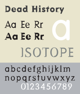
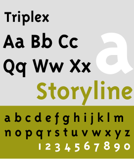
Cholla Slab is a geometric slab-serif variant of a larger typeface family called Cholla designed by Sibylle Hagmann in the period 1998–1999 for the Art Center College of Design. Cholla is licensed by the Emigre foundry. The typeface is named for a group of cactus species indigenous to the Mojave Desert.

Typeface set of characters that share common design features

In typography, a typeface is a set of one or more fonts each composed of glyphs that share common design features. Each font of a typeface has a specific weight, style, condensation, width, slant, italicization, ornamentation, and designer or foundry. For example, "ITC Garamond Bold Condensed Italic" means the bold, condensed-width, italic version of ITC Garamond. It is a different font from "ITC Garamond Condensed Italic" and "ITC Garamond Bold Condensed", but all are fonts within the same typeface, "ITC Garamond". ITC Garamond is a different typeface from "Adobe Garamond" or "Monotype Garamond". There are thousands of different typefaces in existence, with new ones being developed constantly.

Emigre (type foundry) American type foundry

Emigre, also known as Emigre Graphics, is a digital type foundry, publisher and distributor of graphic design centered information based in Berkeley, California, that was founded in 1984 by husband-and-wife team Rudy VanderLans and Zuzana Licko. The type foundry also published Emigre magazine between 1984 and 2005. Note that unlike the word émigré, Emigre is officially spelled without accents.

Cactus family of mostly succulent plants, adapted to dry environments

A cactus is a member of the plant family Cactaceae, a family comprising about 127 genera with some 1750 known species of the order Caryophyllales. The word "cactus" derives, through Latin, from the Ancient Greek κάκτος, kaktos, a name originally used by Theophrastus for a spiny plant whose identity is not certain. Cacti occur in a wide range of shapes and sizes. Most cacti live in habitats subject to at least some drought. Many live in extremely dry environments, even being found in the Atacama Desert, one of the driest places on earth. Cacti show many adaptations to conserve water. Almost all cacti are succulents, meaning they have thickened, fleshy parts adapted to store water. Unlike many other succulents, the stem is the only part of most cacti where this vital process takes place. Most species of cacti have lost true leaves, retaining only spines, which are highly modified leaves. As well as defending against herbivores, spines help prevent water loss by reducing air flow close to the cactus and providing some shade. In the absence of leaves, enlarged stems carry out photosynthesis. Cacti are native to the Americas, ranging from Patagonia in the south to parts of western Canada in the north—except for Rhipsalis baccifera, which also grows in Africa and Sri Lanka.

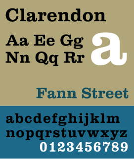
The family is distinct for maintaining a highly unified design across weights and the serif and sans serif variants while allowing for a wide range of variation in form and counter-form across the family. Similarities in structure can be found with the 1930 Berthold foundry typeface, "City".

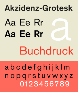
In typography, a serif is a small line or stroke regularly attached to the end of a larger stroke in a letter or symbol within a particular font or family of fonts. A typeface or "font family" making use of serifs is called a serif typeface, and a typeface that does not include them is a sans-serif one. Some typography sources refer to sans-serif typefaces as "grotesque" or "Gothic", and serif typefaces as "roman".

H. Berthold AG was one of the largest and most successful type foundries in the world for most of the modern typographic era, making the transition from foundry type to cold type successfully and only coming to dissolution in the digital type era.

City (typeface) slab serif typeface

City is a slab serif typeface designed by Georg Trump and released around 1930 by the Berthold type foundry in Berlin, Germany. Though classified as a slab serif, City displays a strong modernist influence in its geometric structure of right angles and opposing round corners. The typeface takes inspiration from the machine age, and industry. A consistent application of repeated parts: an outer circle softening interior rectilinear spaces, results in a highly unified and refined typeface.

The typeface family has been awarded by both the Type Directors Club of New York and the Association Typographique Internationale (ATypI).

The ATypI or Association Typographique Internationale is an international non-profit organisation dedicated to typography and type design. The primary activity of the association is an annual fall conference, held in a different global city each year.

Related Research Articles

Adrian Frutiger Swiss typeface designer

Adrian Johann Frutiger was a Swiss typeface designer who influenced the direction of type design in the second half of the 20th century. His career spanned the hot metal, phototypesetting and digital typesetting eras. Until his death, he lived in Bremgarten bei Bern.

Zuzana Licko is a Slovak-born American type designer known for co-founding the graphic design magazine Emigre and for creating numerous typefaces, including Mrs Eaves.

Georgia (typeface) typeface

Georgia is a serif typeface designed in 1993 by Matthew Carter and hinted by Tom Rickner for the Microsoft Corporation. It was intended as a serif font that would appear elegant but legible printed small or on low-resolution screens. The font is inspired by Scotch Roman designs of the 19th century and was based on designs for a print typeface in the same style Carter was working on when contacted by Microsoft; this would be released under the name Miller the following year. The typeface's name referred to a tabloid headline claiming "Alien heads found in Georgia."

Typotheque is a type foundry and design studio from The Hague, Netherlands that develops and markets original typefaces. In October 2009, Typotheque became the first type foundry to introduce the concept of webfonts. The typefaces sold under the Typotheque foundry label are mostly designed by Peter Biľak, including the popular Fedra Sans and Fedra Serif font families. Typotheque specializes in creation of Latin and non-Latin fonts and publishes books, such as We Want You To Love Type, bi-annual independent art/design publication Dot Dot Dot, or the magazine of unexpected creativity Works That Work.

Slab serif

In typography, a slab serif typeface is a type of serif typeface characterized by thick, block-like serifs. Serif terminals may be either blunt and angular (Rockwell), or rounded (Courier). Slab serifs were invented in and most popular during the nineteenth century.

Bookman (typeface) typeface

Bookman or Bookman Old Style, is a serif typeface. A wide, legible design that is slightly bolder than most body text faces, Bookman has been used for both display typography and for printing at small sizes such as in trade printing, and less commonly for body text. In advertising use it is particularly associated with the graphic design of the 1960s and 1970s, when revivals of it were very popular.

Akzidenz-Grotesk typeface

Akzidenz-Grotesk is a sans-serif typeface family originally released by the Berthold Type Foundry of Berlin. Akzidenz means 'commercial' and indicates its intended use as a typeface for trade printing such as publicity, tickets and forms, as opposed to book or fine printing.

Clarendon (typeface) typeface

Clarendon is the name of a slab-serif typeface that was released in 1845 by Thorowgood and Co. of London, a letter foundry often known as the Fann Street Foundry. The original Clarendon design is credited to Robert Besley, a partner in the foundry, and was originally engraved by punchcutter Benjamin Fox, who may also have contributed to its design. Many copies, adaptations and revivals have been released, becoming almost an entire genre of type design.

Mrs Eaves typeface

Mrs Eaves is a transitional serif typeface designed by Zuzana Licko in 1996. It is a variant of Baskerville, which was designed in Birmingham, England, in the 1750s. Mrs Eaves adapts Baskerville for use in display contexts, such as headings and book blurbs, through the use of a low x-height and a range of unusual combined characters or ligatures.

Joanna (typeface) typeface designed by Eric Gill

Joanna is a serif typeface designed by Eric Gill (1882–1940) in the period 1930–31, and named for one of his daughters. Gill chose Joanna for setting An Essay on Typography, a book by Gill on his thoughts on typography, typesetting, and page design. He described it as "a book face free from all fancy business."

Syntax (typeface)

Syntax comprises a family of fonts designed by Swiss typeface designer Hans Eduard Meier. Originally just a sans-serif font, it was extended with additional serif designs.

Calisto MT

Calisto MT is an old style, serif typeface designed for the Monotype Corporation foundry in 1986 by Ron Carpenter, a British typographer.

Dead History typeface designed by P. Scott Makela

Dead History is a typeface which explores combining structural elements of both geometric sans-serif and Didone serif typefaces. Designed in 1990 by P. Scott Makela, the face is licensed by Emigre.

Open Sans sans-serif typeface

Open Sans is a humanist sans-serif typeface designed by Steve Matteson and commissioned by Google. Featuring wide apertures on many letters and a large x-height, the typeface is highly legible on screen and at small sizes. It belongs to the humanist genre of sans-serif typefaces, with a true italic. It was released in 2011.

Triplex (typeface) typeface

The Triplex type font style is a typeface designed by Zuzana Licko and John Downer in 1985 and 1989. It is distributed by Emigre. It is used by Avex & Prezi for its logo. It has both Sans-serif and Serif variation.

Reverse-contrast typefaces

A reverse-contrast letterform is a typeface or custom lettering in which the stress is reversed from the norm: instead of the vertical lines being the same width or thicker than horizontals, which is normal in Latin-alphabet writing and especially printing, the horizontal lines are the thickest. The result is a dramatic effect, in which the letters seem to have been printed the wrong way round. Originally invented in the early nineteenth century as attention-grabbing novelty display designs, modern font designer Peter Biľak, who has created a design in the genre, has described them as "a dirty trick to create freakish letterforms that stood out."

References

International Standard Book Number Unique numeric book identifier

The International Standard Book Number (ISBN) is a numeric commercial book identifier which is intended to be unique. Publishers purchase ISBNs from an affiliate of the International ISBN Agency.