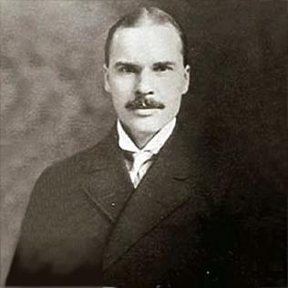
Morris Fuller Benton was an American typeface designer who headed the design department of the American Type Founders (ATF), for which he was the chief type designer from 1900 to 1937.

Cooper Black is an ultra-bold serif typeface intended for display use that was designed by Oswald Bruce Cooper and released by the Barnhart Brothers & Spindler type foundry in 1922. The typeface was drawn as an extra-bold weight of Cooper's "Cooper Old Style" family. It rapidly became a standard typeface and was licensed by American Type Founders and also copied by many other manufacturers of printing systems.
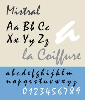
Mistral is a casual script typeface designed by Roger Excoffon for the Fonderie Olive type foundry, and released in 1953. The Amsterdam Type foundry released a version in 1955.

Rotis is a typeface developed in 1988 by Otl Aicher, a German graphic designer and typographer. In Rotis, Aicher explores an attempt at maximum legibility through a highly unified yet varied typeface family that ranges from full serif, glyphic, and sans-serif. The four basic Rotis variants are:

Cheltenham is a typeface for display use designed in 1896 by architect Bertram Goodhue and Ingalls Kimball, director of the Cheltenham Press. The original drawings were known as Boston Old Style and were made about 14" high. These drawings were then turned over to Morris Fuller Benton at American Type Founders (ATF) who developed it into a final design. Trial cuttings were made as early as 1899 but the face was not complete until 1902. The face was patented by Kimball in 1904. Later the basic face was spun out into an extensive type family by Morris Fuller Benton.
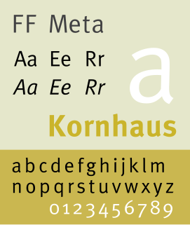
FF Meta is a humanist sans-serif typeface family designed by Erik Spiekermann and released in 1991 through his FontFont library. According to Spiekermann, FF Meta was intended to be a "complete antithesis of Helvetica", which he found "boring and bland". It originated from an unused commission for the Deutsche Bundespost. Throughout the 1990s, FF Meta was embraced by the international design community with Spiekermann and E. M. Ginger writing that it had been dubiously praised as the Helvetica of the 1990s.

City is a slab serif typeface designed by Georg Trump and released around 1930 by the Berthold type foundry in Berlin, Germany. Though classified as a slab serif, City displays a strong modernist influence in its geometric structure of right angles and opposing round corners. The typeface takes inspiration from the machine age, and industry. A consistent application of repeated parts: an outer circle softening interior rectilinear spaces, results in a highly unified and refined typeface.

Bastard is a blackletter typeface designed by Jonathan Barnbrook in 1990. The name derives from a typographic classification known as Bastarda. The Bastard face is an exploration of the blackletter face with a simple kit of parts. The face is available in three weights: Spindly Bastard, Fat Bastard, and Even Fatter Bastard.

Bell Centennial is an realist sans-serif typeface designed by Matthew Carter in the period 1975–78. The typeface was commissioned by AT&T as a proprietary type to replace their then current directory typeface Bell Gothic on the occasion of AT&T’s one hundredth anniversary. Carter was working for the Mergenthaler Linotype Company which now licenses the face for general public use.

Bulmer is the name given to a serif typeface originally designed by punchcutter William Martin around 1790 for the Shakespeare Press, run by William Bulmer (1757–1830). The types were used for printing the Boydell Shakespeare folio edition.

Caledonia is a serif typeface designed by William Addison Dwiggins in 1938 for the Mergenthaler Linotype Company and commonly used in book design. As a transitional serif design, one inspired by the Scotch Roman typefaces of the early nineteenth century, Caledonia has a contrasting design of alternating thick and thin strokes, a design that stresses the vertical axis and sharp, regular serifs on ascenders and descenders.

Fette Fraktur is a blackletter typeface of the sub-classification Fraktur designed by the German punchcutter Johann Christian Bauer (1802–1867) in 1850. The C.E. Weber Foundry published a version in 1875, and the D Stempel AG foundry published the version shown at right in 1908.

Égyptienne is a French serif typeface belonging to the classification slab serif, or Egyptian, where the serifs are unbracketed and similar in weight to the horizontal strokes of the letters. Egyptienne was designed in 1956 by Adrian Frutiger for the Fonderie Deberny et Peignot and was the first new text face created for the process of phototypesetting.

Granjon is an old-style serif typeface designed by George W. Jones in the period 1928–1929 for the British branch of the Linotype company, and based on the Garamond typeface that was used in a book printed by the Parisian Jean Poupy in 1592. The roman design was from Claude Garamond and the italic version was from Robert Granjon. Because several other Garamonds were on the market in the 1920s, Jones decided to name his type Granjon. Jones, a master printer based in London, had been engaged by Linotype to improve the quality of their typeface range through the development of revivals of notable type designs of the past.
Roger Excoffon was a French typeface designer and graphic designer.

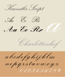
Script typefaces are based upon the varied and often fluid stroke created by handwriting. They are generally used for display or trade printing, rather than for extended body text in the Latin alphabet. Some Greek alphabet typefaces, especially historically, have been a closer simulation of handwriting.

Tower was a slab serif typeface designed by Morris Fuller Benton for American Type Founders and based upon his earlier design for Stymie, but with straight sides to the round letters emphasizing the vertical appearance. Tower Italic was designed but not cast. In 1936, Tower Bold was started by the same designer, but was instead made into Stymie Bold Condensed.
Jakob Erbar was a German professor of graphic design and a type designer. Erbar trained as a typesetter for the Dumont-Schauberg Printing Works before studying under Fritz Helmut Ehmcke and Anna Simons. Erbar went on to teach in 1908 at the Städtischen Berufsschule and from 1919 to his death at the Kölner Werkschule. His seminal Erbar series was one of the first geometric sans-serif typefaces, predating both Paul Renner's Futura and Rudolf Koch's Kabel by some five years.
The Stephenson Blake Grotesque fonts are a series of sans-serif fonts created by printing company Stephenson Blake of Sheffield mostly around the end of the nineteenth century.