
In typography and lettering, a sans-serif, sans serif, gothic, or simply sans letterform is one that does not have extending features called "serifs" at the end of strokes. Sans-serif fonts tend to have less line width variation than serif fonts. In most print, they are often used for headings rather than for body text. They are often used to convey simplicity and modernity or minimalism.
In typography, a serif is a small line or stroke regularly attached to the end of a larger stroke in a letter or symbol within a particular font or family of fonts. A typeface or "font family" making use of serifs is called a serif typeface, and a typeface that does not include them is a sans-serif one. Some typography sources refer to sans-serif typefaces as "grotesque" or "Gothic", and serif typefaces as "roman".

In typography, a typeface is a set of one or more fonts each composed of glyphs that share common design features. Each font of a typeface has a specific weight, style, condensation, width, slant, italicization, ornamentation, and designer or foundry. For example, "ITC Garamond Bold Condensed Italic" means the bold, condensed-width, italic version of ITC Garamond. It is a different font from "ITC Garamond Condensed Italic" and "ITC Garamond Bold Condensed", but all are fonts within the same typeface, "ITC Garamond". ITC Garamond is a different typeface from "Adobe Garamond" or "Monotype Garamond". There are thousands of different typefaces in existence, with new ones being developed constantly.

In typography, italic type is a cursive font based on a stylized form of calligraphic handwriting. Owing to the influence from calligraphy, italics normally slant slightly to the right. Italics are a way to emphasise key points in a printed text, to identify many types of creative works, or, when quoting a speaker, a way to show which words they stressed. One manual of English usage described italics as "the print equivalent of underlining".

Univers is the name of a large sans-serif typeface family designed by Adrian Frutiger and released by his employer Deberny & Peignot in 1957. Classified as a neo-grotesque sans-serif, one based on the model of nineteenth-century German typefaces such as Akzidenz-Grotesk, it was notable for its availability from the moment of its launch in a comprehensive range of weights and widths. The original marketing for Univers deliberately referenced the periodic table to emphasise its scope.

Gentium is a Unicode serif typeface designed by Victor Gaultney. Gentium fonts are free and open source software, and are released under the SIL Open Font License (OFL), which permits modification and redistribution. Gentium has wide support for languages using the Latin, Greek, and Cyrillic alphabets, and the International Phonetic Alphabet. Gentium Plus variants released in November 2010 now include over 5,500 glyphs and advanced typographic features through OpenType and Graphite.

Johnston is a sans-serif typeface designed by and named after Edward Johnston. The typeface was commissioned in 1913 by Frank Pick, commercial manager of the Underground Electric Railways Company of London, as part of his plan to strengthen the company's corporate identity. Johnston was originally created for printing, but it rapidly became used for the enamel station signs of the Underground system as well.
The PANOSE System is a method for classifying typefaces solely on their visual characteristics, developed by Benjamin Bauermeister. It can be used to identify an unknown font from a sample image or to match a known font to its closest visual neighbor from a font pool. The word "PANOSE" is composed of letters taken from the six classes in which the creator of the system organized the Latin alphabet.
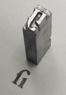
In metal typesetting, a font was a particular size, weight and style of a typeface. Each font was a matched set of type, one piece for each glyph, and a typeface consisting of a range of fonts that shared an overall design.
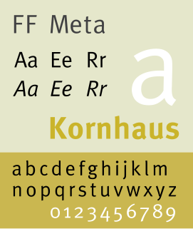
FF Meta is a humanist sans-serif typeface family designed by Erik Spiekermann and released in 1991 through his FontFont library. According to Spiekermann, FF Meta was intended to be a "complete antithesis of Helvetica", which he found "boring and bland". It originated from an unused commission for the Deutsche Bundespost. Throughout the 1990s, FF Meta was embraced by the international design community with Spiekermann and E. M. Ginger writing that it had been dubiously praised as the Helvetica of the 1990s.
Contemporary typographers view typography as a craft with a very long history tracing its origins back to the first punches and dies used to make seals and currency in ancient times. The basic elements of typography are at least as old as civilization and the earliest writing systems—a series of key developments that were eventually drawn together into one, systematic craft.

Cholla Slab is a geometric slab-serif variant of a larger typeface family called Cholla designed by Sibylle Hagmann in the period 1998–1999 for the Art Center College of Design. Cholla is licensed by the Emigre foundry. The typeface is named for a group of cactus species indigenous to the Mojave Desert.

Anatomy of a Typeface is a book on typefaces written by Alexander Lawson. The book is notable for devoting entire chapters to the development and uses of individual or small groupings of typefaces. Beyond Anatomy of a Typeface Lawson has considered and discussed the classification of types. Within Anatomy, Lawson arranges the typefaces by classification. In his preface, Lawson qualifies his classification: "After using this system in the teaching of typography over a thirty-year period, I know that it is reasonably effective in the initial study of printing types. I am not disposed to consider it faultless by any means. A classification system, after all, is simply a tool ... Its primary purpose is to help people become familiar with these forms preparatory to putting them to effective and constructive typographic use."

Martin Majoor is a Dutch type designer and graphic designer.

A reverse-contrast letterform is a typeface or custom lettering in which the stress is reversed from the norm: instead of the vertical lines being the same width or thicker than horizontals, which is normal in Latin-alphabet writing and especially printing, the horizontal lines are the thickest. The result is a dramatic effect, in which the letters seem to have been printed the wrong way round. Originally invented in the early nineteenth century as attention-grabbing novelty display designs, modern font designer Peter Biľak, who has created a design in the genre, has described them as "a dirty trick to create freakish letterforms that stood out."


