
Typography is the art and technique of arranging type to make written language legible, readable and appealing when displayed. The arrangement of type involves selecting typefaces, point sizes, line lengths, line-spacing (leading), and letter-spacing (tracking), as well as adjusting the space between pairs of letters (kerning). The term typography is also applied to the style, arrangement, and appearance of the letters, numbers, and symbols created by the process. Type design is a closely related craft, sometimes considered part of typography; most typographers do not design typefaces, and some type designers do not consider themselves typographers. Typography also may be used as an ornamental and decorative device, unrelated to the communication of information.

Palatino is the name of an old-style serif typeface designed by Hermann Zapf, initially released in 1949 by the Stempel foundry and later by other companies, most notably the Mergenthaler Linotype Company.

Verdana is a humanist sans-serif typeface designed by Matthew Carter for Microsoft Corporation, with hand-hinting done by Thomas Rickner, then at Monotype. Demand for such a typeface was recognized by Virginia Howlett of Microsoft's typography group and commissioned by Steve Ballmer. The name "Verdana" is derived from "verdant" (green) and "Ana".

A typeface is the design of lettering that can include variations in size, weight, slope, width, and so on. Each of these variations of the typeface is a font.

Garamond is a group of many serif typefaces, named for sixteenth-century Parisian engraver Claude Garamond, generally spelled as Garamont in his lifetime. Garamond-style typefaces are popular and particularly often used for book printing and body text.
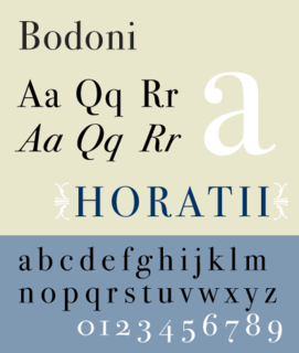
Bodoni is the name given to the serif typefaces first designed by Giambattista Bodoni (1740–1813) in the late eighteenth century and frequently revived since. Bodoni's typefaces are classified as Didone or modern. Bodoni followed the ideas of John Baskerville, as found in the printing type Baskerville—increased stroke contrast reflecting developing printing technology and a more vertical axis—but he took them to a more extreme conclusion. Bodoni had a long career and his designs changed and varied, ending with a typeface of a slightly condensed underlying structure with flat, unbracketed serifs, extreme contrast between thick and thin strokes, and an overall geometric construction.

Frederic William Goudy was an American printer, artist and type designer whose typefaces include Copperplate Gothic, Goudy Old Style and Kennerley. He was one of the most prolific of American type designers and his self-named type continues to be one of the most popular in America.

Monotype Imaging Holdings Inc., founded as Lanston Monotype Machine Company in 1887 in Philadelphia by Tolbert Lanston, is an American company that specializes in digital typesetting and typeface design for use with consumer electronics devices. Incorporated in Delaware and headquartered in Woburn, Massachusetts, the company has been responsible for many developments in printing technology—in particular the Monotype machine, which was a fully mechanical hotmetal typesetter, that produced texts automatically, all single type. Monotype was involved in the design and production of many typefaces in the 20th century. Monotype developed many of the most widely used typeface designs, including Times New Roman, Gill Sans, Arial, Bembo and Albertus.

In typography, a slab serif typeface is a type of serif typeface characterized by thick, block-like serifs. Serif terminals may be either blunt and angular (Rockwell), or rounded (Courier). Slab serifs were introduced in the early nineteenth century.

Bookman or Bookman Old Style, is a serif typeface. A wide, legible design that is slightly bolder than most body text faces, Bookman has been used for both display typography, for trade printing such as advertising, and less commonly for body text. In advertising use it is particularly associated with the graphic design of the 1960s and 1970s, when revivals of it were very popular. It is also used as the official font of Indonesian laws since 2011.
A swash is a typographical flourish, such as an exaggerated serif, terminal, tail, entry stroke, etc., on a glyph. The use of swash characters dates back to at least the 16th century, as they can be seen in Ludovico Vicentino degli Arrighi's La Operina, which is dated 1522. As with italic type in general, they were inspired by the conventions of period handwriting. Arrighi's designs influenced designers in Italy and particularly in France.
Modern typographers view typography as a craft with a very long history tracing its origins back to the first punches and dies used to make seals and coinage currency in ancient times. The basic elements of typography are at least as old as civilization and the earliest writing systems—a series of key developments that were eventually drawn together into one systematic craft. While woodblock printing and movable type had precedents in East Asia, typography in the Western world developed after the invention of the printing press by Johannes Gutenberg in the mid-15th century. The initial spread of printing throughout Germany and Italy led to the enduring legacy and continued use of blackletter, roman, and italic types.
The International Typeface Corporation (ITC) was a type manufacturer founded in New York in 1970 by Aaron Burns, Herb Lubalin and Edward Rondthaler. The company was one of the world's first type foundries to have no history in the production of metal type. It is now a wholly owned brand or subsidiary of Monotype Imaging.

Centaur is a serif typeface by book and typeface designer Bruce Rogers, based on the Renaissance-period printing of Nicolas Jenson around 1470. He used it for his design of the Oxford Lectern Bible. It was given widespread release by the British branch of Monotype, paired with an italic designed by calligrapher Frederic Warde and based on the slightly later work of calligrapher and printer Ludovico Vicentino degli Arrighi. The italic has sometimes been named separately as the "Arrighi" italic.

The Bauhaus typeface design is based on Herbert Bayer's 1925 experimental Universal typeface and the Bauhaus aesthetic overall.
The Adobe Originals program is a series of digital typefaces created by Adobe Systems from 1989 for professional use, intended to be of extremely high design quality while offering a large feature set across many languages. Many are strongly influenced by research into classic designs from the past and calligraphy. Adobe Originals fonts are sold separately or with Adobe products such as InDesign.
Sumner Stone is a typeface designer and graphic artist. He notably designed ITC Stone while working for Adobe. A specimen of ITC Stone is shown at his personal website.

Century is a family of serif type faces particularly intended for body text. The family originates from a first design, Century Roman, cut by American Type Founders designer Linn Boyd Benton in 1894 for master printer Theodore Low De Vinne, for use in The Century Magazine. ATF rapidly expanded it into a very large family, first by Linn Boyd, and later by his son Morris.
Josef Týfa was a Czech type designer. He significantly contributed to the cultivation of corporate style and the development of book design and advertising in the 1950s and 60s. Typefaces he designed include: Kolektiv, Tyfa, Juvenis, Amos and Academia, many of which he digitized with František Štorm, founder of Storm Type Foundry. He has indicated that his influences include Jaroslav Benda, Pier Luigi Nervi, and modern graphic design and architecture including functionalism.

The Golden Type is a serif font designed by artist William Morris for his fine book printing project, the Kelmscott Press, in 1890. It is an "old-style" serif font, based on type designed by engraver and printer Nicolas Jenson in Venice around 1470. It is named for the Golden Legend, which was intended to be the first book printed using it. The original design has neither an italic nor a bold weight, as neither of these existed in Jenson's time.