Garamond is a group of many old-style serif typefaces, named for sixteenth-century Parisian engraver Claude Garamond. Garamond-style typefaces are popular and often used, particularly for printing body text and books.
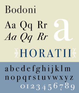
Bodoni is the name given to the serif typefaces first designed by Giambattista Bodoni (1740–1813) in the late eighteenth century and frequently revived since. Bodoni's typefaces are classified as Didone or modern. Bodoni followed the ideas of John Baskerville, as found in the printing type Baskerville—increased stroke contrast reflecting developing printing technology and a more vertical axis—but he took them to a more extreme conclusion. Bodoni had a long career and his designs changed and varied, ending with a typeface of a slightly condensed underlying structure with flat, unbracketed serifs, extreme contrast between thick and thin strokes, and an overall geometric construction.

Emigre, also known as Emigre Graphics, is a digital type foundry, publisher and distributor of graphic design centered information based in Berkeley, California, that was founded in 1984 by husband-and-wife team Rudy VanderLans and Zuzana Licko. The type foundry also published Emigre magazine between 1984 and 2005. Note that unlike the word émigré, Emigre is officially spelled without accents.

A type foundry is a company that designs or distributes typefaces. Before desktop publishing, type foundries manufactured and sold metal and wood typefaces and matrices for line-casting machines like the Linotype and Monotype machines designed to be used with letterpress printers. Today's digital type foundries accumulate and distribute typefaces created by type designers, who may either be freelancers operating their own independent foundry, or employed by another foundry. Type foundries may also provide custom type design services.
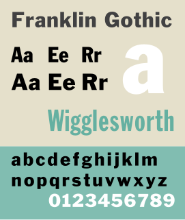
Franklin Gothic and its related faces are a large family of realist sans-serif typefaces developed by the type foundry American Type Founders (ATF) and credited to its head designer Morris Fuller Benton. “Gothic” was a contemporary term meaning sans-serif.
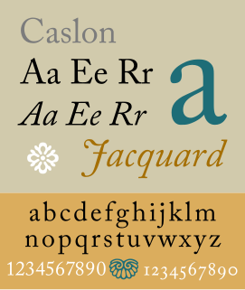
Caslon is the name given to serif typefaces designed by William Caslon I in London, or inspired by his work.

Bookman or Bookman Old Style, is a serif typeface. A wide, legible design that is slightly bolder than most body text faces, Bookman has been used for both display typography and for printing at small sizes such as in trade printing, and less commonly for body text. In advertising use it is particularly associated with the graphic design of the 1960s and 1970s, when revivals of it were very popular.
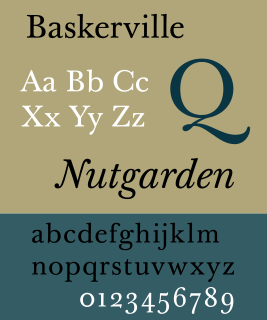
Baskerville is a serif typeface designed in the 1750s by John Baskerville (1706–1775) in Birmingham, England, and cut into metal by punchcutter John Handy. Baskerville is classified as a transitional typeface, intended as a refinement of what are now called old-style typefaces of the period, especially those of his most eminent contemporary, William Caslon.

DIN 1451 is a sans-serif typeface that is widely used for traffic, administrative and technical applications.

FF Scala is an old-style serif typeface designed by Dutch typeface designer Martin Majoor in 1990 for the Muziekcentrum Vredenburg in Utrecht, the Netherlands. The FF Scala font family was named for the Teatro alla Scala (1776–78) in Milan, Italy. Like many contemporary Dutch serif faces, FF Scala is not an academic revival of a single historic typeface but shows influences of several historic models. Similarities can be seen with William Addison Dwiggins' 1935 design for the typeface Electra in its clarity of form, and rhythmic, highly calligraphic italics. Eric Gill's 1931 typeface Joanna, with its old style armature but nearly square serifs, is also similar in its nearly mono-weighted stroke width.
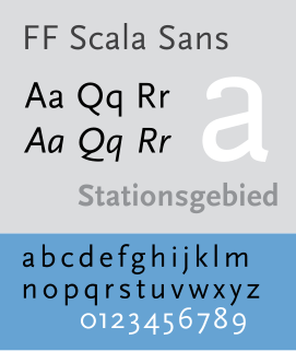
FF Scala Sans is a humanist sans-serif typeface designed by Dutch designer Martin Majoor in 1993 for the Vredenburg Music Center in Utrecht, the Netherlands. It was designed as a companion to Majoor's earlier serif old style typeface FF Scala, designed in 1990.
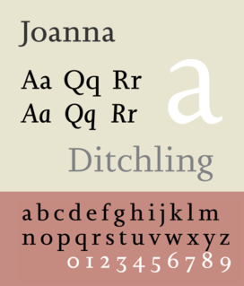
Joanna is a serif typeface designed by Eric Gill (1882–1940) in the period 1930–31, and named for one of his daughters. Gill chose Joanna for setting An Essay on Typography, a book by Gill on his thoughts on typography, typesetting, and page design. He described it as "a book face free from all fancy business."

Script typefaces are based upon the varied and often fluid stroke created by handwriting. They are generally used for display or trade printing, rather than for extended body text in the Latin alphabet. Some Greek alphabet typefaces, especially historically, have been a closer simulation of handwriting.

Plantin is an old-style serif typeface named after the sixteenth-century printer Christophe Plantin. It was created in 1913 by the British Monotype Corporation for their hot metal typesetting system, and is loosely based on a Gros Cicero face cut in the 16th century by Robert Granjon and held in the collection of the Plantin-Moretus Museum of Antwerp.

Martin Majoor is a Dutch type designer and graphic designer.
FontShop International is an international manufacturer of digital typefaces (fonts), based in Berlin. It is one of the largest digital type foundries.
Evert Bloemsma (1958–2005) was a Dutch type designer and graphic designer. In 1981 he graduated from the Hoogeschool voor de Kunsten in Arnhem. He taught typography at the Breda academy AKV St. Joost and at ArtEZ.

A font catalog or font catalogue is a collection of specimen of typefaces offering sample use of the fonts for the included typefaces, originally in the form of a printed book. The definition has also been applied to websites offering a specimens collection similar to what a printed catalog provides.
Cyrus Highsmith is an American typeface designer, illustrator, and author.