Related Research Articles
A letterer is a member of a team of comic book creators responsible for drawing the comic book's text. The letterer's use of typefaces, calligraphy, letter size, and layout all contribute to the impact of the comic. The letterer crafts the comic's "display lettering": the story title lettering and other special captions and credits that usually appear on a story's first page. The letterer also writes the letters in the word balloons and draws in sound effects. Many letterers also design logos for the comic book company's various titles.
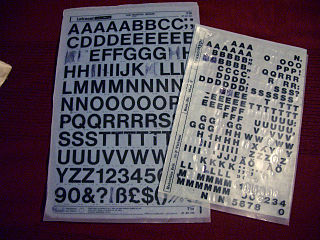
Letraset was a company known mainly for manufacturing sheets of typefaces and other artwork elements using the dry-transfer lettering method. Letraset has been acquired by the Colart group and become part of its subsidiary Winsor & Newton.

Todd Klein is an American comic book letterer, logo designer, and occasional writer, primarily for DC Comics.

Speech balloons are a graphic convention used most commonly in comic books, comics, and cartoons to allow words to be understood as representing a character's speech or thoughts. A formal distinction is often made between the balloon that indicates speech and the one that indicates thoughts; the balloon that conveys thoughts is often referred to as a thought bubble or conversation cloud.

Lettering is an umbrella term that covers the art of drawing letters, instead of simply writing them. Lettering is considered an art form, where each letter in a phrase or quote acts as an illustration. Each letter is created with attention to detail and has a unique role within a composition. Lettering is created as an image, with letters that are meant to be used in a unique configuration. Lettering words do not always translate into alphabets that can later be used in a typeface, since they are created with a specific word in mind.
The United States Equestrian Federation is the national governing body for most equestrian sports in the United States. It began on January 20, 1917, as the Association of American Horse Shows, later changed to the American Horse Shows Association (AHSA). In 2001, the organization changed its name to USA Equestrian (USAE) and, in 2003 it merged with the United States Equestrian Team (USET). In 2017, USEF rebranded as US Equestrian. In 2019, USEF outsourced its laboratory services to the University of Kentucky.

A physical training uniform is a military or organizational uniform used during exercise, calisthenics, drills, and in some cases, very casual periods of time. Most militaries, especially the United States Armed Forces and their auxiliaries require use of a physical training (PT) uniform during unit exercise. All items worn by military personnel conducting PT as a group are subject to uniformity, at commander discretions, however, some U.S. military units produce unique T-shirts with their unit insignia and motto, and for special events, this shirt is part of the uniform. Occasionally, exercise will also be conducted in that branch's utility uniforms, normally with the blouse removed and the undershirt exposed. For unit runs, esprit de corps or special occasions, commanders may have personnel wear unique T-shirts with the distinctive unit insignia and unit colors.
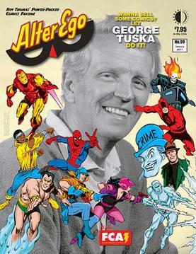
Alter Ego is an American magazine devoted to comic books and comic-book creators of the 1930s to late-1960s periods comprising what fans and historians call the Golden Age and Silver Age of Comic Books.
Michael Harvey MBE was an English lettering artist, teacher and writer specialising in lettering, type design and letter cutting. His work appears in many English cathedrals and on the National Gallery, London.
Comicraft is a company which provides graphic design and lettering services to various companies.
Mary White née Rollinson (1926–2013) was a ceramic artist and calligrapher.
Thomas Orzechowski is a comic book letterer, primarily known for his work on Uncanny X-Men. Over the course of Orzechowski's career, he has lettered something on the order of 6,000 pages of long-time X-Men writer Chris Claremont's scripts.
Ken Bruzenak is an American comic book letterer, primarily known for his work on Howard Chaykin’s American Flagg! Bruzenak's lettering and logowork was integral to the comic's futuristic, trademark-littered ambience. During the course of his career, Bruzenak has been closely associated with both Chaykin and Jim Steranko.
Joe Rosen was an American comic book artist, primarily known for his work as a letterer. Over the course of his career with Marvel Comics and DC Comics, Rosen lettered such titles as The Fantastic Four, Captain America, Daredevil, Spider-Man, G.I. Joe: A Real American Hero, The Incredible Hulk, The Further Adventures of Indiana Jones, and X-Factor. He also lettered the DC/Marvel intercompany crossover book Superman and Spider-Man.
Technical lettering is the process of forming letters, numerals, and other characters in technical drawing. It is used to describe, or provide detailed specifications for, an object. With the goals of legibility and uniformity, styles are standardized and lettering ability has little relationship to normal writing ability. Engineering drawings use a Gothic sans-serif script, formed by a series of short strokes. Lower case letters are rare in most drawings of machines.
United States Committee of the International Council on Monuments and Sites (ICOMOS-USA) is one of numerous national subsidiary committees of ICOMOS, forming a worldwide alliance for the study and conservation of historic buildings, districts, and sites. It is the focus of international cultural resources exchange in the United States, working to share preservation information and expertise worldwide. It also highlights and interprets the unique American preservation system: the partnership between private organizations and federal, state, and local governments, and the cooperation between the academic community, professionals and civic volunteers.
Letter Arts Review is a quarterly magazine devoted to contemporary and historical lettering, calligraphy, typography, and text-based art. The magazine was established in 1982. It was published by John Neal Bookseller until issue 35.1. In June 2021 Greg Sharp, President and CEO of Sea Hill Press Inc, became the third publisher of the Magazine. Letter Arts Review is edited and designed by the calligrapher Christopher Calderhead. The magazine is headquartered in Leesburg, Florida, United States. A juried issue showing contemporary developments within this field is published annually.

Letter cutting is a form of inscriptional architectural lettering closely related to monumental masonry and stone carving, often practised by artists, sculptors, and typeface designers. Rather than traditional stone carving, where images and symbols are the dominant features, in letter cutting the unique skill is "meticulous setting out and skilled cutting of the lettering style, in terms of design, angle and depth of the lettering".
Letter carvers see the drawing and carving of letters as a particular craft in itself, allied to but distinct from masonry and carving in general. Most letter carvers are both designers and carvers. Typefaces designed for printing are rarely satisfactory when carved into stone, so most letter carvers design their own letterforms.
James Mosley is a retired librarian and historian whose work has specialised in the history of printing and letter design.

Bryant Olcher Fedden was a self-taught letter-cutter, glass engraver and sculptor who developed his craft in a workshop environment with craftspeople whom he taught and supported. He was a member of the Gloucestershire Guild of Craftsmen for more than forty years. He was a founder member of the Letter Exchange, a professional organisation promoting lettering in all its forms. Bryant Fedden has work in the Victoria and Albert Museum Collections.
References
- Neuenschwander, Brody (1991). "Dot the i; 20th Century German Lettering". letterexchange.org. London. Archived from the original on August 15, 2003.