
Helvetica or Neue Haas Grotesk is a widely used sans-serif typeface developed in 1957 by Swiss typeface designer Max Miedinger and Eduard Hoffmann.

Frutiger is a series of typefaces named after its Swiss designer, Adrian Frutiger. Frutiger is a humanist sans-serif typeface, intended to be clear and highly legible at a distance or at small text sizes. A very popular design worldwide, type designer Steve Matteson described its structure as "the best choice for legibility in pretty much any situation" at small text sizes, while Erik Spiekermann named it as "the best general typeface ever".

Rockwell is a slab serif typeface designed by the Monotype Corporation and released in 1934. The project was supervised by Monotype's engineering manager Frank Hinman Pierpont. This typeface is distinguished by a serif at the apex of the uppercase A, while the lowercase a has two storeys. Because of its monoweighted stroke, Rockwell is used primarily for display or at small sizes rather than as a body text. Rockwell is based on an earlier, more condensed slab serif design cast by the Inland Type Foundry called Litho Antique.
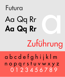
Futura is a geometric sans-serif typeface designed by Paul Renner and released in 1927. It was designed as a contribution on the New Frankfurt-project. It is based on geometric shapes, especially the circle, similar in spirit to the Bauhaus design style of the period. It was developed as a typeface by the Bauer Type Foundry, in competition with Ludwig & Mayer's seminal Erbar typeface of 1926.
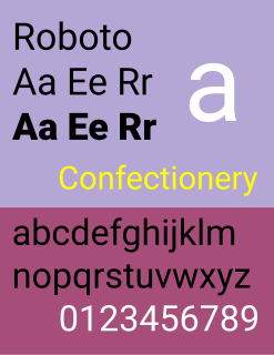
Roboto is a neo-grotesque sans-serif typeface family developed by Google as the system font for its mobile operating system Android, and released in 2011 for Android 4.0 "Ice Cream Sandwich".

Highway Gothic is a sans-serif typeface developed by the United States Federal Highway Administration (FHWA) and used for road signage in the Americas, including the U.S., Canada, and Latin American countries, as well as in Asian countries influenced by American signage practices, including the Philippines, China, Taiwan, Malaysia, Indonesia and Thailand. Variants, minor and major are used in countries like Turkey, Mexico, Australia, Spain, the Netherlands, Brazil, New Zealand, Macau, and some signs in countries like India and Saudi Arabia, when written in English. The typefaces were developed to maximize legibility at a distance and at high speed. Computer typeface versions known as Highway Gothic or Interstate, which are for sale to the general public, include punctuation marks based on a rectangular shape. However, on signage the official FHWA Series punctuation is based on a circular shape.

Rotis is a typeface developed in 1988 by Otl Aicher, a German graphic designer and typographer. In Rotis, Aicher explores an attempt at maximum legibility through a highly unified yet varied typeface family that ranges from full serif, glyphic, and sans-serif. The four basic Rotis variants are:
Anuthin Wongsunkakon is a Thai type designer and one of the founding partners of Cadson Demak, a Thai communication design firm. He began studying graphic design at Rangsit University during the time when the Thai design industry made its shift from pre-computer to computer based design. After completing his bachelor's degree he continued his studies in New York at Pratt Institute, choosing it for the city it’s in rather than for its prestigiousness or distinction.
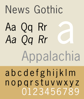
News Gothic is a sans-serif typeface in the grotesque or industrial style. It was designed by Morris Fuller Benton and released in 1908 by his employer American Type Founders (ATF). News Gothic is similar in proportion and structure to Franklin Gothic, also designed by Benton, but lighter.
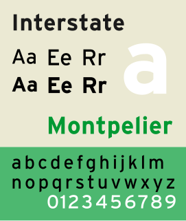
Interstate is a digital typeface designed by Tobias Frere-Jones in the period 1993–1999, and licensed by Font Bureau. The typeface is based on Style Type E of the FHWA series of fonts, a signage alphabet drawn for the United States Federal Highway Administration by Dr. Theodore W. Forbes in 1949.
The term "ADA Signs" has come into common use in the architectural, construction and signage industries with the advent of the Americans With Disabilities Act, or ADA. The Americans with Disabilities Act regulates accessibility; and includes requirements for signage that is conveniently located and easy to read both visually and through tactile touch.

Drogowskaz is a geometric sans-serif typeface used in public signage in Poland. Originally developed in 1975 by Marek Sigmund for the Ministry of Transportation and put into effect on April 1 of that year, it is currently used in accordance with the Ministry of Infrastructure regulation of July 3, 2003 on all types of road signs in Poland. It is also used for nameboards and station signs at railway stations.

Toronto Subway is a geometric sans-serif typeface designed for the original section of the Toronto Transit Commission’s Yonge subway. It is today used at station entrances, fare booths and track level signage throughout the system.

Yale is an old style serif typeface designed by Matthew Carter and first released in 2004. It was commissioned by Yale University for use in all of its signage, promotional and internal material.

Fira Sans is a humanist sans-serif typeface designed by Erik Spiekermann, Ralph du Carrois, Anja Meiners, Botio Nikoltchev of Carrois Type Design and Patryk Adamczyk of Mozilla Corporation. Originally commissioned by Telefónica and Mozilla Corporation as part of the joint effort during the development of Firefox OS. It is a slightly wider and calmer adaptation of Spiekermann's typeface Meta, which was used at Mozilla's brand typeface at the time but optimized for legibility on (small) screens. With the name Fira, Mozilla wanted to communicate the concepts of fire, light and joy but in a language agnostic way to signal the project's global nature. Fira was released in 2013 initially under the Apache License and later reissued under the SIL Open Font License.
Lineto is a Swiss type foundry founded by Cornel Windlin and Stephan Müller in 1993. In 1998, Lineto launched a website to distribute their fonts digitally. In 2007, Jürg Lehni joined the venture.
Jokerman is a decorative typeface created in 1995 by British designer Andrew K. Smith. It employs dots, spirals and straight lines that can be either attached or placed near each letter or integrated into the character to create negative space. It is described by Microsoft as having "fanciful internal and external elements". Smith named the typeface after the Bob Dylan song "Jokerman".

Thai typography concerns the representation of the Thai script in print and on displays, and dates to the earliest printed Thai text in 1819. The printing press was introduced by Western missionaries during the mid-nineteenth century, and the printed word became an increasingly popular medium, spreading modern knowledge and aiding reform as the country modernized. The printing of textbooks for a new education system and newspapers and magazines for a burgeoning press in the early twentieth century spurred innovation in typography and type design, and various styles of Thai typefaces were developed through the ages as metal type gave way to newer technologies. Modern media is now served by digital typography, and despite early obstacles including lack of copyright protection, the market now sees contributions by several type designers and digital type foundries.
