
The Cyrillic script is a writing system used for various languages across Eurasia and is used as the national script in various Slavic, Turkic, Mongolic and Iranic-speaking countries in Southeastern Europe, Eastern Europe, the Caucasus, Central Asia, North Asia and East Asia.

In typography, emphasis is the strengthening of words in a text with a font in a different style from the rest of the text, to highlight them. It is the equivalent of prosodic stress in speech.

Letter case is the distinction between the letters that are in larger uppercase or capitals and smaller lowercase in the written representation of certain languages. The writing systems that distinguish between the upper and lowercase have two parallel sets of letters, with each letter in one set usually having an equivalent in the other set. The two case variants are alternative representations of the same letter: they have the same name and pronunciation and are treated identically when sorting in alphabetical order.

Gentium is a Unicode serif typeface designed by Victor Gaultney. Gentium fonts are free and open source software, and are released under the SIL Open Font License (OFL), which permits modification and redistribution. Gentium has wide support for languages using the Latin, Greek, and Cyrillic alphabets, and the International Phonetic Alphabet. Gentium Plus variants released in November 2010 now include over 5,500 glyphs and advanced typographic features through OpenType and Graphite.

Lucida is an extended family of related typefaces designed by Charles Bigelow and Kris Holmes and released from 1984 onwards. The family is intended to be extremely legible when printed at small size or displayed on a low-resolution display – hence the name, from 'lucid'.

In typography, all caps refers to text or a font in which all letters are capital letters, for example: TEXT IN ALL CAPS. All caps may be used for emphasis. They are commonly seen in legal documents, the titles on book covers, in advertisements and in newspaper headlines. Short strings of words in capital letters appear bolder and "louder" than mixed case, and this is sometimes referred to as "screaming" or "shouting". All caps can also be used to indicate that a given word is an acronym.

In typography, small caps are lowercase characters typeset with glyphs that resemble uppercase letters (capitals) but reduced in height and weight, close to the surrounding lowercase letters or text figures. This is technically not a case-transformation, but a substitution of glyphs, although the effect is often simulated by case-transformation and scaling. Small caps are used in running text as a form of emphasis that is less dominant than all uppercase text, and as a method of emphasis or distinctiveness for text alongside or instead of italics, or when boldface is inappropriate. For example, the text "Text in small caps" appears as Tᴇxᴛ ɪɴ sᴍᴀʟʟ ᴄᴀᴘs in small caps. Small caps can be used to draw attention to the opening phrase or line of a new section of text, or to provide an additional style in a dictionary entry where many parts must be typographically differentiated.
Unicode has subscripted and superscripted versions of a number of characters including a full set of Arabic numerals. These characters allow any polynomial, chemical and certain other equations to be represented in plain text without using any form of markup like HTML or TeX.

Eurostile is a geometric sans-serif typeface designed by Aldo Novarese in 1962. Novarese created Eurostile for one of the best-known Italian foundries, Nebiolo, in Turin.
In metal typesetting, a font was a particular size, weight and style of a typeface. Each font was a matched set of type, one piece for each glyph, and a typeface consisting of a range of fonts that shared an overall design.

Parisine is a typeface created by Jean-François Porchez. Distributed by Typofonderie.

The Commemorative Order of Saint Thomas of Acon is an independent British Christian masonic organisation. Membership is restricted to those who are subscribing members of a Preceptory (Commandery) in amity with the Great Priory of the United Religious, Military and Masonic Order of the Temple of England and Wales and Provinces Overseas. Membership is by invitation only. The basic organisation of the Order is a Chapel.
Unicode supports several phonetic scripts and notations through the existing writing systems and the addition of extra blocks with phonetic characters. These phonetic extras are derived of an existing script, usually Latin, Greek or Cyrillic. In Unicode there is no "IPA script". Apart from IPA, extensions to the IPA and obsolete and nonstandard IPA symbols, these blocks also contain characters from the Uralic Phonetic Alphabet and the Americanist Phonetic Alphabet.

GNU FreeFont is a family of free OpenType, TrueType and WOFF vector fonts, implementing as much of the Universal Character Set (UCS) as possible, aside from the very large CJK Asian character set. The project was initiated in 2002 by Primož Peterlin and is now maintained by Steve White.

Syntax comprises a family of fonts designed by Swiss typeface designer Hans Eduard Meier. Originally just a sans-serif font, it was extended with additional serif designs.

Bank Gothic is a rectilinear geometric sans-serif typeface designed by Morris Fuller Benton for American Type Founders and released in 1930. The design has become popular from the late twentieth century to suggest a science-fiction, military, corporate, or sports aesthetic.
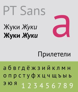
The Public Type or PT Fonts are a family of free/libre fonts released from 2009 onwards, comprising PT Sans, PT Serif and PT Mono. They were commissioned from the design agency ParaType by Rospechat, a department of the Russian Ministry of Communications, to celebrate the 300th anniversary of Peter the Great's orthography reform and to create a font family that supported all the different variations of Cyrillic script used by the minority languages of Russia, as well as the Latin alphabet.
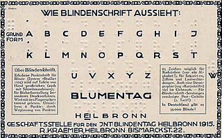
German Braille is one of the older braille alphabets. The French-based order of the letter assignments was largely settled on with the 1878 convention that decided the standard for international braille. However, the assignments for German letters beyond the 26 of the basic Latin alphabet are mostly unrelated to French values.

Literata is an old-style serif typeface commissioned by Google and designed by the independent type foundry TypeTogether. It was released in 2015 and is the default font family in Google Play Books, since version 3.4.5. The typeface was intended to establish a unique visual identity for the Play Books app, suitable across a wide variety of screen sizes, resolutions, and rendering software. The designers went back to the old-style Roman and Scotch typefaces for inspiration.
