External links
- http://udleditions.cast.org/strategy_visualize.html
- http://de.slideshare.net/StineArensbach/strategic-visualization-17203395
| | This business-related article is a stub. You can help Wikipedia by expanding it. |
Strategy visualization is any kind of (semi-artistic) infographics for visualization of a business strategy.[ citation needed ]
| | This business-related article is a stub. You can help Wikipedia by expanding it. |
The National Center for Supercomputing Applications (NCSA) is a state-federal partnership to develop and deploy national-scale cyberinfrastructure that advances research, science and engineering based in the United States. NCSA operates as a unit of the University of Illinois Urbana-Champaign, and provides high-performance computing resources to researchers across the country. Support for NCSA comes from the National Science Foundation, the state of Illinois, the University of Illinois, business and industry partners, and other federal agencies.
Business administration, also known as business management, is the administration of a commercial enterprise. It includes all aspects of overseeing and supervising the business operations of an organization. From the point of view of management and leadership, it also covers fields that include office building administration, accounting, finance, designing, development, quality assurance, data analysis, sales, project management, information-technology management, research and development, marketing and communication studies.
Visualization or visualisation is any technique for creating images, diagrams, or animations to communicate a message. Visualization through visual imagery has been an effective way to communicate both abstract and concrete ideas since the dawn of humanity. from history include cave paintings, Egyptian hieroglyphs, Greek geometry, and Leonardo da Vinci's revolutionary methods of technical drawing for engineering and scientific purposes.
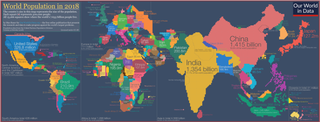
A cartogram is a thematic map of a set of features, in which their geographic size is altered to be directly proportional to a selected variable, such as travel time, population, or Gross National Product. Geographic space itself is thus warped, sometimes extremely, in order to visualize the distribution of the variable. It is one of the most abstract types of map; in fact, some forms may more properly be called diagrams. They are primarily used to display emphasis and for analysis as nomographs.

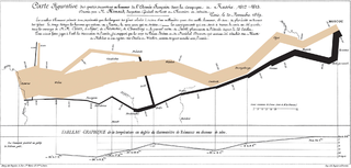
Infographics are graphic visual representations of information, data, or knowledge intended to present information quickly and clearly. They can improve cognition by using graphics to enhance the human visual system's ability to see patterns and trends. Similar pursuits are information visualization, data visualization, statistical graphics, information design, or information architecture. Infographics have evolved in recent years to be for mass communication, and thus are designed with fewer assumptions about the readers' knowledge base than other types of visualizations. Isotypes are an early example of infographics conveying information quickly and easily to the masses.
Reading comprehension is the ability to process written text, understand its meaning, and to integrate with what the reader already knows. Reading comprehension relies on two abilities that are connected to each other: word reading and language comprehension. Comprehension specifically is a "creative, multifaceted process" that is dependent upon four language skills: phonology, syntax, semantics, and pragmatics.

Ben Shneiderman is an American computer scientist, a Distinguished University Professor in the University of Maryland Department of Computer Science, which is part of the University of Maryland College of Computer, Mathematical, and Natural Sciences at the University of Maryland, College Park, and the founding director (1983-2000) of the University of Maryland Human-Computer Interaction Lab. He conducted fundamental research in the field of human–computer interaction, developing new ideas, methods, and tools such as the direct manipulation interface, and his eight rules of design.
George William Furnas is an American academic, Professor and Associate Dean for Academic Strategy at the School of Information of the University of Michigan, known for his work on semantic analysis and on human-system communication.
Data and information visualization is the practice of designing and creating easy-to-communicate and easy-to-understand graphic or visual representations of a large amount of complex quantitative and qualitative data and information with the help of static, dynamic or interactive visual items. Typically based on data and information collected from a certain domain of expertise, these visualizations are intended for a broader audience to help them visually explore and discover, quickly understand, interpret and gain important insights into otherwise difficult-to-identify structures, relationships, correlations, local and global patterns, trends, variations, constancy, clusters, outliers and unusual groupings within data. When intended for the general public to convey a concise version of known, specific information in a clear and engaging manner, it is typically called information graphics.

In business computer information systems, a dashboard is a type of graphical user interface which often provides at-a-glance views of key performance indicators (KPIs) relevant to a particular objective or business process. In other usage, "dashboard" is another name for "progress report" or "report" and considered a form of data visualization. In providing this overview, business owners can save time and improve their decision making by utilizing dashboards.

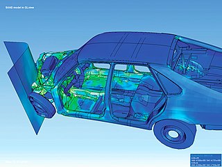
Flow visualization or flow visualisation in fluid dynamics is used to make the flow patterns visible, in order to get qualitative or quantitative information on them.

Fernanda Bertini Viégas is a Brazilian computer scientist and graphical designer, whose work focuses on the social, collaborative and artistic aspects of information visualization.

The Wolfram Demonstrations Project is an organized, open-source collection of small interactive programmes called Demonstrations, which are meant to visually and interactively represent ideas from a range of fields. It is hosted by Wolfram Research, whose stated goal is to bring computational exploration to a large population. At its launch, it contained 1300 demonstrations but has grown to over 10,000. The site won a Parents' Choice Award in 2008.
The ICTCM Award is presented each year at the International Conference on Technology in Collegiate Mathematics sponsored by Pearson Addison–Wesley & Pearson Prentice Hall publishers. This award, now in its twelfth year, was established by Pearson Education to recognize an individual or group for excellence and innovation in using technology to enhance the teaching and learning of mathematics. Electronic conference proceedings are available beginning with ICTCM 7. List of free electronic journals in mathematics

Saros cycle series 111 for solar eclipses occurred at the Moon's ascending node, repeating every 18 years and 11 days, and contained 79 events.
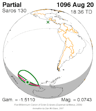
Saros cycle series 130 for solar eclipses occurs at the Moon's descending node, repeating every 18 years, 11 days, containing 73 events. All eclipses in this series occurs at the Moon's descending node.
BigQuery is Google's fully managed, serverless data warehouse that enables scalable analysis over petabytes of data. It is a Platform as a Service (PaaS) that supports querying using a dialect of SQL. It also has built-in machine learning capabilities. BigQuery was announced in May 2010 and made generally available in November 2011.
In information visualization and graphic design, Truchet tiles are square tiles decorated with patterns that are not rotationally symmetric. When placed in a square tiling of the plane, they can form varied patterns, and the orientation of each tile can be used to visualize information associated with the tile's position within the tiling.

SNAMP is an open-source, cross-platform software platform for telemetry, tracing and elasticity management of distributed applications.
Jessica Hullman is a computer scientist and the Ginni Rometty associate professor of Computer Science at Northwestern University. She is known for her research in Information visualization.