Related Research Articles
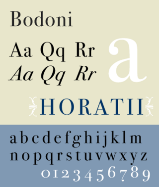
Bodoni is the name given to the serif typefaces first designed by Giambattista Bodoni (1740–1813) in the late eighteenth century and frequently revived since. Bodoni's typefaces are classified as Didone or modern. Bodoni followed the ideas of John Baskerville, as found in the printing type Baskerville—increased stroke contrast reflecting developing printing technology and a more vertical axis—but he took them to a more extreme conclusion. Bodoni had a long career and his designs changed and varied, ending with a typeface of a slightly condensed underlying structure with flat, unbracketed serifs, extreme contrast between thick and thin strokes, and an overall geometric construction.

Franklin Gothic and its related faces are a large family of sans-serif typefaces in the industrial or grotesque style developed in the early years of the 20th century by the type foundry American Type Founders (ATF) and credited to its head designer Morris Fuller Benton. “Gothic” was a contemporary term meaning sans-serif.

Bookman or Bookman Old Style, is a serif typeface. A wide, legible design that is slightly bolder than most body text faces, Bookman has been used for both display typography, for trade printing such as advertising, and less commonly for body text. In advertising use it is particularly associated with the graphic design of the 1960s and 1970s, when revivals of it were very popular. It is also used as the official font of Indonesian laws since 2011.

Bernhard Gothic is a family of geometric sans serif typeface designed by Lucian Bernhard in 1929 for the American Type Founders (ATF). Five variations by Bernhard were introduced over two years:

Cheltenham is a typeface for display use designed in 1896 by architect Bertram Goodhue and Ingalls Kimball, director of the Cheltenham Press. The original drawings were known as Boston Old Style and were made about 14" high. These drawings were then turned over to Morris Fuller Benton at American Type Founders (ATF) who developed it into a final design. Trial cuttings were made as early as 1899 but the face was not complete until 1902. The face was patented by Kimball in 1904. Later the basic face was spun out into an extensive type family by Morris Fuller Benton.

Goudy Old Style is an old-style serif typeface originally created by Frederic W. Goudy for American Type Founders (ATF) in 1915.

News Gothic is a sans-serif typeface designed by Morris Fuller Benton, and was released in 1908 by his employer American Type Founders (ATF). The typeface is similar in proportion and structure to Franklin Gothic, also designed by Benton, but lighter.

Twentieth Century is a geometric sans-serif typeface designed by Sol Hess for Lanston Monotype in 1937. It was created as a competitor to the successful Futura typeface for Monotype's hot metal typesetting system. Like Futura it has a single-story 'ɑ' and a straight 'j' with no bend.
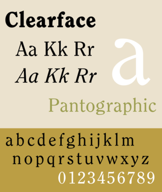
Clearface is a serif typeface designed by Morris Fuller Benton with the collaboration of his father Linn Boyd Benton, produced at American Type Founders in 1907, immediately following his preparation of Century Old Style. The bold was drawn first, in 1905, but the regular weight was the first to be released. Six variants were released between 1907 and 1911, and the design has frequently been rereleased and revived since. Clearface is a warm, curving design, showing the influence of the Arts and Crafts movement, for instance in the tilted 'e' and blobby, organic design, but not particularly based on any past period of type design and with a mixture of cursive and structured features.

Thomas Maitland Cleland was an American book designer, painter, illustrator, and type designer.

Robert Hunter Middleton was an American book designer, painter, and typeface designer. Born in Glasgow, Scotland he came to Chicago in 1908 where he studied at the School of the Art Institute. He joined the design department of the Ludlow Typograph Company in 1923 and served as director of the department of typeface design from 1933–71. In 1944 he began operating a private press, The Cherryburn Press. He died in Chicago.
Sidney Clyde Gaunt was an American type designer and artist.
Robert Wiebking (1870–1927) was a German-American engraver typeface designer who was known for cutting type matrices for Frederic Goudy from 1911 to 1926.
Sol Hess was an American typeface designer. After a three-year scholarship course at Pennsylvania Museum School of Industrial Design, he began at Lanston Monotype in 1902, rising to typographic manager in 1922. He was a close friend and collaborator with Monotype art director Frederic Goudy, succeeding him in that position in 1940. Hess was particularly adept at expanding type faces into whole families, allowing him to complete 85 faces for Monotype, making him America's fourth most prolific type designer. While he was with Monotype, Hess worked on commissions for many prominent users of type, including, Crowell-Collier, Sears Roebuck, Montgomery Ward, Yale University Press, World Publishing Company, and Curtis Publishing for whom he re-designed the typography of their Saturday Evening Post.

Century is a family of serif type faces particularly intended for body text. The family originates from a first design, Century Roman, cut by American Type Founders designer Linn Boyd Benton in 1894 for master printer Theodore Low De Vinne, for use in The Century Magazine. ATF rapidly expanded it into a very large family, first by Linn Boyd, and later by his son Morris.
Joseph Warren Phinney was an American printer, type designer, and business executive. Phinney began his career at the Dickinson Type Foundry in Boston where he designed type and worked in management, eventually becoming owner. He was a key player in arranging the merger of twenty-six large foundries to form the American Type Founders Company in 1892, becoming both manager of the Boston branch and head of the design department, where he oversaw the consolidation of type faces following the merger. Though his own designs were largely derivative, Phinney took a great interest in type and its history and throughout his tenure at A.T.F. he sought to preserve and protect that company's legacy, as for instance, when he oversaw the re-introduction of Binny & Ronaldson's 1796 type design, Roman No. 1, as Oxford in 1892, or when he purchased Frederick W. Goudy's first type design, Camelot, in 1896. He stayed with A.T.F. for the rest of his career, passing the role of design head to Morris Fuller Benton and becoming senior vice-president. Phinney retired shortly before the company fell upon hard times during the Great Depression and died in 1934.
The Inland Type Foundry was an American type foundry established in 1894 in Saint Louis, Missouri and later with branch offices in Chicago and New York City. Although it was founded to compete directly with the "type trust", and was consistently profitable, it was eventually sold to ATF.
References
- ↑ Jaspert, W. Pincus, W. Turner Berry and A.F. Johnson. The Encyclopedia of Type Faces. Blandford Press Lts.: 1953, 1983, ISBN 0-7137-1347-X, p. 2408-249
- ↑ American Metal Typefaces of the Twentieth Century, Mac McGrew, Oak Knoll, 2nd edition, 1993, pag. 3
- ↑ American Metal Typefaces of the Twentieth Century, Mac McGrew, Oak Knoll, 2nd edition, 1993, pag. 5-7
- ↑ American Metal Typefaces of the Twentieth Century, Mac McGrew, Oak Knoll, 2nd edition, 1993, pag. 17
- ↑ American Metal Typefaces of the Twentieth Century, Mac McGrew, Oak Knoll, 2nd edition, 1993, pag. 21
- ↑ American Metal Typefaces of the Twentieth Century, Mac McGrew, Oak Knoll, 2nd edition, 1993, pag. 23
- ↑ American Metal Typefaces of the Twentieth Century, Mac McGrew, Oak Knoll, 2nd edition, 1993, pag. 47
- ↑ American Metal Typefaces of the Twentieth Century, Mac McGrew, Oak Knoll, 2nd edition, 1993, pag. 61
- ↑ American Metal Typefaces of the Twentieth Century, Mac McGrew, Oak Knoll, 2nd edition, 1993, pag. 63-77
- ↑ American Metal Typefaces of the Twentieth Century, Mac McGrew, Oak Knoll, 2nd edition, 1993, pag. 83-93
- ↑ American Metal Typefaces of the Twentieth Century, Mac McGrew, Oak Knoll, 2nd edition, 1993, pag. 105,107,111,113
- ↑ American Metal Typefaces of the Twentieth Century, Mac McGrew, Oak Knoll, 2nd edition, 1993, pag. 117-123
- ↑ American Metal Typefaces of the Twentieth Century, Mac McGrew, Oak Knoll, 2nd edition, 1993, pag. 131-133
- ↑ American Metal Typefaces of the Twentieth Century, Mac McGrew, Oak Knoll, 2nd edition, 1993, pag. 319
- ↑ American Metal Typefaces of the Twentieth Century, Mac McGrew, Oak Knoll, 2nd edition, 1993, pag. 137
- ↑ Provan, Archie, and Alexander S. Lawson, 100 Type Histories (volume 1), National Composition Association, Arlington, Virginia, 1983, pp. 20-21.
- ↑ American Metal Typefaces of the Twentieth Century, Mac McGrew, Oak Knoll, 2nd edition, 1993, pag. 145
- ↑ American Metal Typefaces of the Twentieth Century, Mac McGrew, Oak Knoll, 2nd edition, 1993, pag. 143
- ↑ American Metal Typefaces of the Twentieth Century, Mac McGrew, Oak Knoll, 2nd edition, 1993, pag. 157, 159, 177
- ↑ American Metal Typefaces of the Twentieth Century, Mac McGrew, Oak Knoll, 2nd edition, 1993, pag. 173
- ↑ American Metal Typefaces of the Twentieth Century, Mac McGrew, Oak Knoll, 2nd edition, 1993, pag. 175. 177
- ↑ American Metal Typefaces of the Twentieth Century, Mac McGrew, Oak Knoll, 2nd edition, 1993, pag. 185, 187, 189
- ↑ American Metal Typefaces of the Twentieth Century, Mac McGrew, Oak Knoll, 2nd edition, 1993, pag. 195
- ↑ American Metal Typefaces of the Twentieth Century, Mac McGrew, Oak Knoll, 2nd edition, 1993, pag. 199
- ↑ American Metal Typefaces of the Twentieth Century, Mac McGrew, Oak Knoll, 2nd edition, 1993, pag. 213, 219, 221, 223, 225, 227
- ↑ American Metal Typefaces of the Twentieth Century, Mac McGrew, Oak Knoll, 2nd edition, 1993, pag. 237
- ↑ American Metal Typefaces of the Twentieth Century, Mac McGrew, Oak Knoll, 2nd edition, 1993, pag. 245, 247, 249, 251, 253, 255, 261
- ↑ American Metal Typefaces of the Twentieth Century, Mac McGrew, Oak Knoll, 2nd edition, 1993, pag. 275
- ↑ American Metal Typefaces of the Twentieth Century, Mac McGrew, Oak Knoll, 2nd edition, 1993, pag. 281, 285, 289, 291, 293, 301
- ↑ American Metal Typefaces of the Twentieth Century, Mac McGrew, Oak Knoll, 2nd edition, 1993, pag. 313, 317
- ↑ American Metal Typefaces of the Twentieth Century, Mac McGrew, Oak Knoll, 2nd edition, 1993, pag. 329, 333, 337