In English writing, quotation marks or inverted commas, also known informally as quotes, talking marks, speech marks, quote marks, quotemarks or speechmarks, are punctuation marks placed on either side of a word or phrase in order to identify it as a quotation, direct speech or a literal title or name. Quotation marks may be used to indicate that the meaning of the word or phrase they surround should be taken to be different from that typically associated with it, and are often used in this way to express irony. They also sometimes appear to be used as a means of adding emphasis, although this usage is usually considered incorrect.
In punctuation, a word divider is a glyph that separates written words. In languages which use the Latin, Cyrillic, and Arabic alphabets, as well as other scripts of Europe and West Asia, the word divider is a blank space, or whitespace. This convention is spreading, along with other aspects of European punctuation, to Asia and Africa, where words are usually written without word separation.
In writing, a space is a blank area that separates words, sentences, syllables and other written or printed glyphs (characters). Conventions for spacing vary among languages, and in some languages the spacing rules are complex.

In typography, kerning is the process of adjusting the spacing between characters in a proportional font, usually to achieve a visually pleasing result. Kerning adjusts the space between individual letterforms, while tracking (letter-spacing) adjusts spacing uniformly over a range of characters. In a well-kerned font, the two-dimensional blank spaces between each pair of characters all have a visually similar area. The term "keming" is sometimes used informally to refer to poor kerning
In typography, leading is the space between adjacent lines of type; the exact definition varies.
An underscore, also called an underline, low line, or low dash, is a line drawn under a segment of text. In proofreading, underscoring is a convention that says "set this text in italic type", traditionally used on manuscript or typescript as an instruction to the printer. Its use to add emphasis in modern documents is a deprecated practice. The underscore character, _, originally appeared on the typewriter and was primarily used to emphasise words as in the proofreader's convention. To produce an underscored word, the word was typed, the typewriter carriage was moved back to the beginning of the word, and the word was overtyped with the underscore character.
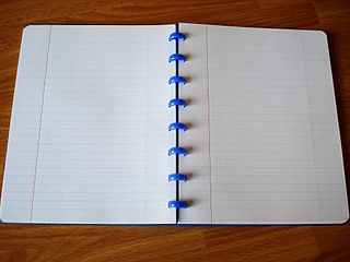
Ruled paper is writing paper printed with lines as a guide for handwriting. The lines often are printed with fine width and in light colour and such paper is sometimes called feint-ruled paper. Additional vertical lines may provide margins or act as tab stops or create a grid for plotting data; for example, graph paper is divided into squares by horizontal and vertical lines.
In word processing and digital typesetting, a non-breaking space, , also called NBSP, required space, hard space, or fixed space, is a space character that prevents an automatic line break at its position. In some formats, including HTML, it also prevents consecutive whitespace characters from collapsing into a single space.
In typography, letter-spacing or tracking is an optically-consistent adjustment to the space between letters to change the visual density of a line or block of text. Letter-spacing is distinct from kerning, which adjusts the spacing of particular pairs of adjacent characters such as "7." which would appear to be badly spaced if left unadjusted.
In typesetting and page layout, alignment or range is the setting of text flow or image placement relative to a page, column (measure), table cell, or tab. The type alignment setting is sometimes referred to as text alignment, text justification, or type justification. The edge of a page or column is known as a margin, and a gap between columns is known as a gutter.
Sentence spacing concerns how spaces are inserted between sentences in typeset text and is a matter of typographical convention. Since the introduction of movable-type printing in Europe, various sentence spacing conventions have been used in languages with a Latin alphabet. These include a normal word space, a single enlarged space, and two full spaces.

In music theory, voicing refers to two closely related concepts:
- How a musician or group distributes, or spaces, notes and chords on one or more instruments
- The simultaneous vertical placement of notes in relation to each other; this relates to the concepts of spacing and doubling

Procedure signs or prosigns are shorthand signals used in Morse code radio telegraphy procedure, for the purpose of simplifying and standardizing radio communication protocol. They are several from Morse code abbreviations, which consist mainly of brevity codes that convey messages to other parties with greater speed and accuracy.
Microtypography is the name given to a range of methods for improving the readability and appearance of text, especially justified text. The methods reduce the appearance of large interword spaces and create edges to the text that appear more even. Microtypography methods can also increase reading comprehension of text, reducing the cognitive load of reading.
For the Korean language, South Korea mainly uses a combination of East Asian and European punctuation, while North Korea uses a little more of the East Asian punctuation style.

The history of sentence spacing is the evolution of sentence spacing conventions from the introduction of movable type in Europe by Johannes Gutenberg to the present day.
Sentence spacing guidance is provided in many language and style guides. The majority of style guides that use a Latin-derived alphabet as a language base now prescribe or recommend the use of a single space after the concluding punctuation of a sentence.
Sentence spacing in digital media concerns the horizontal width of the space between sentences in computer- and web-based media. Digital media allow sentence spacing variations not possible with the typewriter. Most digital fonts permit the use of a variable space or a no-break space. Some modern font specifications, such as OpenType, have the ability to automatically add or reduce space after punctuation, and users may be able to choose sentence spacing variations.
A typographic approximation is a replacement of an element of the writing system with another glyph or glyphs. The replacement may be a nearly homographic character, a digraph, or a character string. An approximation is different from a typographical error in that an approximation is intentional and aims to preserve the visual appearance of the original. The concept of approximation also applies to the World Wide Web and other forms of textual information available via digital media, though usually at the level of characters, not glyphs.