Graphic design is a profession, academic discipline and applied art whose activity consists in projecting visual communications intended to transmit specific messages to social groups, with specific objectives. Graphic design is an interdisciplinary branch of design and of the fine arts. Its practice involves creativity, innovation and lateral thinking using manual or digital tools, where it is usual to use text and graphics to communicate visually.
National Rail (NR) is the trading name licensed for use by the Rail Delivery Group, an unincorporated association whose membership consists of the passenger train operating companies (TOCs) of England, Scotland, and Wales. The TOCs run the passenger services previously provided by the British Railways Board, from 1965 using the brand name British Rail. Northern Ireland, which is bordered by the Republic of Ireland, has a different system. National Rail services share a ticketing structure and inter-availability that generally do not extend to services which were not part of British Rail.

Typography is the art and technique of arranging type to make written language legible, readable and appealing when displayed. The arrangement of type involves selecting typefaces, point sizes, line lengths, line-spacing (leading), and letter-spacing (tracking), as well as adjusting the space between pairs of letters (kerning). The term typography is also applied to the style, arrangement, and appearance of the letters, numbers, and symbols created by the process. Type design is a closely related craft, sometimes considered part of typography; most typographers do not design typefaces, and some type designers do not consider themselves typographers. Typography also may be used as an ornamental and decorative device, unrelated to the communication of information.

Frutiger is a series of typefaces named after its Swiss designer, Adrian Frutiger. Frutiger is a humanist sans-serif typeface, intended to be clear and highly legible at a distance or at small text sizes. A very popular design worldwide, type designer Steve Matteson described its structure as "the best choice for legibility in pretty much any situation" at small text sizes, while Erik Spiekermann named it as "the best general typeface ever".

A metro station or subway station is a train station for a rapid transit system, which as a whole is usually called a "metro" or "subway". A station provides a means for passengers to purchase tickets, board trains, and evacuate the system in the case of an emergency. In the United Kingdom, they are known as underground stations, most commonly used in reference to the London Underground.
The DOT pictograms are a set of fifty pictograms used to convey information useful to travelers without using words. Such images are often used in airports, train stations, hotels, and other public places for foreign tourists, as well as being easier to identify than strings of text. Among these pictograms are graphics representing toilets and telephones. As a result of their near-universal acceptance, some describe them as the "Helvetica" of pictograms, and the character portrayed within them as Helvetica Man.

Johnston is a sans-serif typeface designed by and named after Edward Johnston. The typeface was commissioned in 1913 by Frank Pick, commercial manager of the Underground Electric Railways Company of London, as part of his plan to strengthen the company's corporate identity. Johnston was originally created for printing, but it rapidly became used for the enamel station signs of the Underground system as well.

Rail Alphabet is a neo-grotesque sans-serif typeface designed by Jock Kinneir and Margaret Calvert for signage on the British Rail network. First used at Liverpool Street station, it was then adopted by the Design Research Unit (DRU) as part of their comprehensive 1965 rebranding of the company.

Digital signage is a segment of electronic signage. Digital displays use technologies such as LCD, LED, projection and e-paper to display digital images, video, web pages, weather data, restaurant menus, or text. They can be found in public spaces, transportation systems, museums, stadiums, retail stores, hotels, restaurants and corporate buildings etc., to provide wayfinding, exhibitions, marketing and outdoor advertising. They are used as a network of electronic displays that are centrally managed and individually addressable for the display of text, animated or video messages for advertising, information, entertainment and merchandising to targeted audiences.

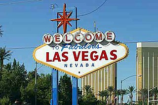
Clearview, also known as Clearview Hwy, is the name of a humanist sans-serif typeface family for guide signs used on roads in the United States, Canada, Indonesia, the Philippines, Israel, Brazil and Sri Lanka. It was developed by independent researchers with the help of the Texas Transportation Institute and the Pennsylvania Transportation Institute, under the supervision of the Federal Highway Administration (FHWA). It was once expected to replace the FHWA typefaces in many applications, although newer studies of its effectiveness have called its benefits into question.
Margaret Vivienne Calvert is a British typographer and graphic designer who, with colleague Jock Kinneir, designed many of the road signs used throughout the United Kingdom, Crown Dependencies, and British Overseas Territories, as well as the Transport font used on road signs, the Rail Alphabet font used on the British railway system, and an early version of the signs used in airports. The typeface developed by Kinneir and Calvert was further developed into New Transport and used for the single domain GOV.UK website in the United Kingdom.
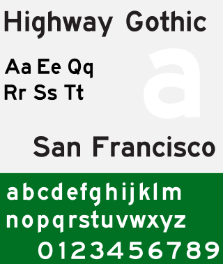
Highway Gothic is a sans-serif typeface developed by the United States Federal Highway Administration (FHWA) and used for road signage in the Americas, including the U.S., Canada, Latin America and some Caribbean countries, as well as in Asian countries influenced by American signage practices, including the Philippines, China, Taiwan, Malaysia, Indonesia and Thailand.
Signage is the design or use of signs and symbols to communicate a message. A signage also means signs collectively or being considered as a group. The term signage is documented to have been popularized in 1975 to 1980.
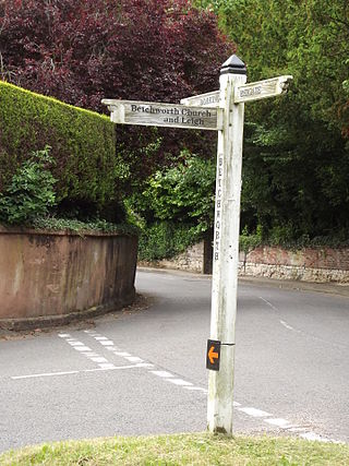
A fingerpost is a type of sign post consisting of a post with one or more arms, known as fingers, pointing in the direction of travel to places named on the fingers, often including distance information.

DIN 1451 is a sans-serif typeface that is widely used for traffic, administrative and technical applications.
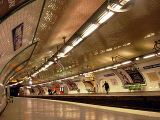
From the original plain white tilework and Art Nouveau entrances, the architecture of Paris Métro stations has evolved with successive waves of building and renovation.
Richard "Jock" Kinneir was a British typographer and graphic designer who, with his colleague Margaret Calvert, designed many of the road signs used throughout the United Kingdom, Crown Dependencies, and British overseas territories. Their system has become a model for modern road signage.

Rapid transit or mass rapid transit (MRT), also known as heavy rail or metro, is a type of high-capacity public transport that is generally built in urban areas. A rapid transit system that primarily or traditionally runs below the surface may be called a subway, tube, or underground. Unlike buses or trams, rapid transit systems are railways, usually electric, that operate on an exclusive right-of-way, which cannot be accessed by pedestrians or other vehicles. They are often grade-separated in tunnels or on elevated railways.

Toronto Subway is a geometric sans-serif typeface designed for the original section of the Toronto Transit Commission’s Yonge subway. It is today used at station entrances, fare booths and track level signage throughout the system.

Motorway is a sans-serif typeface designed by Jock Kinneir and Margaret Calvert for use on the motorway network of the United Kingdom. Motorway was first used on the M6 Preston bypass in 1958 and has been in use on the UK's motorways ever since. The typeface is also used in some other countries, most notably Ireland and Portugal.
