Umbra (typeface)

Last updated
Umbra
Umbra.png
Category Display
Designer(s) R. Hunter Middleton
Foundry Ludlow
Umbra sample.png
Sample

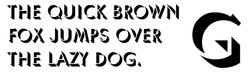
Umbra is a sans-serif display typeface designed in 1935 by R. Hunter Middleton for the Ludlow Typograph company. [1] [2] It is an adaptation of the uppercase light weight of his earlier typeface Tempo. The name Umbra refers to its shadow effect, in which the actual letter shape consists of negative space and is defined solely by its black dimensional shadow. [3] Several other typefaces were created in similar style around the same time, including shadowed weights of Gill Sans. Nebiolo's Ombra, part of their Semplicità family, is very similar.

Sans-serif letter form that does not have extending features called "serifs" at the end of strokes

In typography and lettering, a sans-serif, sans serif, gothic, or simply sans letterform is one that does not have extending features called "serifs" at the end of strokes. Sans-serif fonts tend to have less line width variation than serif fonts. In most print, they are often used for headings rather than for body text. They are often used to convey simplicity and modernity or minimalism.

Typeface set of characters that share common design features

In typography, a typeface is a set of one or more fonts each composed of glyphs that share common design features. Each font of a typeface has a specific weight, style, condensation, width, slant, italicization, ornamentation, and designer or foundry. For example, "ITC Garamond Bold Condensed Italic" means the bold, condensed-width, italic version of ITC Garamond. It is a different font from "ITC Garamond Condensed Italic" and "ITC Garamond Bold Condensed", but all are fonts within the same typeface, "ITC Garamond". ITC Garamond is a different typeface from "Adobe Garamond" or "Monotype Garamond". There are thousands of different typefaces in existence, with new ones being developed constantly.

R. Hunter Middleton American book designer, painter, and type designer

Robert Hunter Middleton was an American book designer, painter, and type designer. Born in Glasgow, Scotland he came to Chicago in 1908 where he studied at the School of the Art Institute. He joined the design department of the Ludlow Typograph Company in 1923 and served as director of the department of typeface design from 1933–71. In 1944 he began operating a private press, The Cherryburn Press. He died in Chicago.

Umbra has been digitised. [4]

Related Research Articles

Rockwell (typeface) typeface

Rockwell is a slab serif typeface designed by the Monotype Corporation and released in 1934. The project was supervised by Monotype's engineering manager Frank Hinman Pierpont. This typeface is distinguished by a serif at the apex of the uppercase A, while the lowercase a has two storeys. Because of its monoweighted stroke, Rockwell is used primarily for display or at small sizes rather than as a body text. Rockwell is based on an earlier, more condensed slab serif design cast by the Inland Type Foundry called Litho Antique.

Futura (typeface) geometric sans-serif typeface

Futura is a geometric sans-serif typeface designed by Paul Renner and released in 1927. It was designed as a contribution on the New Frankfurt-project. It is based on geometric shapes, especially the circle, similar in spirit to the Bauhaus design style of the period. It was developed as a typeface by the Bauer Type Foundry, in competition with Ludwig & Mayer's seminal Erbar typeface of 1926.

Univers typeface

Univers is the name of a large sans-serif typeface family designed by Adrian Frutiger and released by his employer Deberny & Peignot in 1957. Classified as a neo-grotesque sans-serif, one based on the model of nineteenth-century German typefaces such as Akzidenz-Grotesk, it was notable for its availability from the moment of its launch in a comprehensive range of weights and widths. The original marketing for Univers deliberately referenced the periodic table to emphasise its scope.

Gill Sans Typeface

Gill Sans is a sans-serif typeface designed by Eric Gill and released by the British branch of Monotype from 1928 onwards.

Johnston (typeface) typeface

Johnston is a sans-serif typeface designed by and named after Edward Johnston. The typeface was commissioned in 1913 by Frank Pick, commercial manager of the Underground Electric Railways Company of London, as part of his plan to strengthen the company's corporate identity. Johnston was originally created for printing, but it rapidly became used for the enamel station signs of the Underground system as well.

Myriad (typeface) typeface

Myriad is a humanist sans-serif typeface designed by Robert Slimbach and Carol Twombly for Adobe Systems. Myriad was intended as a neutral, general-purpose typeface that could fulfil a range of uses and have a form easily expandable by computer-aided design to a large range of weights and widths.

Cooper Black Ultra-bold serif typeface

Cooper Black is an ultra-bold serif typeface intended for display use that was designed by Oswald Bruce Cooper and released by the Barnhart Brothers & Spindler type foundry in 1922. The typeface was drawn as an extra-bold weight of Cooper's "Cooper Old Style" family. It rapidly became a standard typeface and was licensed by American Type Founders and also copied by many other manufacturers of printing systems.

Akzidenz-Grotesk typeface

Akzidenz-Grotesk is a sans-serif typeface family originally released by the Berthold Type Foundry of Berlin. Akzidenz means 'commercial' and indicates its intended use as a typeface for trade printing such as publicity, tickets and forms, as opposed to book or fine printing.

Kabel (typeface) typeface

Kabel is a sans-serif typeface designed by German designer Rudolf Koch, and released by the Klingspor foundry from 1927 onwards.

Rotis typeface

Rotis is a typeface developed in 1988 by Otl Aicher, a German graphic designer and typographer. In Rotis, Aicher explores an attempt at maximum legibility through a highly unified yet varied typeface family that ranges from full serif, glyphic, and sans-serif. The four basic Rotis variants are:

Cheltenham (typeface) font, typeface

Cheltenham is a typeface for display use designed in 1896 by architect Bertram Goodhue and Ingalls Kimball, director of the Cheltenham Press. The original drawings were known as Boston Old Style and were made about 14" high. These drawings were then turned over to Morris Fuller Benton at American Type Founders (ATF) who developed it into a final design. Trial cuttings were made as early as 1899 but the face was not complete until 1902. The face was patented by Kimball in 1904. Later the basic face was spun out into an extensive type family by Morris Fuller Benton.

Umbra is the Latin word for shadow and may refer to:

DIN 1451 sans-serif font, used on german traffic signs

DIN 1451 is a sans-serif typeface that is widely used for traffic, administrative and technical applications.

Joanna (typeface) typeface designed by Eric Gill

Joanna is a serif typeface designed by Eric Gill (1882–1940) in the period 1930–31, and named for one of his daughters. Gill chose Joanna for setting An Essay on Typography, a book by Gill on his thoughts on typography, typesetting, and page design. He described it as "a book face free from all fancy business."

News Gothic realist sans-serif typeface

News Gothic is a realist sans-serif typeface dated to 1908 designed by Morris Fuller Benton, and released by his employer American Type Founders (ATF). News Gothic is similar in proportion and structure to Franklin Gothic, also designed by Benton, but lighter.

Tempo (typeface)

Tempo is a 1930 sans-serif typeface designed by R. Hunter Middleton for the Ludlow Typograph company. Tempo is a geometric sans-serif design, closely copying German typefaces in this style, above all Futura, which had attracted considerable attention in the United States. Unlike Futura, however, it has a "dynamic" true italic, with foot serifs suggesting handwriting and optional swash capitals.

Karnak (typeface)

Karnak is a slab-serif typeface designed by R. Hunter Middleton for the Ludlow Typograph company.

Radiant (typeface)

Radiant is a sans-serif typeface designed by R. Hunter Middleton for the Ludlow Typograph company. Radiant is a "stressed" or "modulated" sans-serif, in which there is a clear difference between the weight of vertical and horizontal strokes. It is intended particularly for display and non-body-text use, such as in advertising.

Semplicità sans serif typeface of geometric style

Semplicità is a sans-serif typeface of the geometric style. It was published by the Nebiolo type foundry of Turin, Italy from around 1928.

References

  1. Allan Haley (15 September 1992). Typographic Milestones. John Wiley & Sons. pp. 117–120. ISBN   978-0-471-28894-7.
  2. Neil Macmillan (2006). An A-Z of Type Designers. Yale University Press. p. 135. ISBN   0-300-11151-7.
  3. Devroye, Luc. "R. Hunter Middleton". Type Design Information. Retrieved 4 October 2016.
  4. http://www.creativebloq.com/typography/font-day-umbra-11410374