Helvetica, also known by its original name Neue Haas Grotesk, is a widely used sans-serif typeface developed in 1957 by Swiss typeface designer Max Miedinger and Eduard Hoffmann.

Rockwell is a slab serif typeface designed by the Monotype Corporation and released in 1934. The project was supervised by Monotype's engineering manager Frank Hinman Pierpont. This typeface is distinguished by a serif at the apex of the uppercase A, while the lowercase a has two storeys. Because of its monoweighted stroke, Rockwell is used primarily for display or at small sizes rather than as a body text. Rockwell is based on an earlier, more condensed slab serif design cast by the Inland Type Foundry called Litho Antique.

Univers is a large sans-serif typeface family designed by Adrian Frutiger and released by his employer Deberny & Peignot in 1957. Classified as a neo-grotesque sans-serif, one based on the model of nineteenth-century German typefaces such as Akzidenz-Grotesk, it was notable for its availability from the moment of its launch in a comprehensive range of weights and widths. The original marketing for Univers deliberately referenced the periodic table to emphasise its scope.

Gill Sans is a humanist sans-serif typeface designed by Eric Gill and released by the British branch of Monotype from 1928 onwards.
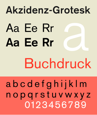
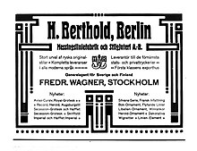
Akzidenz-Grotesk is a sans-serif typeface family originally released by the Berthold Type Foundry of Berlin. "Akzidenz" indicates its intended use as a typeface for commercial print runs such as publicity, tickets and forms, as opposed to fine printing, and "grotesque" was a standard name for sans-serif typefaces at the time.

News Gothic is a sans-serif typeface designed by Morris Fuller Benton, and was released in 1908 by his employer American Type Founders (ATF). The typeface is similar in proportion and structure to Franklin Gothic, also designed by Benton, but lighter.

Monotype Grotesque is a family of sans-serif typefaces released by the Monotype Corporation for its hot metal typesetting system. It belongs to the grotesque or industrial genre of early sans-serif designs. Like many early sans-serifs, it forms a sprawling family designed at different times.

Folio is a sans-serif typeface in the neo-grotesque style designed by Konrad Friedrich Bauer and Walter Baum in 1957 for the Bauer Type Foundry. Bauer licensed the design to Fonderie Typographique Française for sale in France under the name Caravelle.
Ludwig & Mayer was a German type foundry in Frankfurt am Main, Germany. Many important designers worked for the Ludwig and Mayer type foundry, including Heinrich Jost, Karlgeorg Hoefer, Helmut Matheis, and most notably Jakob Erbar, whose Erbar Book was one of the first geometric sans-serif typefaces, predating both Paul Renner's Futura and Rudolf Koch's Kabel by some five years. Starting in 1925, Ludwig & Mayer types were distributed in the United States by Continental Type Founders Association. When the foundry ceased operations in 1984, rights to the typefaces was transmitted to the Neufville Typefoundry.

D. Stempel AG was a German typographic foundry founded by David Stempel (1869–1927), in Frankfurt am Main, Germany. Many important font designers worked for the Stempel foundry, including Hans Bohn, Warren Chappell, F. H. Ehmcke, Friedrich Heinrichsen, Hanns Th. Hoyer, F. W. Kleukens, Erich Meyer, Hans Möhring, Hiero Rhode, Wilhelm Schwerdtner, Herbert Thannhaeuser, Martin Wilke, Rudolf Wolf, Victor Hammer, Hermann Zapf, and Gudrun Zapf von Hesse. With the introduction of Memphis in 1929, the foundry was the first to cast modern slab serif typefaces.

In typography, Erbar or Erbar-Grotesk is a sans-serif typeface in the geometric style, one of the first designs of this kind released as type. Designer Jakob Erbar's aim was to design a printing type which would be free of all individual characteristics, possess thoroughly legible letter forms, and be a purely typographic creation. His conclusion was that this could only work if the type form was developed from a fundamental element, the circle. Erbar-Grotesk was developed in stages; Erbar wrote that he had originally sketched out the design in 1914 but had been prevented from working on it due to the war. The original version of Erbar was released in 1926, following Erbar's "Phosphor" titling capitals of 1922 which are very similar in design.

J.G. Schelter & Giesecke was a German type foundry and manufacturer of printing presses started 1819 in Leipzig by punchcutter Johann Schelter and typefounder Christian Friedrich Giesecke (1793-1850). The foundry was nationalized in 1946 by the new German Democratic Republic, forming VEB Typoart, Dresden.

Haas Type Foundry was a Swiss manufacturer of foundry type. First the factory was located in Basel, in the 1920s they relocated to Münchenstein.
Schriftguss AG was a type foundry in Germany founded in 1892 under the name Brüder Butter by purchasing the type casting firm of Otto Ludwig Bechert that had been founded in 1889. It was later incorporated in 1922 as Schriftguss A.-G. vorm. [prev.] Brüder Butter. Their types were known for “vigour, liveliness and freshness.” Though some faces were done in house, the foundry mainly worked with outside “Schriftkünstler”, more than was typical at the time. A unique product of the foundry were modular systems of “Plakattype” to compose shapes and letterforms for display and jobbing applications, for instance Dekora, or Albert Auspurg’s 1931 Ne-Po (negative–positive), and finally Super-Plakattype in 1949. After the Nazi seizure of power in 1933 the last of the Butter brothers resigned from the corporation and it was changed to a limited partnership. In 1948 the company was expropriated by the post-war communist government and became public property, under the name VEB Schriftguss Dresden, eventually becoming merged into VEB Typoart – Drucktypen, Matrizen, Messinglinien in 1951. As a state run enterprise, the foundry lost its verve and panache and settled into producing serviceable type without distinction.
Genzsch & Heyse was a German type foundry established in Hamburg. In the 1920s and 1930s, G+H types were sold in the United States by Continental Type Founders Association.
Venus or Venus-Grotesk is a sans-serif typeface family released by the Bauer Type Foundry of Frankfurt am Main, Germany from 1907 onwards. Released in a large range of styles, including condensed and extended weights, it was very popular in the early-to-mid twentieth century. It was exported to other countries, notably the United States, where it was distributed by Bauer Alphabets Inc, the U.S. branch of the firm.
Günter Gerhard Lange was a German typographer, teacher and type designer.

Normal-Grotesk is a sans-serif typeface that was sold by the Haas Type Foundry of Basel and Münchenstein, Switzerland, and popular in Swiss graphic design towards the end of the metal type period in the mid-twentieth century.

Unica or Haas Unica is a neo-grotesque sans-serif typeface developed at Haas Type Foundry in the late 1970s and originally released in 1980. Initiated as a project that sought to combine the strengths of both Helvetica and Univers, it had the misfortune of being released for phototypesetting just as the technology was being made obsolete by desktop publishing, and subsequent corporate mergers and a copyright dispute kept a digital version off the market. In 2015, two digital revivals were released: one by the rights holders, and the other with the blessing of the team that originally developed it.
Martin Wilke (1903–1993) was a German type designer, mostly of script faces. He studied at the School of Arts and Crafts or School of Applied Arts in Berlin in 1921. After 1923, he was hired by studio of Wilhelm Deffke and later became an independent graphic designer.