
A descriptive statistic is a summary statistic that quantitatively describes or summarizes features from a collection of information, while descriptive statistics is the process of using and analysing those statistics. Descriptive statistics is distinguished from inferential statistics by its aim to summarize a sample, rather than use the data to learn about the population that the sample of data is thought to represent. This generally means that descriptive statistics, unlike inferential statistics, is not developed on the basis of probability theory, and are frequently nonparametric statistics. Even when a data analysis draws its main conclusions using inferential statistics, descriptive statistics are generally also presented. For example, in papers reporting on human subjects, typically a table is included giving the overall sample size, sample sizes in important subgroups, and demographic or clinical characteristics such as the average age, the proportion of subjects of each sex, the proportion of subjects with related co-morbidities, etc.

Microsoft Excel is a spreadsheet developed by Microsoft for Windows, macOS, Android and iOS. It features calculation or computation capabilities, graphing tools, pivot tables, and a macro programming language called Visual Basic for Applications (VBA). Excel forms part of the Microsoft Office suite of software.

A chart is a graphical representation for data visualization, in which "the data is represented by symbols, such as bars in a bar chart, lines in a line chart, or slices in a pie chart". A chart can represent tabular numeric data, functions or some kinds of quality structure and provides different info.
In statistics, exploratory data analysis is an approach of analyzing data sets to summarize their main characteristics, often using statistical graphics and other data visualization methods. A statistical model can be used or not, but primarily EDA is for seeing what the data can tell us beyond the formal modeling and thereby contrasts traditional hypothesis testing. Exploratory data analysis has been promoted by John Tukey since 1970 to encourage statisticians to explore the data, and possibly formulate hypotheses that could lead to new data collection and experiments. EDA is different from initial data analysis (IDA), which focuses more narrowly on checking assumptions required for model fitting and hypothesis testing, and handling missing values and making transformations of variables as needed. EDA encompasses IDA.

A screen reader is a form of assistive technology (AT) that renders text and image content as speech or braille output. Screen readers are essential to people who are blind, and are useful to people who are visually impaired, illiterate, or have a learning disability. Screen readers are software applications that attempt to convey what people with normal eyesight see on a display to their users via non-visual means, like text-to-speech, sound icons, or a braille device. They do this by applying a wide variety of techniques that include, for example, interacting with dedicated accessibility APIs, using various operating system features, and employing hooking techniques.
Visualization or visualisation is any technique for creating images, diagrams, or animations to communicate a message. Visualization through visual imagery has been an effective way to communicate both abstract and concrete ideas since the dawn of humanity. Examples from history include cave paintings, Egyptian hieroglyphs, Greek geometry, and Leonardo da Vinci's revolutionary methods of technical drawing for engineering and scientific purposes.

Infographics are graphic visual representations of information, data, or knowledge intended to present information quickly and clearly. They can improve cognition by utilizing graphics to enhance the human visual system's ability to see patterns and trends. Similar pursuits are information visualization, data visualization, statistical graphics, information design, or information architecture. Infographics have evolved in recent years to be for mass communication, and thus are designed with fewer assumptions about the readers' knowledge base than other types of visualizations. Isotypes are an early example of infographics conveying information quickly and easily to the masses.

A tag cloud is a visual representation of text data, which is often used to depict keyword metadata on websites, or to visualize free form text. Tags are usually single words, and the importance of each tag is shown with font size or color. When used as website navigation aids, the terms are hyperlinked to items associated with the tag.

Data and information visualization is an interdisciplinary field that deals with the graphic representation of data and information. It is a particularly efficient way of communicating when the data or information is numerous as for example a time series.
The following are common definitions related to the machine vision field.
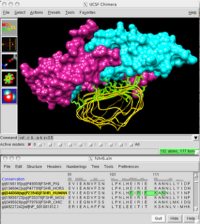
UCSF Chimera is an extensible program for interactive visualization and analysis of molecular structures and related data, including density maps, supramolecular assemblies, sequence alignments, docking results, trajectories, and conformational ensembles. High-quality images and movies can be created. Chimera includes complete documentation and can be downloaded free of charge for noncommercial use.
GeoDa is a free software package that conducts spatial data analysis, geovisualization, spatial autocorrelation and spatial modeling.
GGobi is a free statistical software tool for interactive data visualization. GGobi allows extensive exploration of the data with Interactive dynamic graphics. It is also a tool for looking at multivariate data. R can be used in sync with GGobi. The GGobi software can be embedded as a library in other programs and program packages using an application programming interface (API) or as an add-on to existing languages and scripting environments, e.g., with the R command line or from a Perl or Python scripts. GGobi prides itself on its ability to link multiple graphs together.
Statistical graphics, also known as statistical graphical techniques, are graphics used in the field of statistics for data visualization.
Visual analytics is an outgrowth of the fields of information visualization and scientific visualization that focuses on analytical reasoning facilitated by interactive visual interfaces.

A plot is a graphical technique for representing a data set, usually as a graph showing the relationship between two or more variables. The plot can be drawn by hand or by a computer. In the past, sometimes mechanical or electronic plotters were used. Graphs are a visual representation of the relationship between variables, which are very useful for humans who can then quickly derive an understanding which may not have come from lists of values. Given a scale or ruler, graphs can also be used to read off the value of an unknown variable plotted as a function of a known one, but this can also be done with data presented in tabular form. Graphs of functions are used in mathematics, sciences, engineering, technology, finance, and other areas.
Cultural analytics refers to the use of computational, visualization, and big data methods for the exploration of contemporary and historical cultures. While digital humanities research has focused on text data, cultural analytics has a particular focus on massive cultural data sets of visual material – both digitized visual artifacts and contemporary visual and interactive media. Taking on the challenge of how to best explore large collections of rich cultural content, cultural analytics researchers developed new methods and intuitive visual techniques that rely on high-resolution visualization and digital image processing. These methods are used to address both the existing research questions in humanities, to explore new questions, and to develop new theoretical concepts that fit the mega-scale of digital culture in the early 21st century.
Mondrian is a general-purpose statistical data-visualization system, for interactive data visualization.
The Trade Space Visualizer is a data visualization tool developed at the Applied Research Laboratory (ARL) at The Pennsylvania State University. Initial development started in 2002, and it is currently supported by a team at ARL/Penn State.
Interactive Visual Analysis (IVA) is a set of techniques for combining the computational power of computers with the perceptive and cognitive capabilities of humans, in order to extract knowledge from large and complex datasets. The techniques rely heavily on user interaction and the human visual system, and exist in the intersection between visual analytics and big data. It is a branch of data visualization. IVA is a suitable technique for analyzing high-dimensional data that has a large number of data points, where simple graphing and non-interactive techniques give an insufficient understanding of the information.