
Color or colour is the visual perception based on the electromagnetic spectrum. Though color is not an inherent property of matter, color perception is related to an object's light absorption, reflection, emission spectra and interference. For most humans, colors are perceived in the visible light spectrum with three types of cone cells (trichromacy). Other animals may have a different number of cone cell types or have eyes sensitive to different wavelength, such as bees that can distinguish ultraviolet, and thus have a different color sensitivity range. Animal perception of color originates from different light wavelength or spectral sensitivity in cone cell types, which is then processed by the brain.
Drawing is a visual art that uses an instrument to mark paper or another two-dimensional surface. The instrument might be pencils, crayons, pens with inks, brushes with paints, or combinations of these, and in more modern times, computer styluses with graphics tablets.
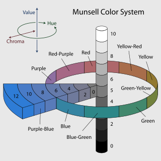
In colorimetry, the Munsell color system is a color space that specifies colors based on three properties of color: hue, chroma, and value (lightness). It was created by Albert H. Munsell in the first decade of the 20th century and adopted by the United States Department of Agriculture (USDA) as the official color system for soil research in the 1930s.

Stereoscopy is a technique for creating or enhancing the illusion of depth in an image by means of stereopsis for binocular vision. The word stereoscopy derives from Greek στερεός (stereos) 'firm, solid', and σκοπέω (skopeō) 'to look, to see'. Any stereoscopic image is called a stereogram. Originally, stereogram referred to a pair of stereo images which could be viewed using a stereoscope.

HSL and HSV are the two most common cylindrical-coordinate representations of points in an RGB color model. The two representations rearrange the geometry of RGB in an attempt to be more intuitive and perceptually relevant than the cartesian (cube) representation. Developed in the 1970s for computer graphics applications, HSL and HSV are used today in color pickers, in image editing software, and less commonly in image analysis and computer vision.

Depth perception is the ability to perceive distance to objects in the world using the visual system and visual perception. It is a major factor in perceiving the world in three dimensions. Depth perception happens primarily due to stereopsis and accommodation of the eye.
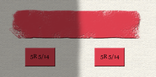
Colorfulness, chroma and saturation are attributes of perceived color relating to chromatic intensity. As defined formally by the International Commission on Illumination (CIE) they respectively describe three different aspects of chromatic intensity, but the terms are often used loosely and interchangeably in contexts where these aspects are not clearly distinguished. The precise meanings of the terms vary by what other functions they are dependent on.

Visual communication is the use of visual elements to convey ideas and information which include signs, typography, drawing, graphic design, illustration, industrial design, advertising, animation, and electronic resources. Visual communication has been proven to be unique when compared to other verbal or written languages because of its more abstract structure. It stands out for its uniqueness, as the interpretation of signs varies on the viewer's field of experience. The interpretation of imagery is often compared to the set alphabets and words used in oral or written languages. Another point of difference found by scholars is that, though written or verbal languages are taught, sight does not have to be learned and therefore people of sight may lack awareness of visual communication and its influence in their everyday life. Many of the visual elements listed above are forms of visual communication that humans have been using since prehistoric times. Within modern culture, there are several types of characteristics when it comes to visual elements, they consist of objects, models, graphs, diagrams, maps, and photographs. Outside the different types of characteristics and elements, there are seven components of visual communication: color, shape, tones, texture, figure-ground, balance, and hierarchy.
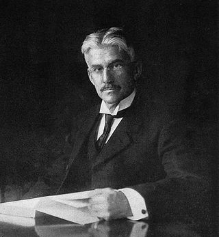
Albert Henry Munsell was an American painter, teacher of art, and the inventor of the Munsell color system.

The term composition means "putting together". It can be thought of as the organization of the elements of art according to the principles of art. Composition can apply to any work of art, from music through writing and into photography, that is arranged using conscious thought.
A color model is an abstract mathematical model describing the way colors can be represented as tuples of numbers, typically as three or four values or color components. When this model is associated with a precise description of how the components are to be interpreted, taking account of visual perception, the resulting set of colors is called "color space."
Visual design elements and principles describe fundamental ideas about the practice of visual design.
A color solid is the three-dimensional representation of a color space or model and can be thought as an analog of, for example, the one-dimensional color wheel, which depicts the variable of hue ; or the two-dimensional chromaticity diagram, which depicts the variables of hue and colorfulness. The added spatial dimension allows a color solid to depict the three dimensions of color: lightness, hue, and colorfulness, allowing the solid to depict all conceivable colors in an organized three-dimensional structure.
The following outline is provided as an overview of and topical guide to the visual arts:

Visual hierarchy, according to Gestalt psychology, is a pattern in the visual field wherein some elements tend to "stand out," or attract attention, more strongly than other elements, suggesting a hierarchy of importance. While it may occur naturally in any visual field, the term is most commonly used in design, where elements are intentionally designed to make some look more important than others. This order is created by the visual contrast between forms in a field of perception. Objects with highest contrast to their surroundings are recognized first by the human mind.
The watercolor illusion, also referred to as the water-color effect, is an optical illusion in which a white area takes on a pale tint of a thin, bright, intensely colored polygon surrounding it if the coloured polygon is itself surrounded by a thin, darker border. The inner and outer borders of watercolor illusion objects often are of complementary colours. The watercolor illusion is best when the inner and outer contours have chromaticities in opposite directions in color space. The most common complementary pair is orange and purple. The watercolor illusion is dependent on the combination of luminance and color contrast of the contour lines in order to have the color spreading effect occur.
A map symbol or cartographic symbol is a graphical device used to visually represent a real-world feature on a map, working in the same fashion as other forms of symbols. Map symbols may include point markers, lines, regions, continuous fields, or text; these can be designed visually in their shape, size, color, pattern, and other graphic variables to represent a variety of information about each phenomenon being represented.
A color appearance model (CAM) is a mathematical model that seeks to describe the perceptual aspects of human color vision, i.e. viewing conditions under which the appearance of a color does not tally with the corresponding physical measurement of the stimulus source.

HCL (Hue-Chroma-Luminance) or LCh refers to any of the many cylindrical color space models that are designed to accord with human perception of color with the three parameters. Lch has been adopted by information visualization practitioners to present data without the bias implicit in using varying saturation. They are, in general, designed to have characteristics of both cylindrical translations of the RGB color space, such as HSL and HSV, and the L*a*b* color space. Some conflicting definitions of the terms are:
