Erik Spiekermann

Last updated
Erik Spiekermann
20201015-Erik Spiekermann-m-NP.jpg
Erik Spiekermann in 2020
Born (1947-05-30) May 30, 1947 (age 76)
NationalityGerman
Occupation(s)typographer, designer and writer

Erik Spiekermann (born 30 May 1947) is a German typographer, designer and writer. He is an honorary professor at the University of the Arts Bremen and ArtCenter College of Design.

Contents

Biography

Spiekermann studied art history at Berlin's Free University, funding himself by running a letterpress printing press in the basement of his house. [1]

Between 1972 and 1979, he worked as a freelance graphic designer in London before returning to Berlin and founding MetaDesign with two partners.

In 1989, he and his then-wife Joan Spiekermann started FontShop, the first mail-order distributor for digital fonts. FontShop International followed and now publishes the FontFont range of typefaces. MetaDesign combined clean, teutonic-looking information design and complex corporate design systems for clients like BVG (Berlin Transit), Düsseldorf Airport, Audi, Volkswagen and Heidelberg Printing, amongst others.

In 2001, Spiekermann left MetaDesign over policy disagreements and started United Designers Network, with offices in Berlin, London, and San Francisco.

In April 2006, the Art Center College of Design in Pasadena awarded Spiekermann an Honorary Doctorship for his contribution to design. [2] His family of typefaces for Deutsche Bahn (German Railways), designed with Christian Schwartz, received a Gold Medal at the German Federal Design Prize in 2006, the highest such award in Germany. [2] In May 2007, he was the first designer to be elected into the European Design Awards Hall of Fame. [3]

In January 2007, UDN was renamed SpiekermannPartners. In January 2009, SpiekermannPartners merged with Dutch design agency Eden Design & Communication and continued its operations under the name Edenspiekermann . [4] Edenspiekermann currently run offices in Amsterdam, Berlin, San Francisco and Los Angeles. He now runs an experimental letterpress workshop in Berlin, Hacking Gutenberg (www.hackinggutenberg.berlin)

Spiekermann is considered a very influential personality in the field of typeface design and information design. [5] He often attends international meetings, and has been giving a substantial contribution in several fields, such as app development and public wayfinding. [6] [7] [8]

Notable works

Specimens of typefaces by Erik Spiekermann SpiekermannFaces.png
Specimens of typefaces by Erik Spiekermann

Spiekermann has designed many commercial typefaces as well as typefaces as part of corporate design programmes. [9] [10]

Spiekermann co-authored Stop Stealing Sheep & Find Out How Type Works. He also participated in the creation of numerous corporate identities and other works, including redesigns of the publications The Economist and Reason . [14]

Spiekermann also appeared in the documentary Helvetica .

Awards

See also

Related Research Articles

<span class="mw-page-title-main">Helvetica</span> Neo-grotesque sans-serif typeface

Helvetica, also known by its original name Neue Haas Grotesk, is a widely used sans-serif typeface developed in 1957 by Swiss typeface designer Max Miedinger and Eduard Hoffmann.

<span class="mw-page-title-main">Univers</span> Sans-serif typeface family

Univers is a large sans-serif typeface family designed by Adrian Frutiger and released by his employer Deberny & Peignot in 1957. Classified as a neo-grotesque sans-serif, one based on the model of nineteenth-century German typefaces such as Akzidenz-Grotesk, it was notable for its availability from the moment of its launch in a comprehensive range of weights and widths. The original marketing for Univers deliberately referenced the periodic table to emphasise its scope.
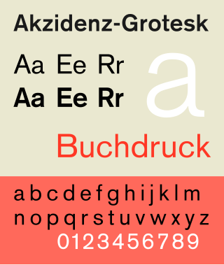
<span class="mw-page-title-main">Akzidenz-Grotesk</span> Sans-serif typeface family by the Berthold Type Foundry of Berlin

Akzidenz-Grotesk is a sans-serif typeface family originally released by the Berthold Type Foundry of Berlin. "Akzidenz" indicates its intended use as a typeface for commercial print runs such as publicity, tickets and forms, as opposed to fine printing, and "grotesque" was a standard name for sans-serif typefaces at the time.

<span class="mw-page-title-main">Rotis</span> Typeface

Rotis is a typeface developed in 1988 by Otl Aicher, a German graphic designer and typographer. In Rotis, Aicher explores an attempt at maximum legibility through a highly unified yet varied typeface family that ranges from full serif, glyphic, and sans-serif. The four basic Rotis variants are:

<span class="mw-page-title-main">DIN 1451</span> Sans-serif font, used on German traffic signs

DIN 1451 is a sans-serif typeface that is widely used for traffic, administrative and technical applications.
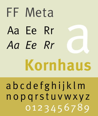
<span class="mw-page-title-main">FF Meta</span> Sans-serif typeface

FF Meta is a humanist sans-serif typeface family designed by Erik Spiekermann and released in 1991 through his FontFont library.

<span class="mw-page-title-main">FF Scala</span> Typeface

FF Scala is an old-style serif typeface designed by Dutch typeface designer Martin Majoor in 1991 for the Muziekcentrum Vredenburg in Utrecht, the Netherlands. The FF Scala font family was named for the Teatro alla Scala (1776–78) in Milan, Italy. Like many contemporary Dutch serif faces, FF Scala is not an academic revival of a single historic typeface but shows influences of several historic models. Similarities can be seen with William Addison Dwiggins' 1935 design for the typeface Electra in its clarity of form, and rhythmic, highly calligraphic italics. Eric Gill's 1931 typeface Joanna, with its old style armature but nearly square serifs, is also similar in its nearly mono-weighted stroke width.

<span class="mw-page-title-main">FF Scala Sans</span> Typeface

FF Scala Sans is a humanist sans-serif typeface designed by Dutch designer Martin Majoor in 1993 for the Vredenburg Music Center in Utrecht, the Netherlands. It was designed as a companion to Majoor's earlier serif old style typeface FF Scala, designed in 1990.

<span class="mw-page-title-main">Luc(as) de Groot</span>

Lucas de Groot, known professionally as Luc(as) de Groot, is a Dutch type designer. He is the head of the type foundry Fontfabrik, also trading as LucasFonts.
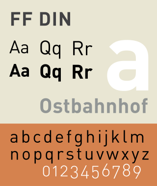
<span class="mw-page-title-main">FF DIN</span> Typeface

FF DIN is a sans-serif typeface in the industrial or "grotesque" style. It was designed in 1995 by Albert-Jan Pool, based on DIN-Mittelschrift and DIN-Engschrift, as defined in the German standard DIN 1451. DIN is an acronym for Deutsches Institut für Normung. It was published by FontShop in its FontFont library of typefaces.

<span class="mw-page-title-main">Christian Schwartz</span> American type designer (born 1977)

Christian Schwartz is an American type designer. He has been awarded the German Design Award and the Prix Charles Peignot.
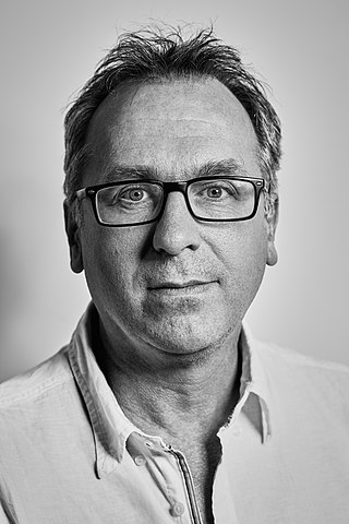
<span class="mw-page-title-main">Martin Majoor</span> Dutch type designer and graphic designer (born 1960)

Martin Majoor is a Dutch type designer and graphic designer. As of 2006, he had worked since 1997 in both Arnhem, Netherlands, and Warsaw, Poland.

FontShop International was an international manufacturer of digital typefaces (fonts), based in Berlin. It was one of the largest digital type foundries.
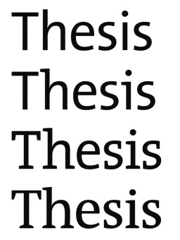
<span class="mw-page-title-main">Font superfamily</span> Group of typefaces

In typography, a font superfamily or typeface superfamily is a font family containing fonts that fall into multiple classifications.

<span class="mw-page-title-main">Klim Type Foundry</span> New Zealand type foundry

The Klim Type Foundry is a digital type foundry operated by Kris Sowersby, a New Zealand typeface designer. Klim was founded in 2005 and is currently based in Wellington. Klim produces retail typefaces, custom typefaces and custom lettering and logotypes. Sowersby has garnered many international awards for his typefaces.

<span class="mw-page-title-main">Dalton Maag</span> Type foundry

Dalton Maag is an independent font foundry with offices in London, UK, and São Paulo, Brazil. It designs fonts for use in corporate identities, logos, and other text uses. Dalton Maag has a library of 30 retail fonts as of 2016 and offers custom font creation and modification services to its clients.
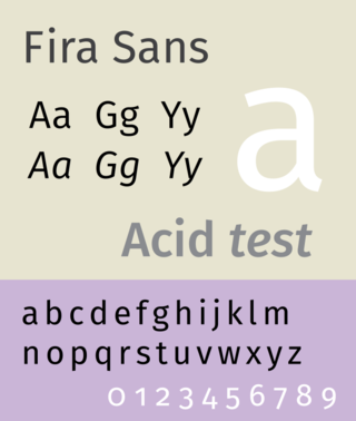
<span class="mw-page-title-main">Fira (typeface)</span> Typeface

Fira Sans is a humanist sans-serif typeface designed by Erik Spiekermann, Ralph du Carrois, Anja Meiners, Botio Nikoltchev of Carrois Type Design and Patryk Adamczyk of Mozilla Corporation. Originally commissioned by Telefónica and Mozilla Corporation as part of the joint effort during the development of Firefox OS. It is a slightly wider and calmer adaptation of Spiekermann's typeface Meta, which was used at Mozilla's brand typeface at the time but optimized for legibility on (small) screens. With the name Fira, Mozilla wanted to communicate the concepts of fire, light and joy but in a language agnostic way to signal the project's global nature. Fira was released in 2013 initially under the Apache License and later reissued under the SIL Open Font License.

Just van Rossum is a Dutch typeface designer, software developer, and professor at the Royal Academy of Art in the Hague. He is the co-founder of design firm, LettError, along with Erik van Blokland. Just van Rossum is the younger brother of Guido van Rossum, creator of the Python programming language.

References

  1. "ATypI". Archived from the original on 2010-02-26. Retrieved 2009-08-18.
  2. 1 2 "Erik Spiekermann". EDAwards. 2007. Archived from the original on 2012-06-26. Retrieved 2007-08-02.
  3. "Identifont - Erik Spiekermann". www.identifont.com.
  4. Official press release Archived 2008-12-21 at the Wayback Machine
  5. "Erik Spiekermann". European Design Awards. 2006. Archived from the original on 2016-03-12. Retrieved 2017-04-20.
  6. UrbanAge (15 January 2013). "Urban Age Electric City: Erik Spiekermann - Mapping and designing urban systems". Archived from the original on 2021-12-21 via YouTube.
  7. "City of Amsterdam – Edenspiekermann". www.edenspiekermann.com.
  8. "Info Connectivity System – Edenspiekermann". www.edenspiekermann.com.
  9. "Erik Spiekermann « MyFonts". www.myfonts.com.
  10. "FontShop". FontShop.
  11. "Nokia sans character - Spiekerblog". spiekermann.com.
  12. "Fira Sans". Typografie.info. 20 July 2013.
  13. "Case". Fontwerk.com.
  14. Fost, Dan (November 14, 2001). "Wired founder helps Reason". San Francisco Chronicle . Retrieved 2007-08-02.
  15. "ICOGRADA | Prof. Erik Spiekermann receives Lifetime Achievement Award at the Design Award of the Federal Republic of Germany 2011". Archived from the original on 2011-02-22. Retrieved 2011-02-22.

Further reading