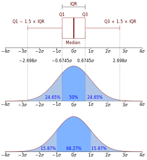
In descriptive statistics, the interquartile range (IQR) is a measure of statistical dispersion, which is the spread of the data. The IQR may also be called the midspread, middle 50%, or H‑spread. It is defined as the difference between the 75th and 25th percentiles of the data. To calculate the IQR, the data set is divided into quartiles, or four rank-ordered even parts via linear interpolation. These quartiles are denoted by Q1 (also called the lower quartile), Q2 (the median), and Q3 (also called the upper quartile). The lower quartile corresponds with the 25th percentile and the upper quartile corresponds with the 75th percentile, so IQR = Q3 − Q1.
In statistics, a quartile is a type of quantile which divides the number of data points into four parts, or quarters, of more-or-less equal size. The data must be ordered from smallest to largest to compute quartiles; as such, quartiles are a form of order statistic. The three main quartiles are as follows:

In geometry, the convex hull or convex envelope or convex closure of a shape is the smallest convex set that contains it. The convex hull may be defined either as the intersection of all convex sets containing a given subset of a Euclidean space, or equivalently as the set of all convex combinations of points in the subset. For a bounded subset of the plane, the convex hull may be visualized as the shape enclosed by a rubber band stretched around the subset.

In statistics, an outlier is a data point that differs significantly from other observations. An outlier may be due to variability in the measurement or it may indicate experimental error; the latter are sometimes excluded from the data set. An outlier can cause serious problems in statistical analyses.
In descriptive statistics, a box plot or boxplot is a method for graphically demonstrating the locality, spread and skewness groups of numerical data through their quartiles. In addition to the box on a box plot, there can be lines extending from the box indicating variability outside the upper and lower quartiles, thus, the plot is also termed as the box-and-whisker plot and the box-and-whisker diagram. Outliers that differ significantly from the rest of the dataset may be plotted as individual points beyond the whiskers on the box-plot. Box plots are non-parametric: they display variation in samples of a statistical population without making any assumptions of the underlying statistical distribution. The spacings in each subsection of the box-plot indicate the degree of dispersion (spread) and skewness of the data, which are usually described using the five-number summary. In addition, the box-plot allows one to visually estimate various L-estimators, notably the interquartile range, midhinge, range, mid-range, and trimean. Box plots can be drawn either horizontally or vertically.
The five-number summary is a set of descriptive statistics that provides information about a dataset. It consists of the five most important sample percentiles:
- the sample minimum (smallest observation)
- the lower quartile or first quartile
- the median
- the upper quartile or third quartile
- the sample maximum

Sea surface temperature (SST), or ocean surface temperature, is the water temperature close to the ocean's surface. The exact meaning of surface varies according to the measurement method used, but it is between 1 millimetre (0.04 in) and 20 metres (70 ft) below the sea surface. Air masses in the Earth's atmosphere are highly modified by sea surface temperatures within a short distance of the shore. Localized areas of heavy snow can form in bands downwind of warm water bodies within an otherwise cold air mass. Warm sea surface temperatures are known to be a cause of tropical cyclogenesis over the Earth's oceans. Tropical cyclones can also cause a cool wake, due to turbulent mixing of the upper 30 metres (100 ft) of the ocean. SST changes diurnally, like the air above it, but to a lesser degree. There is less SST variation on breezy days than on calm days. In addition, ocean currents such as the Atlantic Multidecadal Oscillation (AMO), can affect SST's on multi-decadal time scales, a major impact results from the global thermohaline circulation, which affects average SST significantly throughout most of the world's oceans.
Functional data analysis (FDA) is a branch of statistics that analyzes data providing information about curves, surfaces or anything else varying over a continuum. In its most general form, under an FDA framework, each sample element of functional data is considered to be a random function. The physical continuum over which these functions are defined is often time, but may also be spatial location, wavelength, probability, etc. Intrinsically, functional data are infinite dimensional. The high intrinsic dimensionality of these data brings challenges for theory as well as computation, where these challenges vary with how the functional data were sampled. However, the high or infinite dimensional structure of the data is a rich source of information and there are many interesting challenges for research and data analysis.
In robust statistics, robust regression is a form of regression analysis designed to overcome some limitations of traditional parametric and non-parametric methods. Regression analysis seeks to find the relationship between one or more independent variables and a dependent variable. Certain widely used methods of regression, such as ordinary least squares, have favourable properties if their underlying assumptions are true, but can give misleading results if those assumptions are not true; thus ordinary least squares is said to be not robust to violations of its assumptions. Robust regression methods are designed to be not overly affected by violations of assumptions by the underlying data-generating process.
Robust statistics is statistics with good performance for data drawn from a wide range of probability distributions, especially for distributions that are not normal. Robust statistical methods have been developed for many common problems, such as estimating location, scale, and regression parameters. One motivation is to produce statistical methods that are not unduly affected by outliers. Another motivation is to provide methods with good performance when there are small departures from a parametric distribution. For example, robust methods work well for mixtures of two normal distributions with different standard-deviations; under this model, non-robust methods like a t-test work poorly.
In statistics, Cook's distance or Cook's D is a commonly used estimate of the influence of a data point when performing a least-squares regression analysis. In a practical ordinary least squares analysis, Cook's distance can be used in several ways: to indicate influential data points that are particularly worth checking for validity; or to indicate regions of the design space where it would be good to be able to obtain more data points. It is named after the American statistician R. Dennis Cook, who introduced the concept in 1977.

Quantile regression is a type of regression analysis used in statistics and econometrics. Whereas the method of least squares estimates the conditional mean of the response variable across values of the predictor variables, quantile regression estimates the conditional median of the response variable. Quantile regression is an extension of linear regression used when the conditions of linear regression are not met.
In statistics, an L-estimator is an estimator which is a linear combination of order statistics of the measurements. This can be as little as a single point, as in the median, or as many as all points, as in the mean.

A plot is a graphical technique for representing a data set, usually as a graph showing the relationship between two or more variables. The plot can be drawn by hand or by a computer. In the past, sometimes mechanical or electronic plotters were used. Graphs are a visual representation of the relationship between variables, which are very useful for humans who can then quickly derive an understanding which may not have come from lists of values. Given a scale or ruler, graphs can also be used to read off the value of an unknown variable plotted as a function of a known one, but this can also be done with data presented in tabular form. Graphs of functions are used in mathematics, sciences, engineering, technology, finance, and other areas.
In statistics, robust measures of scale are methods that quantify the statistical dispersion in a sample of numerical data while resisting outliers. The most common such robust statistics are the interquartile range (IQR) and the median absolute deviation (MAD). These are contrasted with conventional or non-robust measures of scale, such as sample variance or standard deviation, which are greatly influenced by outliers.

Peter J. Rousseeuw is a statistician known for his work on robust statistics and cluster analysis. He obtained his PhD in 1981 at the Vrije Universiteit Brussel, following research carried out at the ETH in Zurich in the group of Frank Hampel, which led to a book on influence functions. Later he was professor at the Delft University of Technology, The Netherlands, at the University of Fribourg, Switzerland, and at the University of Antwerp, Belgium. Currently he is professor at KU Leuven, Belgium. He is a fellow of the Institute of Mathematical Statistics (1993) and the American Statistical Association (1994). His former PhD students include A. Leroy, H. Lopuhäa, G. Molenberghs, C. Croux, M. Hubert, S. Van Aelst and T. Verdonck.
In statistical graphics and scientific visualization, the contour boxplot is an exploratory tool that has been proposed for visualizing ensembles of feature-sets determined by a threshold on some scalar function. Analogous to the classical boxplot and considered an expansion of the concepts defining functional boxplot, the descriptive statistics of a contour boxplot are: the envelope of the 50% central region, the median curve and the maximum non-outlying envelope.

A bagplot, or starburst plot, is a method in robust statistics for visualizing two- or three-dimensional statistical data, analogous to the one-dimensional box plot. Introduced in 1999 by Rousseuw et al., the bagplot allows one to visualize the location, spread, skewness, and outliers of a data set.
In statistics, the medcouple is a robust statistic that measures the skewness of a univariate distribution. It is defined as a scaled median difference of the left and right half of a distribution. Its robustness makes it suitable for identifying outliers in adjusted boxplots. Ordinary box plots do not fare well with skew distributions, since they label the longer unsymmetrical tails as outliers. Using the medcouple, the whiskers of a boxplot can be adjusted for skew distributions and thus have a more accurate identification of outliers for non-symmetrical distributions.
Robust Regression and Outlier Detection is a book on robust statistics, particularly focusing on the breakdown point of methods for robust regression. It was written by Peter Rousseeuw and Annick M. Leroy, and published in 1987 by Wiley.
 Data of monthly sea surface temperatures (SST) measured in degrees Celsius over the east-central tropical Pacific Ocean from 1951 to 2007.
 The functional boxplot of SST with blue curves denoting envelopes, and a black curve representing the median curve. The red dashed curves are the outlier candidates detected by the 1.5 times the 50% central region rule.
 The enhanced functional boxplot of SST with dark magenta denoting the 25% central region, magenta representing the 50% central region and pink indicating the 75% central region.
 The pointwise boxplots of SST with medians connected by a black line.
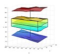 The surface boxplot with the box in the middle representing the 50% central region in R3, the middle surface inside the box denoting the median surface, and the upper and lower surfaces indicating the maximum non-outlying envelope.


