Haettenschweiler

Last updated
Haettenschweiler
Haettenschweiler sample coloured.tiff
Category Sans-serif
Classification Grotesque
Designer(s) Walter Haettenschweiler
Robert Norton (?)
Foundry Microsoft
Date created1954

Haettenschweiler is a sans-serif typeface in the grotesque style that is very bold and condensed. It is intended for headlines and display text.

Contents

Schmalfette Grotesk

Versions of the font that are now commonly used are descend from an upper-case only design called Schmalfette Grotesk (German for bold condensed sans-serif) by Walter Haettenschweiler that was published in 1954.

Schmalfette was published in the book Lettera (1954) which Haettenschweiler had written with Armin Haab. [1] The Lettera series collected lettering designs (mostly hand-painted) and original designs, and was often used by designers as a source of inspiration. [2] [3] [4]

An early reuse of the design was in the German young peoples' magazine Twen . [5] Microsoft's history of the font, possibly written by Robert Norton (see below) notes that after Lettera 4 was published the design 'was immediately picked up by designers at Paris Match who cut up pictures of it to make headlines' until it was publicly released. Similar methods were also used by British designers, as it was not available in Britain. [6] [7]

Adaptations and digitisation

According to Microsoft's release notes, the Haettenschweiler font in common modern use descends from a later phototypesetting adaptation by the company Photoscript, who created a lower-case for it; its owner Robert Norton would later become Microsoft's font consultant and may also have written Microsoft's unsigned article on its history. [8] [9] [10] [11] [12] The font Haettenschweiler now bundled with much Microsoft software is a digitisation credited to Eraman Ltd. and Monotype Imaging. [9] [13] Haettenschweiler himself did not receive royalties for the design, and commented: "I never received a single cent, but at least they named it after me." [14]

Aesthetic

Haettenschweiler's highly compact, tightly spaced and industrial design is a prominent example of the aggressive, menacing style of graphic design that despite its poor legibility was popular in the 1960s and 70s, and was often used for purposes besides newspapers, such as book covers. [15]

This type of design has been criticised for having low legibility in smaller point sizes, in situations with low contrast between background and text colours, or at a distance, with (for example) 8 and 9 seeming very similar. Counters are minimal and normally fully enclosed, a common feature of 'Grotesk' typefaces, while apertures are very narrow. This folded-up effect gives it a striking appearance at the cost of legibility. The problems are particularly large in a lower-case (which, as previously noted, Haettenschweiler himself declined to design), where the fine detail of the characters mean that strokes run closer together than in the capitals. [16]

Several fonts were created in the same style in the early-to-mid 1960s, including Helvetica Inserat and British imitators Compacta and Impact. Haettenschweiler has narrower characters than Impact. Geoffrey Lee, who designed Impact in 1963, wrote that "many of us admired the vitality and colour of what we knew only as Schmalfette, and used it by old-fashioned cut and paste. Use was limited as it was never made in metal as far as I know, and existed then in capitals and numerals only." [17] Lee wrote that a motivation for designing Impact was to allow a similar design to be used by British designers, since at the time continental metal type was expensive and complex for British companies to license and use. He also commented that he felt that the lower-case characters added were not so useful: "Later someone added (or found) a lowercase for its new existence. I personally find the style lacks the attractive feel of the caps." Matthew Carter would later design Helvetica Compressed for similar reasons. [18]

A number of alternative digitisations of Schmalfette exist. A custom digitisation is used for the American television show Charlie Rose for branding. [19] Another is "Schmalfette CP", by CounterPoint Type Studio.

Usage

A 2010 Princeton University study involving presenting students with text in a font slightly harder to read found that they consistently retained more information from material displayed in fonts perceived as ugly or disfluent (Monotype Corsiva, Haettenschweiler, and Comic Sans Italic) than in a simpler, more traditional font like Helvetica. [20]

It is used in the Nottingham Forest logo, with a modified R and a lowercase E at upper-case height.

The font is also seen in the Cartoon Network show The Powerpuff Girls , as the text was used for the end credits and promos for the show.

Bibliography

Related Research Articles

<span class="mw-page-title-main">Palatino</span> Serif typeface

Palatino is the name of an old-style serif typeface designed by Hermann Zapf, initially released in 1949 by the Stempel foundry and later by other companies, most notably the Mergenthaler Linotype Company.

<span class="mw-page-title-main">Sans-serif</span> Typeface classification for letterforms without serifs

In typography and lettering, a sans-serif, sans serif, gothic, or simply sans letterform is one that does not have extending features called "serifs" at the end of strokes. Sans-serif typefaces tend to have less stroke width variation than serif typefaces. They are often used to convey simplicity and modernity or minimalism. For the purposes of type classification, sans-serif designs are usually divided into these major groups: § Grotesque and § Neo-grotesque, § Geometric, § Humanist and § Other or mixed.

<span class="mw-page-title-main">Helvetica</span> Neo-grotesque sans-serif typeface

Helvetica, also known by its original name Neue Haas Grotesk, is a widely used sans-serif typeface developed in 1957 by Swiss typeface designer Max Miedinger and Eduard Hoffmann.

<span class="mw-page-title-main">Matthew Carter</span> British type designer (born 1937)

Matthew Carter is a British type designer. A 2005 New Yorker profile described him as 'the most widely read man in the world' by considering the amount of text set in his commonly used fonts.

<span class="mw-page-title-main">Univers</span> Sans-serif typeface family

Univers is a large sans-serif typeface family designed by Adrian Frutiger and released by his employer Deberny & Peignot in 1957. Classified as a neo-grotesque sans-serif, one based on the model of nineteenth-century German typefaces such as Akzidenz-Grotesk, it was notable for its availability from the moment of its launch in a comprehensive range of weights and widths. The original marketing for Univers deliberately referenced the periodic table to emphasise its scope.

<span class="mw-page-title-main">Gill Sans</span> Humanist sans-serif typeface family developed by Monotype

Gill Sans is a humanist sans-serif typeface designed by Eric Gill and released by the British branch of Monotype from 1928 onwards.

<span class="mw-page-title-main">Johnston (typeface)</span> Sans-serif typeface

Johnston is a sans-serif typeface designed by and named after Edward Johnston. The typeface was commissioned in 1913 by Frank Pick, commercial manager of the Underground Electric Railways Company of London, as part of his plan to strengthen the company's corporate identity. Johnston was originally created for printing, but it rapidly became used for the enamel station signs of the Underground system as well.

<span class="mw-page-title-main">Georgia (typeface)</span> 1996 typeface by Matthew Carter

Georgia is a serif typeface designed in 1993 by Matthew Carter and hinted by Tom Rickner for Microsoft. It was intended as a serif typeface that would appear elegant but legible when printed small or on low-resolution screens. The typeface is inspired by Scotch Roman designs of the 19th century and was based on designs for a print typeface on which Carter was working when contacted by Microsoft; this would be released under the name Miller the following year. The typeface's name referred to a tabloid headline, "Alien heads found in Georgia."

Oblique type is a form of type that slants slightly to the right, used for the same purposes as italic type. Unlike italic type, however, it does not use different glyph shapes; it uses the same glyphs as roman type, except slanted. Oblique and italic type are technical terms to distinguish between the two ways of creating slanted font styles; oblique designs may be labelled italic by companies selling fonts or by computer programs. Oblique designs may also be called slanted or sloped roman styles. Oblique fonts, as supplied by a font designer, may be simply slanted, but this is often not the case: many have slight corrections made to them to give curves more consistent widths, so they retain the proportions of counters and the thick-and-thin quality of strokes from the regular design.

<span class="mw-page-title-main">Font</span> Particular size, weight and style of a typeface

In metal typesetting, a font is a particular size, weight and style of a typeface. Each font is a matched set of type, with a piece for each glyph. A typeface consists of various fonts that share an overall design.

<span class="mw-page-title-main">Impact (typeface)</span> Sans-serif typeface

Impact is a sans-serif typeface in the industrial or grotesk style designed by Geoffrey Lee in 1965 and released by the Stephenson Blake foundry of Sheffield. It is well known for having been included in the core fonts for the Web package and distributed with Microsoft Windows since Windows 98. In the 2010s, it gained popularity for its use in image macros and other internet memes.

<span class="mw-page-title-main">Akzidenz-Grotesk</span> Sans-serif typeface family by the Berthold Type Foundry of Berlin

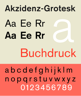
Akzidenz-Grotesk is a sans-serif typeface family originally released by the Berthold Type Foundry of Berlin. "Akzidenz" indicates its intended use as a typeface for commercial print runs such as publicity, tickets and forms, as opposed to fine printing, and "grotesque" was a standard name for sans-serif typefaces at the time.

<span class="mw-page-title-main">Monotype Grotesque</span> Grotesque sans-serif typeface

Monotype Grotesque is a family of sans-serif typefaces released by the Monotype Corporation for its hot metal typesetting system. It belongs to the grotesque or industrial genre of early sans-serif designs. Like many early sans-serifs, it forms a sprawling family designed at different times.

<span class="mw-page-title-main">Compacta (typeface)</span> Sans-serif typeface

Compacta is a condensed sans-serif typeface designed by Fred Lambert for Letraset in 1963. It is visually similar to the typefaces Impact and Haettenschweiler, though Compacta has a distinctively square shape in comparison. Letraset was a dry transfer system, widely used by amateur or small-scale lettering projects, although many professional designers used it as well. Compacta was Letraset's first original typeface design, and proved widely popular. Rights to it were acquired by Linotype and others, leading to it becoming available in other formats such as digitally.

<span class="mw-page-title-main">Erbar</span> Sans-serif typeface

In typography, Erbar or Erbar-Grotesk is a sans-serif typeface in the geometric style, one of the first designs of this kind released as type. Designer Jakob Erbar's aim was to design a printing type which would be free of all individual characteristics, possess thoroughly legible letter forms, and be a purely typographic creation. His conclusion was that this could only work if the type form was developed from a fundamental element, the circle. Erbar-Grotesk was developed in stages; Erbar wrote that he had originally sketched out the design in 1914 but had been prevented from working on it due to the war. The original version of Erbar was released in 1926, following Erbar's "Phosphor" titling capitals of 1922 which are very similar in design.

<span class="mw-page-title-main">Display typeface</span> Font that is used at large sizes for headings

A display typeface is a typeface that is intended for use in display type at large sizes for titles, headings, pull quotes, and other eye-catching elements, rather than for extended passages of body text.

<span class="mw-page-title-main">Permanent Headline</span> Display sans serif typeface

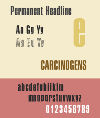
Permanent Headline is a bold, highly compressed sans-serif typeface in the neo-grotesque style. It was designed by Karlgeorg Hoefer for the type foundry Ludwig & Mayer in Frankfurt am Main. It was released from 1964 and later issued by a range of companies in phototypesetting and digital versions.

<span class="mw-page-title-main">Normal-Grotesk</span> Sans-serif typeface

Normal-Grotesk is a sans-serif typeface that was sold by the Haas Type Foundry of Basel and Münchenstein, Switzerland, and popular in Swiss graphic design towards the end of the metal type period in the mid-twentieth century.

<span class="mw-page-title-main">Semplicità</span> Typeface

Semplicità is a sans-serif typeface of the geometric style. It was published by the Nebiolo type foundry of Turin, Italy from around 1928.

References

  1. "Entwerfer und Gestalter". Webpaper.nzz.ch. Retrieved 4 October 2016.
  2. . ISBN   0803842821.{{cite book}}: Missing or empty |title= (help)
  3. . ISBN   9780803842823.{{cite book}}: Missing or empty |title= (help)
  4. "Grafiker "Haetti" ist gestorben". Zugcultur.ch. Retrieved 4 October 2016.
  5. "Walter Haettenschweiler. Obituary". Form.de. Retrieved 4 October 2016.
  6. Dempsey, Mike. "Schmalfette: Tall, dark and handsome". Graphic Journey. Retrieved 22 August 2015.
  7. Dempsey, Mike. "Blast from the past". Design Journey. Retrieved 23 August 2015.
  8. Neil Macmillan (2006). An A-Z of Type Designers. Yale University Press. p. 141. ISBN   0-300-11151-7.
  9. 1 2 "Haettenschweiler font information". Microsoft. Retrieved 22 August 2015.
  10. Dempsey, Mike. "Walter Haettenschweiler 1933 – 2014". Graphic Journey. Retrieved 23 August 2015.
  11. Barker, Nicolas. "Robert Norton - obituary". The Independent. Archived from the original on 23 June 2001. Retrieved 11 May 2016.{{cite web}}: CS1 maint: unfit URL (link)
  12. Berry, John (20 April 2001). "The Mischievous Mind behind Microsoft's TrueType Fonts". Creative Pro. Retrieved 11 May 2016.
  13. "Die Microsoft-Schrift aus Zug". Zug Cultur. Retrieved 4 October 2016.
  14. "Schmalfette". Fonts in Use. Retrieved 4 October 2016.
  15. "Permanent Headline - Fonts in Use". Fonts in Use. Retrieved 17 June 2016.
  16. Covert, Adrian (3 June 2014). "Why Apple's New Font Won't Work On Your Desktop". FastCoDesign. Retrieved 28 November 2014.
  17. Lee, Geoffrey. "Comments on Typophile thread". Typophile (archived). Archived from the original on August 26, 2005. Retrieved 27 October 2014.
  18. Drucker, Margaret Re ; essays by Johanna; Mosley, James (2003). Typographically speaking : the art of Matthew Carter (2. ed.). New York: Princeton Architectural. p. 53. ISBN   9781568984278.{{cite book}}: CS1 maint: multiple names: authors list (link)
  19. Coles, Stephen (13 April 2016). "Charlie Rose: One of the strongest talk shows on television finally has a typographic identity that carries as much weight". Fonts in Use. Retrieved 4 October 2016.
  20. Diemand-Yauman, C.; Oppenheimer, D. M.; Vaughan, E. B. (2011). "Fortune favors the bold (and the italicized): Effects of disfluency on educational outcomes". Cognition. 118 (1): 111–5. doi:10.1016/j.cognition.2010.09.012. PMID   21040910. S2CID   1003005.