Horizontal and vertical writing in East Asian scripts

Last updated

An excerpt from The Cold Food Observance (Han Shi Tie 
) by Song dynasty scholar Su Shi (1037-1101). The calligraphy is read in columns from top to bottom, from right to left. Su shi-calligraphy.jpg
An excerpt from The Cold Food Observance (寒食帖) by Song dynasty scholar Su Shi (1037–1101). The calligraphy is read in columns from top to bottom, from right to left.
Inside the Forbidden City.jpg
Imperial throne inside the Forbidden City in Beijing. The plaque at the top 正大光明 is written from right to left, while the plaques on the sides use vertical writing.
Kasutera0038.jpg
The word kasutera (カステラ) written from right to left on the right-hand side of a festival stall in Hakone, Japan.
Peking-Cheng-YangMunStation1.jpg
Two examples of right-to-left characters on a Chinese postcard from 1901, 津天 and 京北
dongailbo cangganho.jpg
First issue of The Dong-a Ilbo on 1 April 1920. The title 報日亞東 and 號刊創 were written from right to left.

Left-to-right vertical writing

There are only two types of vertical scripts known to have been written from left to right: the Old Uyghur script and its descendants — Traditional Mongolian, Oirat Clear, Manchu, and Buryat — and the 'Phags-pa script. The former developed because the Uyghurs rotated their Sogdian-derived script, originally written right to left, 90 degrees counter-clockwise to emulate Chinese writing, but without changing the relative orientation of the letters. 'Phags-pa in turn was an adaptation of Tibetan script written vertically on the model of Mongolian to supplant those writing systems current in the Mongol Empire. Of these, only traditional Mongolian still remains in use today in Inner Mongolia. [1] [2] :36

History

Chinese

Bamboo book - unfolded - UCR.jpg
An unfolded bamboo book featuring Chinese text written vertically along the strips of bamboo.
VM 5485 China Post Office car at Zhengzhou Train Station.jpg
Text on the sides of China Post vehicles runs from the front of the car to the rear, i.e. from left to right on the vehicle's left side, and from right to left on its right side. English text on the right side is also in reverse order. This arrangement is common on tour buses in China as well.

The first[ citation needed ] printed Chinese text in horizontal alignment was Robert Morrison's Dictionary of the Chinese language, published in 1815–1823 in Macau.

The earliest widely known Chinese publication using horizontal alignment was the magazine Science (科學). Its first issue in January 1915 explained the (then) unusual format:

本雜誌印法,旁行上左,並用西文句讀點之,以便插寫算術及物理化學諸程式,非故好新奇,讀者諒之。 This magazine is printed so that it goes sideways from the top left, and is marked with Western punctuation. This is to make the insertion of mathematical, physical and chemical formulae convenient, not for the sake of novelty-hunting. We ask our readers to excuse us.

In the subsequent decades, the occurrence of words in a Western script became more frequent, and readers began to appreciate the unwieldiness of rotating the paper at each occurrence for vertically set texts. This accelerated acceptance of horizontal writing.

With the proliferation of horizontal text, both horizontal and vertical came to be used concurrently. Proponents of horizontal text argued that vertical text in right-to-left columns was smudged easily when written, and moreover demanded greater movement from the eyes when read. Vertical text proponents considered horizontal text to be a break from established tradition.

After their victory in the Chinese Civil War, the People's Republic of China decided to use horizontal writing. All newspapers in China changed from vertical to horizontal alignment on January 1, 1956. In publications, text is run horizontally although book titles on spines and some newspaper headlines remain vertical for convenience. Inscriptions of signs on most state organs are still vertical.

In Singapore, vertical writing has also become rare. In Taiwan, Hong Kong, Macau, and among older overseas Chinese communities, horizontal writing has been gradually adopted since the 1990s. By the early 2000s, most newspapers in these areas had switched to left-to-right horizontal writing, either entirely or in a combination of vertical text with horizontal left-to-right headings.

Japanese

Meiji-era offices of Nintendo, with its sign written right-to-left Nintendo 1889.jpg
Meiji-era offices of Nintendo, with its sign written right-to-left

Horizontal text came into Japanese in the Meiji era, when the Japanese began to print Western language dictionaries. Initially they printed the dictionaries in a mixture of horizontal Western and vertical Japanese text, which meant readers had to rotate the book ninety degrees to read the Western text. Because this was unwieldy, the idea of yokogaki came to be accepted. One of the first publications to partially use yokogaki was a German to Japanese dictionary (袖珍挿図独和辞書Shūchinsōzu Dokuwa Jisho 'pocket illustrated German to Japanese dictionary') published in 1885 (Meiji 18).

At the beginning of the change to horizontal alignment in Meiji era Japan, there was a short-lived form called migi yokogaki (右横書き, literally "right horizontal writing"), in contrast to hidari yokogaki, (左横書き 'left horizontal writing'), the current standard. This resembled the right-to-left horizontal writing style of languages such as Arabic with line breaks on the left. It was probably based on the traditional single-row right-to-left writing. This form was widely used for pre-WWII advertisements and official documents (like banknotes), but has not survived outside of old-fashioned signboards.

Vertical writing (tategaki縦書き) is still commonly used in Japan in novels, newspapers and magazines, including most Japanese comics and graphic novels (also known as manga), while horizontal writing is used more often in other media, especially those containing English language references. In general, dialogue in manga is written vertically. However, in scenes where a character speaks a foreign language, the dialogue may be written horizontally. In this case, there is a mixture of vertical and horizontal writing on a single page.

Korean

Hunmin Jeongeum Eonhae uses right-to-left vertical writing. It uses hanja and small hangul for ruby lettering placed to the bottom-right. Hunmin jeong-eum.jpg
Hunmin Jeongeum Eonhae uses right-to-left vertical writing. It uses hanja and small hangul for ruby lettering placed to the bottom-right.

Traditionally, Korean writing has been vertical, with columns running right to left.

In 1988, The Hankyoreh became the first Korean newspaper to use horizontal writing, and after 1990, all other major newspapers followed suit. Today, major Korean newspapers hardly ever run text vertically.

Vietnamese

SecondPageOfTamthientugiaidichquocngu.png
Vietnamese is shown here written right to left, top to bottom. Characters shown in Tam thiên tự are Chinese characters glossed with their equivalent chữ Nôm characters alongside the Vietnamese alphabet.
Clear image of Lenh thu.jpg
Characters on a Vietnamese edict written vertically.

Traditionally, Vietnamese writing was vertical, with columns running right to left as the language used a mixture of Chinese characters and independently developed characters derived from Chinese ones to write the native language in a script called chữ Nôm.

After the 1920s, when the Vietnamese alphabet, influenced by the Portuguese alphabet, started to be used nationwide to replace chữ Nôm, vertical writing style fell into disuse.

In art

Calligraphy

In East Asian calligraphy, vertical writing remains the dominant direction.

Graphic novels and comics

Japanese manga tend to use vertical direction for text. Manga frames tend to flow in right-to-left horizontal direction. Frames in yonkoma manga tend to flow in a vertical direction. Page ordering is the same as books that use vertical direction: from right to left. Frames that are chronologically before or after each other use less spacing in between as a visual cue.

Most text in manga is written vertically, which dictates the vertical shapes of the speech bubbles. Some, however, such as Levius , are aimed at the international market and strive to optimize for translation and localization, therefore make use of horizontal text and speech bubbles.

In some cases, horizontal writing in text bubbles may be used to indicate that a translation convention is in use – for example, Kenshi Hirokane uses Japanese text arranged horizontally to imply that a character is actually speaking in a foreign language, like English.

Some publishers that translate manga into European languages may choose to keep the original page order (a notable example is Shonen Jump magazine), while other publishers may reverse the page flow with use of mirrored pages. When manga was first released in Anglophone countries, it was usually in the reversed format (also known as "flipped" or "flopped"), but the non-reversed format eventually came to predominate. [3] [4] [5]

Modern usage

Japanese and Traditional Chinese

Both horizontal and vertical writing are used in Japan, Hong Kong, Macau and [Taiwan. Traditional characters are also used in mainland China in a few limited contexts, such as some books on ancient literature, or as an aesthetic choice for some signs on shops, temples, etc. In those contexts, both horizontal and vertical writing are used as well.

Example of a newspaper article written vertically in Traditional Chinese with a horizontal headline from left to right. The Latin letters and Arabic numerals are rotated when written with the vertical text. Hebei Wen'an jin fasheng dizhen - Beijing you zhengan.png
Example of a newspaper article written vertically in Traditional Chinese with a horizontal headline from left to right. The Latin letters and Arabic numerals are rotated when written with the vertical text.

Vertical writing is commonly used for novels, newspapers, manga, and many other forms of writing. Because it goes downwards, vertical writing is invariably used on the spines of books. Some newspapers combine the two forms, using the vertical format for most articles but including some written horizontally, especially for headlines. Musical notation for some Japanese instruments such as the shakuhachi is written vertically.

Horizontal writing is easier for some purposes; academic texts are sometimes written this way since they often include words and phrases in other languages, which are more easily incorporated horizontally. Scientific and mathematical texts are nearly always written horizontally, since in vertical writing equations must be turned sideways, making them more difficult to read.

Similarly, English language textbooks, which contain many English words, are usually printed in horizontal writing. This is not a fixed rule, however, and it is also common to see English words printed sideways in vertical writing texts.

Japanese business cards ( meishi ) are often printed vertically in Japanese on one side, and horizontally in English on the other. Postcards and handwritten letters may be arranged horizontally or vertically, but the more formal the letter the more likely it is to be written vertically. Envelope addresses are usually vertical, with the recipient's address on the right and the recipient's name in the exact centre of the envelope. See also Japanese etiquette.

Simplified Chinese

The slogans on Tiananmen ("Long live the People's Republic of China" and "Long live the unity of the people of the world") are written in simplified characters from left to right. Commuting to Work.jpg
The slogans on Tiananmen ("Long live the People's Republic of China" and "Long live the unity of the people of the world") are written in simplified characters from left to right.
Highway markings are read from bottom to top. The right lane reads Man Che Dao 
'slow lane' while the middle lane reads Kuai Che Dao 
'fast lane' Bottom to top Chinese character reading order, Guangdong S27 Expressway.JPG
Highway markings are read from bottom to top. The right lane reads 慢车道 'slow lane' while the middle lane reads 快车道 'fast lane'

In mainland China, vertical writing using simplified characters is now comparatively rare, more so in print than in writing and signage. Most publications are now printed in horizontal alignment, like English. Horizontal writing is written left to right in the vast majority of cases, with a few exceptions such as bilingual dictionaries of Chinese and right-to-left scripts like Arabic, in which case Chinese may follow the right-to-left alignment. Right-to-left writing direction can also often be seen on the right side of tourist buses, as it is customary to have the text run (on both sides of the vehicle) from the front of the bus to its rear.

Vertical alignment is generally used for artistic or aesthetic purposes like in logos and on book covers, in scholarly works on Literary Chinese works, or when space constraints demand it, like on the spines of books and when labelling diagrams. Naturally, vertical text is also used on signs that are longer than they are wide; such signs are the norm at the entrances of schools, government offices and police stations. Calligraphy – in simplified or traditional characters – is invariably written vertically. Additionally, vertical text may still be encountered on some business cards and personal letters in China.

Since 2012, street markings are written vertically, but unusually from bottom to top. This is so that the characters are read from nearest to furthest from the drivers' perspective. [6]

Korean

Signage in the Dongdaemun History and Culture Park SMRT station in Seoul. The Korean texts were written vertically. The sign dongdaemunyeogsamunhwagongweon
requires two columns which run from right to left. SMRT-Dongdaemun-Station-Hangul-Vertical.jpg
Signage in the Dongdaemun History and Culture Park SMRT station in Seoul. The Korean texts were written vertically. The sign 동대문역사문화공원 requires two columns which run from right to left.

In modern Korea, vertical writing is uncommon. Modern Korean is usually written horizontally from left to right. Vertical writing is used when the writing space is long vertically and narrow horizontally. For example, titles on the spines of books are usually written vertically. When a foreign language film is subtitled into Korean, the subtitles are sometimes written vertically at the right side of the screen.

In the standard language (표준어; 標準語) of South Korea, punctuation marks are used differently in horizontal and vertical writing. Western punctuation marks are used in horizontal writing and the Japanese punctuation marks are used in vertical writing. However, vertical writing using Western punctuation marks is sometimes found.

In computing

Early computer installations were designed only to support left-to-right horizontal writing based on the Latin alphabet. Today, most computer programs do not fully support the vertical writing system; however, most advanced word processing and publication software that target the East Asian region support the vertical writing system either fully or to a limited extent.

Even though vertical text display is generally not well supported, composing vertical text for print has been made possible. For example, in Asian editions of Windows, Asian fonts are also available in a vertical version, with font names prefixed by "@". [7] Users can compose and edit the document as normal horizontal text. When complete, changing the text font to a vertical font converts the document to vertical orientation for printing purposes. Additionally, OpenType also has valt, vert, vhal, vkna, vkrn, vpal, vrt2, vrtr "feature tags" to define glyphs that can be transformed or adjusted within vertical text; they can be enabled or disabled in CSS3 using font-feature-settings property. [8]

Internet

Since the late 1990s, W3C (World Wide Web Consortium) has been drafting Cascading Style Sheets properties to enable display on the Web of the various languages of the world according to their heritage text directions. Their latest efforts in 2011 show some revisions to the previous format for the Writing Mode property which provides for vertical layout and text display. The format "writing-mode:tb-rl" has been revised as "writing-mode: vertical-rl" in CSS, but the former syntax was preserved as a part of SVG 1.1 specification.

Among Web browsers, Internet Explorer is the first one that has been supporting vertical text and layout coded in HTML. Starting with IE 5.5 in 2000, Microsoft has enabled the writing mode property as a "Microsoft extension to Cascading Style Sheets (CSS)". Google Chrome (since 8.0), Safari (since 5.1), Opera (since 15.0) has supported the -webkit-writing-mode property. [9] Mozilla Firefox got support for unprefixed writing-mode property in version 38.0, later enabled by default in version 41.0. [9] [10] [11]

See also

  • Bi-directional text  – Text that contains both LTR and RTL text
  • East Asian typography  – Typesetting of Chinese characters (used in China, Japan and (traditionally) Vietnam. Also by the Chinese diaspora around the world)
  • Genkō yōshi  – Japanese manuscript paper
  • Stroke order  – Order in which the strokes of a Chinese character are traditionally written
  • Writing system  – Convention of symbols representing language

Related Research Articles

A bidirectional text contains two text directionalities, right-to-left (RTL) and left-to-right (LTR). It generally involves text containing different types of alphabets, but may also refer to boustrophedon, which is changing text direction in each row.

Furigana is a Japanese reading aid consisting of smaller kana printed either above or next to kanji or other characters to indicate their pronunciation. It is one type of ruby text. Furigana is also known as yomigana (読み仮名) and rubi in Japanese. In modern Japanese, it is usually used to gloss rare kanji, to clarify rare, nonstandard or ambiguous kanji readings, or in children's or learners' materials. Before the post-World War II script reforms, it was more widespread.

Katakana is a Japanese syllabary, one component of the Japanese writing system along with hiragana, kanji and in some cases the Latin script.

Punctuation marks are marks indicating how a piece of written text should be read and, consequently, understood. The oldest known examples of punctuation marks were found in the Mesha Stele from the 9th century BC, consisting of points between the words and horizontal strokes between sections. The alphabet-based writing began with no spaces, no capitalization, no vowels, and with only a few punctuation marks, as it was mostly aimed at recording business transactions. Only with the Greek playwrights did the ends of sentences begin to be marked to help actors know when to make a pause during performances. Punctuation includes space between words and the other, historically or currently used, signs.

Sutton SignWriting, or simply SignWriting, is a system of writing sign languages. It is highly featural and visually iconic, both in the shapes of the characters, which are abstract pictures of the hands, face, and body, and in their spatial arrangement on the page, which does not follow a sequential order like the letters that make up written English words. It was developed in 1974 by Valerie Sutton, a dancer who had, two years earlier, developed DanceWriting. Some newer standardized forms are known as the International Sign Writing Alphabet (ISWA).

Ruby characters or rubi characters are small, annotative glosses that are usually placed above or to the right of logographic characters of languages in the East Asian cultural sphere, such as Chinese hanzi, Japanese kanji, and Korean hanja, to show the logographs' pronunciation; these were formerly also used for Vietnamese chữ Hán and chữ Nôm, and may still occasionally be seen in that context when reading archaic texts. Typically called just ruby or rubi, such annotations are most commonly used as pronunciation guides for characters that are likely to be unfamiliar to the reader.

<span class="mw-page-title-main">Soyombo script</span> Abugida-type writing system

The Soyombo script is an abugida developed by the monk and scholar Zanabazar in 1686 to write Mongolian. It can also be used to write Tibetan and Sanskrit.

<span class="mw-page-title-main">Stroke order</span> Order in which the strokes of a Chinese character are traditionally written

Stroke order is the order in which the strokes of a Chinese character are written. A stroke is a movement of a writing instrument on a writing surface.

<span class="mw-page-title-main">Iteration mark</span> Character or punctuation mark used to represent a duplicated character or word

Iteration marks are characters or punctuation marks that represent a duplicated character or word.

<span class="mw-page-title-main">Japanese writing system</span> Structure of the Japanese writing system

The modern Japanese writing system uses a combination of logographic kanji, which are adopted Chinese characters, and syllabic kana. Kana itself consists of a pair of syllabaries: hiragana, used primarily for native or naturalised Japanese words and grammatical elements; and katakana, used primarily for foreign words and names, loanwords, onomatopoeia, scientific names, and sometimes for emphasis. Almost all written Japanese sentences contain a mixture of kanji and kana. Because of this mixture of scripts, in addition to a large inventory of kanji characters, the Japanese writing system is considered to be one of the most complicated currently in use.

Quotation marks are punctuation marks used in pairs in various writing systems to identify direct speech, a quotation, or a phrase. The pair consists of an opening quotation mark and a closing quotation mark, which may or may not be the same glyph. Quotation marks have a variety of forms in different languages and in different media.

The Klingon scripts are fictional alphabetic scripts used in the Star Trek movies and television shows to write the Klingon language.

<i>Genkō yōshi</i> Japanese manuscript paper

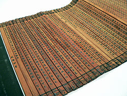
Genkō yōshi is a type of Japanese paper used for writing. It is printed with squares, typically 200 or 400 per sheet, each square designed to accommodate a single Japanese character or punctuation mark. Genkō yōshi may be used with any type of writing instrument, and with or without a shitajiki.

Japanese punctuation includes various written marks, which differ from those found in European languages, as well as some not used in formal Japanese writing but frequently found in more casual writing, such as exclamation and question marks.

Writing systems that use Chinese characters also include various punctuation marks, derived from both Chinese and Western sources. Historically, judou annotations were often used to indicate the boundaries of sentences and clauses in text. The use of punctuation in written Chinese only became mandatory during the 20th century, due to Western influence. Unlike modern punctuation, judou marks were added by scholars for pedagogical purposes and were not viewed as integral to the text. Texts were therefore generally transmitted without judou. In most cases, this practice did not interfere with the interpretation of a text, although it occasionally resulted in ambiguity.

<span class="mw-page-title-main">Siddhaṃ script</span> Brahmic script used to write Sanskrit

Siddhaṃ, also known in its later evolved form as Siddhamātṛkā, is a medieval Brahmic abugida, derived from the Gupta script and ancestral to the Nāgarī, Eastern Nagari, Tirhuta, Odia and Nepalese scripts.

Transformations of text are strategies to perform geometric transformations on text, particularly in systems that do not natively support transformation, such as HTML, seven-segment displays and plain text.

<span class="mw-page-title-main">Writing system</span> Convention of symbols representing language

A writing system comprises a particular set of symbols, called a script, as well as the rules by which the script represents a particular language. Writing systems can generally be classified according to how symbols function according to these rules, with the most common types being alphabets, syllabaries, and logographies. Alphabets use symbols called letters that correspond to spoken phonemes. Abjads generally only have letters for consonants, while pure alphabets have letters for both consonants and vowels. Abugidas use characters that correspond to consonant–vowel pairs. Syllabaries use symbols called syllabograms to represent syllables or moras. Logographies use characters that represent semantic units, such as words or morphemes.

The emphasis mark or emphasis dot is a typographic marking used in some East Asian languages to indicate emphasis. The markings takes in many forms like, a dot or a bullet, a circle, or a triangle. It was used more traditionally, but nowadays, with technology, quotations or changing of font style prevails.

East Asian typography is the application of typography to the writing systems used for the Chinese, Japanese, Korean, and Vietnamese languages. Scripts represented in East Asian typography include Chinese characters, kana, and hangul.

References

  1. György Kara, "Aramaic Scripts for Altaic Languages", in Daniels & Bright The World's Writing Systems, 1994.
  2. Janhunen, Juha (27 January 2006). The Mongolic Languages. Routledge. ISBN   978-1-135-79690-7.
  3. Casey Baseel (2 May 2013). "Manga critic calls for Japanese comics to read from left to right". Japan Today.
  4. "Flipped and Flopped: Manga Fandom In The Mid-1990s". Akihabara Renditions. 27 August 2019.
  5. Deb Aoki (14 September 2018). "Manga Answerman - How Come Some Manga Are Still Published "Flopped"?". Anime News Network.
  6. Gu Yue (古月) (11 August 2012). 警方:竖排从下往上是新国标. Hainan Daily (in Chinese).
  7. Kaplan, Michael S. (4 August 2005). "Let's get vertical". MSDN Blogs. Retrieved 23 August 2008.
  8. "font-feature-settings - CSS". Mozilla Developer Network. Retrieved 30 October 2015.
  9. 1 2 "writing-mode - CSS". Mozilla Developer Network . Retrieved 7 February 2016.
  10. "Firefox 38 for developers". Mozilla Developer Network . Retrieved 7 February 2016.
  11. "Firefox 41 for developers". Mozilla Developer Network . Retrieved 7 February 2016.

Further reading

  • Nihongo Daihakubutsukan (日本語大博物館), author: Jun'ichirō Kida (紀田順一郎), publisher: Just System (ジャストシステム, Jasuto Shisutemu) ISBN   4-88309-046-9 (in Japanese), chapter 9, deals with the change from tategaki to yokogaki in modern Japanese.
  • Ishikawa, Kyuyoh. Taction: The Drama of the Stylus in Oriental Calligraphy. Translated by Waku Miller. Tokyo: International House of Japan, 2011.
  • Obana, Yasuko. "Vertical or Horizontal? Reading Directions in Japanese", Bulletin of the School of Oriental and African Studies, University of London 60, no. 1 (1997): 86-94 (available in the JSTOR online journal archive).
  • Nishiyama, Yutaka. 2010. The Mathematics of Direction in Writing. International Journal of Pure and Applied Mathematics, Vol.61, No.3, 347-356.
Horizontal writing
Chinese name
Traditional Chinese 橫排
Simplified Chinese 横排
Hanja 橫書