Multiple master fonts

Last updated
Optical sizing in Adobe Jenson JensonOpticalSizes.png
Optical sizing in Adobe Jenson

Multiple master fonts (or MM fonts) are an extension to Adobe Systems' Type 1 PostScript fonts, now superseded by the advent of OpenType and, in particular, the introduction of OpenType Font Variations in OpenType 1.8, also called variable fonts. [1] [2]

Contents

Multiple master fonts contain two or more "masters"—that is, original font styles—and enable a user to interpolate between these masters along a continuous range of "axes." With proper application support, these axes could be adjusted on demand.

The intention was that using multiple master fonts, a designer can generate a style of the exact width, thickness and optical size wanted, without losing the integrity or readability of the character glyphs. The effect is similar to morphing, as a designer can choose an intermediate between two styles, for example generating a semibold font by compromising between a bold and regular style, or perhaps extend a trend to create an ultra-light or ultra-bold. This idea was not new, having been used by companies such as URW++, but Adobe hoped to develop the technology to a greater extent.

Adobe's goal in multiple master font technology was to allow end-users of fonts to create the exact font they needed for a situation, by adjusting parameters such as boldness or width. [3] [4] [5] However, multiple master fonts proved unpopular in consumer-facing use due to the difficulty of writing (or rewriting) consumer desktop publishing applications to support them, and because font designers have generally preferred to release fonts in specific weights and styles, as font files that have been individually fine-tuned. However, the multiple master concept remains heavily used at font design studios, allowing designers to generate a range of weights and styles quickly and then optimise them individually. [6] [7] 'Multiple master' may therefore often be seen as a generic term describing interpolated font design generally, not necessarily using Adobe technology. [8] [9]

In 2016, Adobe, Google, Apple and Microsoft announced a new update to the OpenType specification, allowing variable fonts. Similar to the multiple master concept, this will allow custom styles to be generated from a single font file programatically. [10] [2]

Aspects of multiple master fonts

Nine weights of a serif font, created at the company URW++ using interpolation. Interpolation von Schriften.jpg
Nine weights of a serif font, created at the company URW++ using interpolation.

Where available, most MM fonts support one or two (and occasionally three) of the following variables:

For example, the Myriad multiple master font had two axes: "weight" and "width." This font therefore included four separate "master designs" of each character: light compressed, light extended, bold compressed, and bold extended. Any weight or width font in between these endpoints could be produced by interpolating between the character outlines of these master designs. [11] [12] The addition of italics requires another four master designs.

Another example is Adobe Jenson, which supports "weight" and "optical size" axes. This font uses three masters to represent the optical-size axis, designed for 6, 12, and 72 point type, respectively. This allows the common size of 12 points to be optimized, but requires 6 master designs for roman, and another 6 for italic.

Application support

A set of optical sizes developed at URW++. The letters become higher in x-height and more widely spaced as the point size for which they are intended decreases. Unterschiedliche Schriftformen pro Schriftgrosse.jpg
A set of optical sizes developed at URW++. The letters become higher in x-height and more widely spaced as the point size for which they are intended decreases.

Current application support for these fonts is sparse, if not entirely absent. However, font design tools such as FontLab and FontForge can edit MM fonts, and can export into other font formats as needed. Adobe Type Manager (ATM) is required for MM support on Windows and the "Classic" Mac OS (9 and below).

Describing why the technology failed, a retrospective by Tamye Riggs, written for Adobe, noted: "Users were forced to generate instances for each variation of a font they wanted to try, resulting in a hard drive littered with font files bearing such arcane names as MinioMM_578 BD 465 CN 11 OP." Prominent Adobe font designer Carol Twombly cited the frustrations of the failed project as one of several reasons behind her decision to leave font design around 1999, and Adobe's Christopher Slye would later relate that he had been concerned that Adobe's principal type designer Robert Slimbach had damaged his health struggling to apply multiple master technology to Adobe Jenson in the late 1990s. [4] [13]

Free software

Free-software support for multiple master fonts is offered by the program mminstance, which generates standard PostScript fonts from multiple master fonts. These can then be used in any application that is compatible with standard PostScript type 1 fonts.

The FreeType font rendering engine also provides rendering support for multiple master (and GX) fonts.

Legacy of multiple master fonts

Six different styles of Skia. This typeface was prepared using an Apple variant of multiple master technology. Skia variants.png
Six different styles of Skia. This typeface was prepared using an Apple variant of multiple master technology.
Overlaid weights from an unpublished FontFont typeface showing the creation of a family from the basic form.The weights were created using the computer program Superpolator, developed by Erik van Blokland. Font interpolation.png
Overlaid weights from an unpublished FontFont typeface showing the creation of a family from the basic form.The weights were created using the computer program Superpolator, developed by Erik van Blokland.

The multiple master font format has mostly been superseded by OpenType, which provides more support for different languages and glyphs, but does not offer the unique continuous controls for character shape. Typically the OpenType versions of old multiple master fonts include a selection of the most commonly used combinations of axis positions.

Multiple master fonts still serve two purposes:

  1. As the fallback font format of Adobe Acrobat, multiple master fonts are used as a substitute in place of original fonts in the case of missing fonts. Two such substitution fonts are buried amongst the data resources for Acrobat: Adobe Serif MM and Adobe Sans MM. CourierStd is another fallback font family in Acrobat. Other PDF editors such as Foxit PhantomPDF also use multiple master fonts for this purpose.
  2. As a design tool for creating families of fonts; a font designer can create a multiple master font from a base font design and then offer customers a wide number of font variations by building them from the multiple axes of an MM font. E.g. by creating a light version and a heavy version of their font design someone could create a multiple master font with a weight axis and then offer clients any custom weight they wanted. Adobe and others continue to use multiple master technology in font design.

Since in modern multiple master design the norm is to release to the user a curated collection of weights, a key question is which sizes to interpolate to. In the Thesis typeface, developed by Lucas de Groot, de Groot's choice of weights to release was developed using an "interpolation theory". The optical interpolation b, in the three stems a (thinnest), b (interpolation) and c (thickest), is set to the geometric mean of a and c, i.e. b² = ac (as opposed to the linear arithmetic mean). [14] [15]

List of multiple master fonts

Commercial

All known commercial MM fonts were released by Adobe, unless otherwise specified. While these faces are discontinued, all have since been converted to OpenType standard or "Pro" formats.

  • ITC Avant Garde MM
  • Bickham Script MM
  • Briem Akademi MM
  • Briem Script MM
  • Caflisch Script MM
  • Chaparral MM
  • Conga Brava MM
  • Cronos MM
  • Ex Ponto MM
  • Foxit Serif MM (by Foxit Software)
  • ITC Garamond MM
  • Graphite MM
  • Adobe Jenson MM
  • Jimbo MM
  • Kepler MM
  • Kinesis MM
  • Mezz MM
  • Minion MM
  • ITC Motter Corpus MM
  • Myriad MM
  • Nueva MM
  • Ocean Sans MM
  • Penumbra MM
  • Reliq MM
  • Sanvito MM
  • Adobe Serif MM
  • Adobe Sans MM
  • Tekton MM
  • Verve MM
  • Viva MM
  • Waters Titling MM

Free

Further reading

See also

Related Research Articles

Typeface Set of characters that share common design features

A typeface is the design of lettering that can include variations in size, weight, slope, width, and so on. Each of these variations of the typeface is a font.

Helvetica 1957 sans-serif typeface developed by Max Miedinger

Helvetica or Neue Haas Grotesk is a widely used sans-serif typeface developed in 1957 by Swiss typeface designer Max Miedinger with input from Eduard Hoffmann.

Garamond Typeface family

Garamond is a group of many serif typefaces, named for sixteenth-century Parisian engraver Claude Garamond, generally spelled as Garamont in his lifetime. Garamond-style typefaces are popular and particularly often used for book printing and body text.

Frutiger (typeface)

Frutiger is a series of typefaces named after its Swiss designer, Adrian Frutiger. Frutiger is a humanist sans-serif typeface, intended to be clear and highly legible at a distance or at small text sizes. A very popular design worldwide, type designer Steve Matteson described its structure as "the best choice for legibility in pretty much any situation" at small text sizes, while Erik Spiekermann named it as "the best general typeface ever".

Arial Neo-grotesque sans-serif typeface

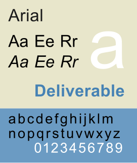
Arial, sometimes marketed or displayed in software as Arial MT, is a sans-serif typeface and set of computer fonts in the neo-grotesque style. Fonts from the Arial family are packaged with all versions of Microsoft Windows from Windows 3.1 onwards, some other Microsoft software applications, Apple's macOS and many PostScript 3 computer printers. The typeface was designed in 1982, by Robin Nicholas and Patricia Saunders, for Monotype Typography. It was created to be metrically identical to the popular typeface Helvetica, with all character widths identical, so that a document designed in Helvetica could be displayed and printed correctly without having to pay for a Helvetica license.

Computer Modern Family of typefaces

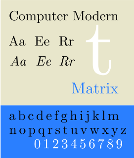
Computer Modern is the original family of typefaces used by the typesetting program TeX. It was created by Donald Knuth with his Metafont program, and was most recently updated in 1992. Computer Modern, or variants of it, remains very widely used in scientific publishing, especially in disciplines that make frequent use of mathematical notation.

Myriad (typeface) Sans-serif typeface family

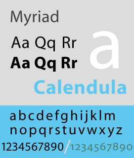
Myriad is a humanist sans-serif typeface designed by Robert Slimbach and Carol Twombly for Adobe Systems. Myriad was intended as a neutral, general-purpose typeface that could fulfill a range of uses and have a form easily expandable by computer-aided design to a large range of weights and widths.

Robert Joseph Slimbach is Principal Type Designer at Adobe, Inc., where he has worked since 1987. He has won many awards for his digital typeface designs, including the rarely awarded Prix Charles Peignot from the Association Typographique Internationale, the SoTA Typography Award, and repeated TDC2 awards from the Type Directors Club. His typefaces are among those most commonly used in books.

Font Particular size, weight and style of a typeface

In metal typesetting, a font was a particular size, weight and style of a typeface. Each font was a matched set of type, with a piece for each glyph, and a typeface consisting of a range of fonts that shared an overall design.

Thesis (typeface) Font superfamily

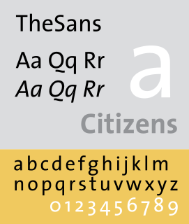
Thesis is a large typeface family designed by Luc(as) de Groot. The typefaces were designed between 1994 and 1999 to provide a modern humanist family. Each typeface is available in a variety of weights as well as in italic. Originally released by FontFont, it is now sold by de Groot through his imprint LucasFonts.

Adobe Jenson

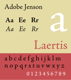
Adobe Jenson is an old-style serif typeface drawn for Adobe Systems by its chief type designer Robert Slimbach. Its Roman styles are based on a text face cut by Nicolas Jenson in Venice around 1470, and its italics are based on those created by Ludovico Vicentino degli Arrighi fifty years later.

Apple's Macintosh computer supports a wide variety of fonts. This support was one of the features that initially distinguished it from other systems.

Syntax (typeface)

Syntax comprises a family of fonts designed by Swiss typeface designer Hans Eduard Meier. Originally just a sans-serif font, it was extended with additional serif designs.

Minion is a serif typeface released in 1990 by Adobe Systems. Designed by Robert Slimbach, it is inspired by late Renaissance-era type and intended for body text and extended reading. Minion's name comes from the traditional naming system for type sizes, in which minion is between nonpareil and brevier, with the type body 7pt in height. As the historically rooted name indicates, Minion was designed for body text in a classic style, although slightly condensed and with large apertures to increase legibility. Slimbach described the design as having "a simplified structure and moderate proportions." The design is slightly condensed, although Slimbach has said that this was intended not for commercial reasons so much as to achieve a good balance of the size of letters relative to the ascenders and descenders.

PostScript fonts are font files encoded in outline font specifications developed by Adobe Systems for professional digital typesetting. This system uses PostScript file format to encode font information.

Arno (typeface)

Arno, or Arno Pro is a serif type family created by Robert Slimbach at Adobe intended for professional use. The name refers to the river that runs through Florence, a centre of the Italian Renaissance. Arno is an old-style serif font, drawing inspiration from a variety of 15th and 16th century typefaces. Slimbach has described the design as a combination of the period's Aldine and Venetian styles, with italics inspired by the calligraphy and printing of Ludovico degli Arrighi.

Adobe Originals

The Adobe Originals program is a series of digital typefaces created by Adobe Systems from 1989 for professional use, intended to be of extremely high design quality while offering a large feature set across many languages. Many are strongly influenced by research into classic designs from the past and calligraphy. Adobe Originals fonts are sold separately or with Adobe products such as InDesign.

Utopia (typeface)

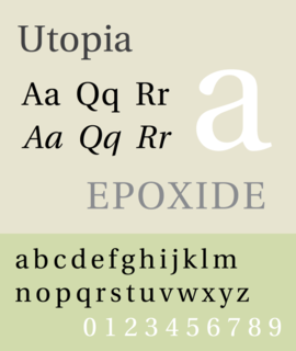
Utopia is the name of a transitional serif typeface designed by Robert Slimbach and released by Adobe Systems in 1989.

Source Sans

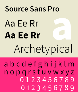
Source Sans Pro is a sans serif typeface created by Paul D. Hunt for Adobe. It is the first open-source font family from Adobe, distributed under the SIL Open Font License.

Variable font Font file with many design variants

A variable font (VF) is a font file that is able to store a continuous range of design variants. An entire typeface can be stored in such a file, with an infinite number of fonts available to be sampled.

References

  1. "OpenType Font Variations Overview". Microsoft. Retrieved 14 September 2016.
  2. 1 2 Hudson, John. "Introducing OpenType Variable Fonts". Medium. Tiro Typeworks. Retrieved 31 October 2016.
  3. Designing Multiple Master Typefaces (PDF). San José: Adobe Systems. 1997. Archived from the original (PDF) on 6 July 2015. Retrieved 20 September 2017.
  4. 1 2 Riggs, Tamye (30 July 2014). "The Adobe Originals Silver Anniversary Story". Typekit blog. Adobe Systems. Retrieved 2 July 2015.
  5. Riggs, Tamye (30 June 2014). "The Adobe Originals Silver Anniversary Story: Expanding the Originals". Typekit blog. Adobe Systems. Retrieved 8 January 2016.
  6. Phinney, Thomas (18 March 2010). "Font Remix Tools (RMX) and Multiple Master Fonts in type design". Phinney. Retrieved 4 July 2015.
  7. Phinney, Thomas. "TrueType, PostScript Type 1, & OpenType: What's the Difference?" (PDF). Adobe. Archived from the original (PDF) on 6 July 2015. Retrieved 4 July 2015.
  8. "Multiple Masters, Part 1: Setting Up Masters". Glyphs application tutorials. Retrieved 8 January 2016.
  9. Griscti, Jessica. "Jess Loves Interpolation". Alphabettes. Retrieved 15 May 2016.
  10. Nieskens, Roel. "Variable Fonts: the Future of (Web) Type". Typographica. Retrieved 31 October 2016.
  11. McClelland, Deke (July 1992). "Review: Myriad". Macworld . Vol. 9 no. 7. pp. 188–9. Retrieved 22 September 2018.
  12. "Derek van Alstyne Rising Star: Robert Slimbach and Carol Twombly". MacUser . Vol. 9 no. 3. March 1993. p.  95 . Retrieved 22 September 2018.
  13. "SOTA Typography Award Honors Robert Slimbach". SOTA. Retrieved 8 January 2016.
  14. "Interpolation Theory". LucasFonts. Retrieved 7 July 2015.
  15. Impallari, Pablo. "Family Steps". Impallari Type. Retrieved 7 July 2015.