
Palatino is the name of an old-style serif typeface designed by Hermann Zapf, initially released in 1949 by the Stempel foundry and later by other companies, most notably the Mergenthaler Linotype Company.
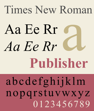
Times New Roman is a serif typeface. It was commissioned by the British newspaper The Times in 1931 and conceived by Stanley Morison, the artistic adviser to the British branch of the printing equipment company Monotype, in collaboration with Victor Lardent, a lettering artist in The Times's advertising department. It has become one of the most popular typefaces of all time and is installed on most personal computers.
The Mergenthaler Linotype Company is a corporation founded in the United States in 1886 to market the Linotype machine, a system to cast metal type in lines (linecaster) invented by Ottmar Mergenthaler. It became the world's leading manufacturer of book and newspaper typesetting equipment; outside North America, its only serious challenger for book typesetting was the Anglo-American Monotype Corporation.

Helvetica, also known by its original name Neue Haas Grotesk, is a widely used sans-serif typeface developed in 1957 by Swiss typeface designer Max Miedinger and Eduard Hoffmann.

Arial is a sans-serif typeface and set of computer fonts in the neo-grotesque style. Fonts from the Arial family are included with all versions of Microsoft Windows after Windows 3.1, as well as in other Microsoft programs, Apple's macOS, and many PostScript 3 printers.

Monotype Imaging Holdings Inc., founded as Lanston Monotype Machine Company in 1887 in Philadelphia by Tolbert Lanston, is an American company that specializes in digital typesetting and typeface design for use with consumer electronics devices. Incorporated in Delaware and headquartered in Woburn, Massachusetts, the company has been responsible for many developments in printing technology—in particular the Monotype machine, which was a fully mechanical hotmetal typesetter, that produced texts automatically, all single type. Monotype was involved in the design and production of many typefaces in the 20th century. Monotype developed many of the most widely used typeface designs, including Times New Roman, Gill Sans, Arial, Bembo and Albertus.
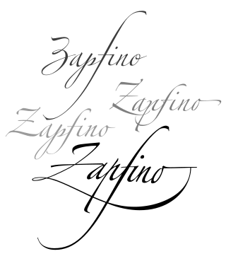
Zapfino is a calligraphic typeface designed for Linotype by typeface designer Hermann Zapf in 1998. It is based on an alphabet Zapf originally penned in 1944. As a font, it makes extensive use of ligatures and character variations.

DIN 1451 is a sans-serif typeface that is widely used for traffic, administrative and technical applications.

Sabon is an old-style serif typeface designed by the German-born typographer and designer Jan Tschichold (1902–1974) in the period 1964–1967. It was released jointly by the Linotype, Monotype, and Stempel type foundries in 1967. The design of the roman is based on types by Claude Garamond, particularly a specimen printed by the Frankfurt printer Konrad Berner. Berner had married the widow of a fellow printer Jacques Sabon, the source of the face's name, who had bought some of Garamond's type after his death. The italics are based on types designed by a contemporary of Garamond's, Robert Granjon. It is effectively a Garamond revival, though a different name was chosen as many other modern typefaces already carry this name.
Compugraphic Corporation, commonly called cg, was an American producer of typesetting systems and phototypesetting equipment, based in Wilmington, Massachusetts, just a few miles from where it was founded. This company is distinct from Compugraphics, a British company founded 1967 in Aldershot, UK that specializes in the production of photomasks used in the production of integrated circuits. In 1981, it was acquired by European competitor Agfa-Gevaert, and its products and processes merged into those of Agfa. By 1988, the merger was complete and the Compugraphic brand was removed from the market.
Walter Valentine Tracy RDI was an English type designer, typographer and writer.
Ruqʿah or Riqʿah (رِقعة) is a writing style of Arabic script intended for the rapid production of texts. It a relatively simple and plain style, used for everyday writing and often used for signs. The Ottoman calligraphers Mumtaz Efendi (1810–1872) and Mustafa Izzet Efendi (1801–1876) are credited with standardizing the writing style which has existed in slightly different styles as everyday handwriting.

Kamel Mrowa was a Lebanese publisher, journalist, writer and ideologue. He was the founder of the Lebanese Arabic daily Al-Hayat in 1946, the Lebanese English-language newspaper, The Daily Star in 1952 and the French language Beyrouth Matin in 1959. His politics opposed military dictatorships which came to rule the Arab world in the 1950s and 1960s. He was killed by a gunman while checking the final proofs of the next day's issue of his paper.

The Amiri Press or Amiriya Press is a printing press, and one of the main agencies with which Muhammad Ali Pasha modernized Egypt. The Amiri Press had a profound effect on Egyptian literature and intellectual life in the country and in the greater region, as scientific works in European languages were translated into Arabic.

Fiona Ross is a British type designer, academic and linguist. Since 2003, she has worked at the University of Reading, where she is a Professor and Lecturer in Non-Latin Typeface Design. She has received awards such as the 2014 SoTA Typography Award and the 2018 TDC Medal.

Amiri is a naskh typeface for Arabic script designed by Khaled Hosny. The beta was released December 2011. As of October 22, 2019, it is hosted on 67,000 websites, and is served by the Google Fonts API approximately 74.8 million times per week.
The Institute for Studies and Research on Arabization is an institute dedicated to Arabization in Rabat, Morocco created by decree January 14, 1960.
Traditional Arabic is an Arabic naskh-based typeface first developed by Monotype as Series 589 in the spring of 1956. It featured a system of interlocking sorts to allow for the diacritics to properly display over the letters they modify.
ASV Codar is an Arabic typeface developed by Ahmed Lakhdar Ghazal. It was designed as a simplified typeface, with one vowels as their own characters. ASV Codar was first released in two versions: a "pure" version with only 84 characters, and a "total" version with 23 additional characters. The typeface is used for road signs in Morocco.
Jurnal al-Khidiw, first published 1821–1822, was the first printed periodical in Arabic. It was a bilingual Turkish–Arabic bulletin for official use, with a run as small as 100 copies. At first it was handwritten and printed lithographically with irregular frequency. It was later printed with weekly and then daily frequency.
