Related Research Articles

Times New Roman is a serif typeface. It was commissioned by the British newspaper The Times in 1931 and conceived by Stanley Morison, the artistic adviser to the British branch of the printing equipment company Monotype, in collaboration with Victor Lardent, a lettering artist in The Times's advertising department. It has become one of the most popular typefaces of all time and is installed on most desktop computers.

Jan Tschichold was a German calligrapher, typographer and book designer. He played a significant role in the development of graphic design in the 20th century – first, by developing and promoting principles of typographic modernism, and subsequently idealizing conservative typographic structures. His direction of the visual identity of Penguin Books in the decade following World War II served as a model for the burgeoning design practice of planning corporate identity programs. He also designed the typeface Sabon.
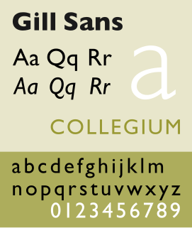
Gill Sans is a humanist sans-serif typeface designed by Eric Gill and released by the British branch of Monotype from 1928 onwards.
Stanley Arthur Morison was an influential British typographer, printing executive and historian of printing. Largely self-educated, he promoted higher standards in printing and an awareness of the best printing and typefaces of the past.

Bembo is a serif typeface created by the British branch of the Monotype Corporation in 1928–1929 and most commonly used for body text. It is a member of the "old-style" of serif fonts, with its regular or roman style based on a design cut around 1495 by Francesco Griffo for Venetian printer Aldus Manutius, sometimes generically called the "Aldine roman". Bembo is named for Manutius's first publication with it, a small 1496 book by the poet and cleric Pietro Bembo. The italic is based on work by Giovanni Antonio Tagliente, a calligrapher who worked as a printer in the 1520s, after the time of Manutius and Griffo.

Beatrice Lamberton Warde was a twentieth century writer and scholar of typography. As a marketing manager for the British Monotype Corporation, she was influential in the development of printing tastes in Britain and elsewhere in the mid-twentieth century and was recognized at the time as "[o]ne of the few women typographers in the world". Her writing advocated higher standards in printing, and championed intelligent use of historic typefaces from the past, which Monotype specialised in reviving, and the work of contemporary typeface designers.

Sabon is an old-style serif typeface designed by the German-born typographer and designer Jan Tschichold (1902–1974) in the period 1964–1967. It was released jointly by the Linotype, Monotype, and Stempel type foundries in 1967. The design of the roman is based on types by Claude Garamond, particularly a specimen printed by the Frankfurt printer Konrad Berner. Berner had married the widow of a fellow printer Jacques Sabon, the source of the face's name, who had bought some of Garamond's type after his death. The italics are based on types designed by a contemporary of Garamond's, Robert Granjon. It is effectively a Garamond revival, though a different name was chosen as many other modern typefaces already carry this name.

The Science Fiction Hall of Fame, Volume Two is an English language science fiction two-volume anthology edited by Ben Bova and published in the U.S. by Doubleday in 1973, distinguished as volumes "Two A" and "Two B". In the U.K. they were published by Gollancz as Volume Two (1973) and Volume Three (1974). The original U.S. subtitle was The Greatest Science Fiction Novellas of All Time.

Centaur is a serif typeface by book and typeface designer Bruce Rogers, based on the Renaissance-period printing of Nicolas Jenson around 1470. He used it for his design of the Oxford Lectern Bible. It was given widespread release by the British branch of Monotype, paired with an italic designed by calligrapher Frederic Warde and based on the slightly later work of calligrapher and printer Ludovico Vicentino degli Arrighi. The italic has sometimes been named separately as the "Arrighi" italic.
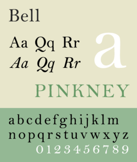
Bell is the name given to a serif typeface designed and cut in 1788 by the punchcutter Richard Austin for the British Letter Foundry, operated by publisher John Bell, and revived several times since.
Jan van Krimpen was a Dutch typographer, book designer and type designer. He worked for the printing house Koninklijke Joh. Enschedé. He also worked with Monotype in England, who issued or reissued many of his designs outside the Netherlands.
Herbert Spencer was a British designer, editor, writer, photographer and teacher. He was born in London.
Typographica was the name of a journal of typography and visual arts founded and edited by Herbert Spencer from 1949 to 1967. Spencer was just 25 years old when the first Typographica was issued. He also served as the editor of the journal.
The Fleuron was a British journal of typography and book arts published in seven volumes from 1923 to 1930. A fleuron is floral ornament used by typographers.
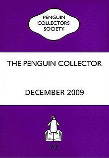
The Penguin Collectors Society (PCS) is an educational charity based in the United Kingdom. Its primary purpose is to promote the study and research of all aspects of Penguin Books, the publishing company founded by Allen Lane in 1935.
Harry Graham Carter was an English typographer, translator and writer. He was a well-known historian of type. He was the father of type designer Matthew Carter.
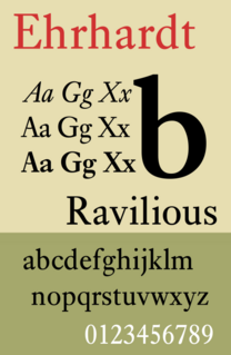
Ehrhardt is an old-style serif typeface released by the British branch of the Monotype Corporation in 1938. Ehrhardt is a modern adaptation of printing types of "stout Dutch character" from the Dutch Baroque tradition sold by the Ehrhardt foundry in Leipzig. These were cut by the Hungarian-Transylvanian pastor and punchcutter Miklós (Nicholas) Tótfalusi Kis while in Amsterdam in the period from 1680 to 1689.
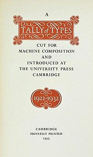
A Tally of Types is a book on typography authored by the type designer Stanley Morison. It was first published in 1953, and showcases significant typeface designs produced during Morison's tenure at the Lanston Monotype Corporation for their hot-metal typesetting machines during the 1920s and 1930s in England.
Fernand Baudin was a Belgian book designer, author, typographer, and teacher. Baudin was active in the field of graphic design in many ways and described himself as a “typographiste”. He was part of national and international typographic organisations, like ATypI, the Graphica-Belgica Prize, and Rencontres internationales de Lure.
Frank Hinman Pierpont was an American engineer and typeface designer. He worked primarily in England for the Monotype Corporation of Britain.