Zapfino

Last updated
Zapfino
Zapfino.svg
Category Formal script
Designer(s) Hermann Zapf
Foundry Linotype
Variations Zapfino Extra
variant glyphs representing the character e (allographs of e) ZaphinoLowercaseE.svg
variant glyphs representing the character e (allographs of e)

Zapfino is a calligraphic typeface designed for Linotype by typeface designer Hermann Zapf in 1998. It is based on an alphabet Zapf originally penned in 1944. As a font, it makes extensive use of ligatures and character variations (for example, the lower case letter d has nine variations).

Contents

History

In 1983, Zapf had completed the typeface AMS Euler with Donald Knuth and David Siegel of Stanford University for the American Mathematical Society, a typeface for mathematical composition including fraktur and Greek letters. David Siegel had recently finished his studies at Stanford and was interested in entering the field of typography. [1] He told Zapf his idea of making a typeface with a large number of glyph variations; he wanted to start with an example of Zapf's calligraphy that was reproduced in a publication by the Society of Typographical Arts in Chicago.

Zapf was concerned that this was the wrong way to go, and while he was interested in creating a complicated program, he was worried about starting something new. However, Zapf remembered a page of calligraphy from his sketchbook from 1944, and considered the possibility of making a typeface from it. He had previously tried to create a calligraphic typeface for Stempel in 1948, but hot metal composition was too limiting on the freedom of swash characters. Such a result could only be achieved using modern digital technology, and so Zapf and Siegel began work on the complicated software necessary. [2] Siegel also hired Gino Lee, a type designer from Boston, Massachusetts, to render the extensive character set. (The "ino" in "Zapfino" refers to Gino.)

However, just before the project was completed, Siegel wrote a letter to Zapf, saying that his girlfriend had left him and that he had lost all interest in anything. Siegel abandoned the project and started a new life, working on bringing color to Macintosh computers and later becoming an Internet design expert. [3]

Zapfino's development had become seriously delayed, until Zapf presented the project to Linotype. They were prepared to complete it and reorganized the project. Zapf worked with Linotype to create four alphabets and various ornaments, flourishes, and other dingbats. Zapfino was released in 1998 as a Type 1 font.

Availability

Apple Inc. includes Zapfino in macOS and iOS, partly to demonstrate its advanced typographic features. The font includes over 1,400 glyphs as of the most recent version, and contains much bigger letters than the Zapfino fonts Linotype sells in retail channel. Since then, Linotype has extended Zapfino to include an additional Forte weight in their Zapfino Extra family which Apple has not licensed for distribution with macOS.

Zapfino Extra (2003)

In 2003, Hermann Zapf completely reworked the Zapfino design, creating Zapfino Extra, a large expansion of the Zapfino family designed in close collaboration with Akira Kobayashi. This font family uses Apple Advanced Typography and OpenType technologies, allowing automatic ligatures and contextual glyph substitutions, accurately reflecting the fluid and dynamic nature of Zapf's calligraphy. This font family comes in 2 font weights, with 3 fonts in Forte weight and total of 12 fonts in the family. The Pro fonts contain glyphs found in other fonts of their respective weights.

Zapfino Extra W1G (2010)

It is a version Zapfino Extra with support of Greek and Cyrillic characters. The family includes Zapfino Extra Paneuropean W1G One font.

OpenType features include access all alternates, fractions, standard ligatures, localized forms, ordinals, scientific inferiors, superscript/subscript, discretionary ligatures.

Zapfino Extra Cyrillic One (2010)

It is a subset of Zapfino Extra Paneuropean W1G One font with only support of Cyrillic characters. [4]

Additional OpenType features include ornaments.

Zapfino Extra X (2003)

Linotype also created Zapfino Extra X, which was based on the 1998 Zapfino fonts included with macOS. This font family, like the Zapfino in macOS, features letters four times larger than the Linotype counterpart.

Zapfino Arabic (2014–2015)

Designed by Nadine Chahine of Monotype Imaging, it is an Arabic version of Zapfino combining Naskh and Nastaaliq calligraphic styles. The character proportions refer to Naskh manuscript traditions but the isolated and final forms bring with them an exaggerated swash-like movement that references the extravagant ascenders and descenders of Zapfino. Work on Zapfino Arabic started in the summer of 2012, and after a meeting with Hermann Zapf in Darmstadt in August to look at early sketches, the project was approved and ready to start. [5] [6]

The family includes only 1 font in regular weight, with font leaning right as the original Zapfino fonts designed by Hermann Zapf. OpenType features include 10 stylistic sets.

Atheism symbol

ScarletLetter.svg

In various online communities, a scarlet-colored capital A in the Zapfino font has been used as an unofficial symbol representing atheism. [7] Officially, the "scarlet A" is used as the logo of the Out Campaign, a public awareness initiative for freethought and atheism, which has been endorsed by Richard Dawkins. [8]

See also

Related Research Articles

<span class="mw-page-title-main">Palatino</span> Serif typeface

Palatino is the name of an old-style serif typeface designed by Hermann Zapf, initially released in 1949 by the Stempel foundry and later by other companies, most notably the Mergenthaler Linotype Company.

<span class="mw-page-title-main">Optima</span> 1958 typeface by Hermann Zapf

Optima is a humanist sans-serif typeface designed by Hermann Zapf and released by the D. Stempel AG foundry, Frankfurt, West Germany in 1958.

<span class="mw-page-title-main">Hermann Zapf</span> German type designer and calligrapher (1918–2015)

Hermann Zapf was a German type designer and calligrapher who lived in Darmstadt, Germany. He was married to the calligrapher and typeface designer Gudrun Zapf-von Hesse. Typefaces he designed include Palatino, Optima, and Zapfino. He is considered one of the greatest type designers of all time.

<span class="mw-page-title-main">Typeface</span> Set of characters that share common design features

A typeface is a design of letters, numbers and other symbols, to be used in printing or for electronic display. Most typefaces include variations in size, weight, slope, width, and so on. Each of these variations of the typeface is a font.

<span class="mw-page-title-main">Helvetica</span> Neo-grotesque sans-serif typeface

Helvetica, also known by its original name Neue Haas Grotesk, is a widely used sans-serif typeface developed in 1957 by Swiss typeface designer Max Miedinger and Eduard Hoffmann.

<span class="mw-page-title-main">Frutiger (typeface)</span> Typeface designed by Adrian Frutiger

Frutiger is a series of typefaces named after its Swiss designer, Adrian Frutiger. Frutiger is a humanist sans-serif typeface, intended to be clear and highly legible at a distance or at small text sizes. A popular design worldwide, type designer Steve Matteson described its structure as "the best choice for legibility in pretty much any situation" at small text sizes, while Erik Spiekermann named it as "the best general typeface ever".

<span class="mw-page-title-main">Arial</span> Neo-grotesque sans-serif typeface

Arial is a sans-serif typeface and set of computer fonts in the neo-grotesque style. Fonts from the Arial family are included with all versions of Microsoft Windows after Windows 3.1, as well as in other Microsoft programs, Apple's macOS, and many PostScript 3 printers.

<span class="mw-page-title-main">Univers</span> Sans-serif typeface family

Univers is a large sans-serif typeface family designed by Adrian Frutiger and released by his employer Deberny & Peignot in 1957. Classified as a neo-grotesque sans-serif, one based on the model of nineteenth-century German typefaces such as Akzidenz-Grotesk, it was notable for its availability from the moment of its launch in a comprehensive range of weights and widths. The original marketing for Univers deliberately referenced the periodic table to emphasise its scope.

<span class="mw-page-title-main">Kris Holmes</span>

Kris Holmes is an American typeface designer, calligrapher, type design educator and animator. She, with Charles Bigelow, is the co-creator of the Lucida and Wingdings font families, among many other typeface designs. She is President of Bigelow & Holmes Inc., a typeface design studio.

<span class="mw-page-title-main">Swash (typography)</span> Typographical flourish found on some letterforms, particularly in italics

A swash is a typographical flourish, such as an exaggerated serif, terminal, tail, entry stroke, etc., on a glyph. The use of swash characters dates back to at least the 16th century, as they can be seen in Ludovico Vicentino degli Arrighi's La Operina, which is dated 1522. As with italic type in general, they were inspired by the conventions of period handwriting. Arrighi's designs influenced designers in Italy and particularly in France.

Apple's Macintosh computer supports a wide variety of fonts. This support was one of the features that initially distinguished it from other systems.

<span class="mw-page-title-main">Microsoft Sans Serif</span> Neo-grotesque sans-serif typeface

Microsoft Sans Serif is a sans-serif typeface introduced with early Microsoft Windows versions. It is the successor of MS Sans Serif, formerly Helv, a proportional bitmap font introduced in Windows 1.0. Both typefaces are very similar in design to Arial and Helvetica. The typeface was designed to match the MS Sans bitmap included in the early releases of Microsoft Windows.

<span class="mw-page-title-main">Sabon</span> Serif typeface

Sabon is an old-style serif typeface designed by the German-born typographer and designer Jan Tschichold (1902–1974) in the period 1964–1967. It was released jointly by the Linotype, Monotype, and Stempel type foundries in 1967. The design of the roman is based on types by Claude Garamond, particularly a specimen printed by the Frankfurt printer Konrad Berner. Berner had married the widow of a fellow printer Jacques Sabon, the source of the face's name, who had bought some of Garamond's type after his death. The italics are based on types designed by a contemporary of Garamond's, Robert Granjon. It is effectively a Garamond revival, though a different name was chosen as many other modern typefaces already carry this name.

<span class="mw-page-title-main">Syntax (typeface)</span> Typeface

Syntax comprises a family of fonts designed by Swiss typeface designer Hans Eduard Meier. Originally just a sans-serif font, it was extended with additional serif designs.

<span class="mw-page-title-main">Avenir (typeface)</span> 1988 typeface by Adrian Frutiger

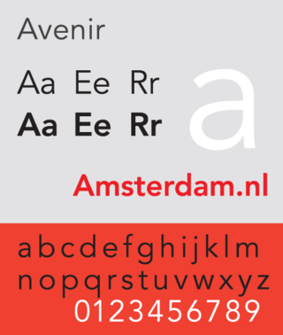
Avenir is a geometric sans-serif typeface designed by Adrian Frutiger in 1987 and released in 1988 by Linotype GmbH.

<span class="mw-page-title-main">Droid (typeface)</span> Typeface family

Droid is a font family first released in 2007 and created by Ascender Corporation for use by the Open Handset Alliance platform Android and licensed under the Apache License. The fonts are intended for use on the small screens of mobile handsets and were designed by Steve Matteson of Ascender Corporation. The name was derived from the Open Handset Alliance platform named Android.

ITC Zapf Chancery is a family of script typefaces designed by the type designer Hermann Zapf and marketed by the International Typeface Corporation. It is one of the three typefaces designed by Zapf that are shipped with computers running Apple's Mac OS. It is also one of the core PostScript fonts.

<span class="mw-page-title-main">Utopia (typeface)</span> Typeface

Utopia is the name of a transitional serif typeface designed by Robert Slimbach and released by Adobe Systems in 1989.

<span class="mw-page-title-main">Unica (typeface)</span> Typeface

Unica or Haas Unica is a neo-grotesque sans-serif typeface developed at Haas Type Foundry in the late 1970s and originally released in 1980. Initiated as a project that sought to combine the strengths of both Helvetica and Univers, it had the misfortune of being released for phototypesetting just as the technology was being made obsolete by desktop publishing, and subsequent corporate mergers and a copyright dispute kept a digital version off the market. In 2015, two digital revivals were released: one by the rights holders, and the other with the blessing of the team that originally developed it.

References

  1. "David Seigel". Adobe. Retrieved 6 May 2020.
  2. "A Short Introduction To the Life of Hermann Zapf". wp.nyu.edu. Retrieved 2023-09-18.
  3. "Zapfino: An Elegant Script Font". Olleymay. Retrieved 6 May 2020.
  4. International typography gets a Cyrillic boost
  5. Zapfino Arabic: a decade of collaboration between Hermann Zapf and Nadine Chahine
  6. Zapfino Arabic: A Typeface in the Making
  7. Mehta, Hemant (9 June 2015). "The Man Whose Font Was Used to Identify Atheists Worldwide Has Died". Friendly Atheist. Patheos. Retrieved 9 June 2015.
  8. "home". outcampaign.org. Retrieved 9 June 2015.