Related Research Articles

Palatino is the name of an old-style serif typeface designed by Hermann Zapf, initially released in 1949 by the Stempel foundry and later by other companies, most notably the Mergenthaler Linotype Company.

Matthew Carter is a British type designer. A 2005 New Yorker profile described him as 'the most widely read man in the world' by considering the amount of text set in his commonly used typefaces.
In typography and handwriting, a descender is the portion of a letter that extends below the baseline of a font.

Westminster is a printing and display typeface inspired by the machine-readable numbers printed on cheques and designed by Leo Maggs.

Umbra is a sans-serif display typeface designed in 1935 by R. Hunter Middleton for the Ludlow Typograph company. It is an adaptation of the uppercase light weight of his earlier typeface Tempo. The name Umbra refers to its shadow effect, in which the actual letter shape consists of negative space and is defined solely by its black dimensional shadow. Several other typefaces were created in similar style around the same time, including shadowed weights of Gill Sans. Nebiolo's Ombra, part of their Semplicità family, is very similar.

Archer is a slab serif typeface designed in 2001 by Tobias Frere-Jones and Jonathan Hoefler for use in Martha Stewart Living magazine. It was later released by Hoefler & Frere-Jones for commercial licensing.

News Gothic is a sans-serif typeface designed by Morris Fuller Benton, and was released in 1908 by his employer American Type Founders (ATF). The typeface is similar in proportion and structure to Franklin Gothic, also designed by Benton, but lighter.
Gert Wiescher was a German graphic artist, type designer and author. He was known for an almost complete re-design of Bodoni classic typefaces, the work of Giambattista Bodoni, the 17th-century Italian typographer. His Bodoni Classic typefaces are considered very close to the authentic version. He has also designed many new typefaces.
Mandaic is a Unicode block containing characters of the Mandaic script used for writing the historic Eastern Aramaic, also called Classical Mandaic, and the modern Neo-Mandaic language.

Footlight is a serif typeface designed by Malaysian type designer Ong Chong Wah in 1986 for the Monotype Corporation. Footlight is an irregular design. It is sold in weights from light to extra-bold with matching italics. It was originally designed as an italic font, a roman version was later made.

Jessica Nicole Hische is an American lettering artist, illustrator, author, and type designer. She was one of the first of a new generation of letterers and the present-day flourishing of the lettering arts can in part be traced back to her emergence.

SST is a humanist sans-serif typeface designed by Monotype for Sony. It supports the Latin, Greek, and Cyrillic alphabets and has matching styles for Thai, Hebrew, Japanese and Arabic. It is modelled after Helvetica and Frutiger. SST is used on Sony's product packaging, operating instructions, websites, TV menus, in PlayStation 4 and on the Xperia smartphone.

Theano Didot is a free and open-source typeface by Alexey Kryukov, released under the Open Font License (OFL) in 2007. It is a revival of the Didot typeface of Firmin Didot, in the Didone or modern serif genre of the early nineteenth century.
David Rakowski is an American composer and typeface designer. He studied under such composers as Robert Ceely, John Heiss, Milton Babbitt, Peter Westergaard, Paul Lansky, and Luciano Berio. In 2006, he was awarded the Chamber Music Society of Lincoln Center's 2004–2006 Elise L. Stoeger Prize. He has twice been a finalist for the Pulitzer Prize for Music: in 1999 for Persistent Memory and in 2002 for his second symphony Ten of a Kind.
Veronese was a typeface of the Monotype company in the UK made to be used for type casting in hot metal typography
Anna Carolina Laudon is a typographic designer and graphic designer. Educated in Fine Art at Gerlesborgsskolan in Stockholm, Laudon earned a master's degree in graphic design at HDK School of Design and Crafts at the University of Gothenburg in Sweden, where she made her first font. She is fascinated in social topics such as Feminism, Human Issues, Intersectionality and Global Communication.

Iosevka is a monospace programming typeface, built declaratively using custom typeface generation software, and with an emphasis on compatibility with CJK characters. It is available under a FOSS license. The default builds are available in two styles of nine weights each, and come with italic and oblique versions. The typeface was designed, however, to be easily configurable by editing textual TOML configuration files in the custom generation software.
Hans Eduard Meier, was a Swiss type designer. He created the neohumanist typeface Syntax at Stempel Foundry, along with Barbedor (1984), Letter (1992) and Lapidar (1995).
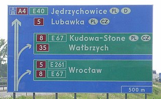
Polish road signs typeface – geometrical typeface meant to making text on Polish road signs, according to Attachment 1 of Regulation on detailed technical conditions for road signs and signals as well as road safety devices and conditions for their placement on roads. The regulation defines a construction of digits, all of the letters of Polish alphabet and the letter V, and the punctuation marks: hyphen, round brackets, comma, full stop (period) and exclamation mark.
References
- 1 2 Devroye, Luc (2003-05-18). "Amelia's adventure". Luc Devroye. Retrieved 2014-07-14.
- ↑ "Moon Boot". Branding Type. Retrieved 2014-07-14.
- ↑ "Yellow Submarine (1968)". Camera Effects Limited. Archived from the original on 2015-09-23. Retrieved 2014-07-14.
| | This typography-related article is a stub. You can help Wikipedia by expanding it. |