Cambria (typeface)

Last updated
Cambria
CambriaSpecimen.svg
Category Serif
Classification Transitional [1]
Designer(s) Jelle Bosma, Steve Matteson and Robin Nicholas
Cambria Math: Jelle Bosma, Ross Mills, John Hudson, Geraldine Wade, Mike Duggan, Greg Hitchcock, Andrei Burago, Vivek Garg
Foundry Ms, Tiro Typeworks (Cambria Math)
Date released2005
License Proprietary

Cambria is a transitional serif typeface commissioned by Microsoft and distributed with Windows and Office. It was designed by Dutch typeface designer Jelle Bosma in 2004, with input from Steve Matteson and Robin Nicholas. It is intended as a serif font that is suitable for body text, that is very readable printed small or displayed on a low-resolution screen and has even spacing and proportions. [2]

Contents

It is part of the ClearType Font Collection, a suite of fonts from various designers released with Windows Vista. All start with the letter C to reflect that they were designed to work well with Microsoft's ClearType text rendering system, a text rendering engine designed to make text clearer to read on LCD monitors. The other fonts in the same group are Calibri, Candara, Consolas, Constantia and Corbel.

Design

Diagonal and vertical hairlines and serifs are relatively strong, while horizontal serifs are small and intend to emphasize stroke endings rather than stand out themselves. This principle is most noticeable in the italics where the lowercase characters are subdued in style. It is somewhat more condensed than average for a font of its kind. [3] A profile of Bosma for the Monotype website commented: "One of the defining features of the typeface is its contrast between heavy vertical serifs and hairlines—which keep the font sturdy, and ensures the design is preserved at small sizes—and its relatively thin horizontals, which ensure the typeface remains crisp when used at larger sizes." Bosma describes it as a "transitional slab-serif hybrid." [1]

Many aspects of the design are somewhat blocky to render well on screen, and full stops are square rather than round. Designers have recommended avoiding using it in printed text because of this: designer Matthew Butterick described it as too monotonous to be attractive on paper. [4] Bosma compared it to optical sizes of fonts designed to be printed small: "The design is a bit like an old metal type font. In those days sizes had their own drawing, so that small sizes are wider and have a lower contrast compared to large fonts in the same design: optical correction. In this sense, Cambria is like a small size font, except that it may also be used at large sizes."

As with the other ClearType fonts, both lining figures and text figures are offered. Lining figures are the default, and are shown on the sample image.

Cambria Math

This is a variant designed for mathematical and scientific texts, as a replacement for Times New Roman. Cambria Math was the first font to implement the OpenType math extension, itself inspired by TeX. Led by Jelle Bosma of Agfa Monotype and Ross Mills of Tiro Typeworks, the project was planned when development of Cambria had started, but Cambria Math was developed in three stages. [5]

Availability

Normal, bold, italic and bold italic Cambria text Cambria "Word" sample.svg
Normal, bold, italic and bold italic Cambria text

Cambria is distributed with all Windows versions since Windows Vista, all Microsoft Office versions since Microsoft Office 2007 for Windows and Microsoft Office 2008 for Mac, and Microsoft Office 2007 viewers and converters. Cambria (Regular) and Cambria Math are packaged together as a TrueType Collection (TTC) file. Microsoft Office 2008 for Mac does not include Cambria Math, as OMML is not supported. Therefore, the Macintosh version of Cambria is packaged as individual TrueType Font (TTF) files, rather than a single TTC file.

This font, along with Calibri, Candara, Consolas, Corbel and Constantia, is also distributed with Microsoft Excel Viewer, Microsoft PowerPoint Viewer, [6] [7] the Microsoft Office Compatibility Pack [8] for Microsoft Windows and the Open XML File Format Converter for Mac. [9] For use in other operating systems, such as Linux, cross-platform use and web use it is not available as a freeware.

The typeface is licensed by Ascender Corporation for use by end users and consumer electronics device manufacturers. The typeface is also licensed by Monotype Imaging to printer manufacturers as part of the Vista 8 Font Set package.

Caladea

In 2013, as part of Chrome, Google released a freely-licensed font called Caladea, which is metric-compatible to Cambria (i.e. can replace it in a document without changing the layout). [10] It is based on Cambo, a font developed by the Argentine type foundry Huerta Tipográfica. Despite being metric-compatible, Caladea covers much smaller language range, e.g. it doesn't support Cyrillic, Greek and advanced typographic features like ligatures, old style numerals or fractions.

Usages

Cambria Math is used for presentation of Office MathML equations in Microsoft Office 2007 and later.

The free typesetting systems XeTeX and LuaTeX can make direct use of Cambria Math as an alternative to traditional TeX mathematical fonts. [11] [12]

Cambria is available for use in Google's Google Drive suite of web applications.

See also

Related Research Articles

<span class="mw-page-title-main">Palatino</span> Serif typeface

Palatino is the name of an old-style serif typeface designed by Hermann Zapf, initially released in 1949 by the Stempel foundry and later by other companies, most notably the Mergenthaler Linotype Company.

<span class="mw-page-title-main">Verdana</span> Humanist sans-serif font

Verdana is a humanist sans-serif typeface designed by Matthew Carter for Microsoft Corporation, with hand-hinting done by Thomas Rickner, then at Monotype. Demand for such a typeface was recognized by Virginia Howlett of Microsoft's typography group and commissioned by Steve Ballmer. The name "Verdana" is derived from "verdant" (green) and "Ana".

<span class="mw-page-title-main">Typeface</span> Set of characters that share common design features

A typeface is a design of letters, numbers and other symbols, to be used in printing or for electronic display. Most typefaces include variations in size, weight, slope, width, and so on. Each of these variations of the typeface is a font.

OpenType is a format for scalable computer fonts. Derived from TrueType, it retains TrueType's basic structure but adds many intricate data structures for describing typographic behavior. OpenType is a registered trademark of Microsoft Corporation.

<span class="mw-page-title-main">Arial</span> Neo-grotesque sans-serif typeface

Arial is a sans-serif typeface and set of computer fonts in the neo-grotesque style. Fonts from the Arial family are included with all versions of Microsoft Windows after Windows 3.1, as well as in other Microsoft programs, Apple's macOS, and many PostScript 3 printers.

Arial Unicode MS is a TrueType font and the extended version of the font Arial. Compared to Arial, it includes higher line height, omits kerning pairs and adds enough glyphs to cover a large subset of Unicode 2.1—thus supporting most Microsoft code pages, but also requiring much more storage space. It also adds Ideographic layout tables, but unlike Arial, it mandates no smoothing in the 14–18 point range, and contains Roman (upright) glyphs only; there is no oblique (italic) version. Arial Unicode MS was previously distributed with Microsoft Office, but this ended in 2016 version. It is bundled with Mac OS X v10.5 and later. It may also be purchased separately from Ascender Corporation, who licenses the font from Microsoft.

<span class="mw-page-title-main">Computer Modern</span> Family of typefaces

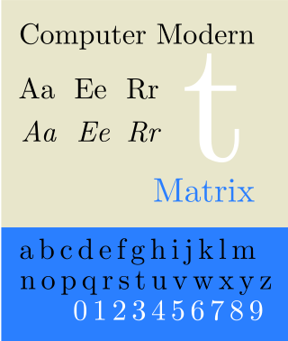
Computer Modern is the original family of typefaces used by the typesetting program TeX. It was created by Donald Knuth with his Metafont program, and was most recently updated in 1992. Computer Modern, or variants of it, remains very widely used in scientific publishing, especially in disciplines that make frequent use of mathematical notation.

<span class="mw-page-title-main">Lucida</span> Typeface family designed by Charles Bigelow and Kris Holmes in 1984

Lucida is an extended family of related typefaces designed by Charles Bigelow and Kris Holmes and released from 1984 onwards. The family is intended to be extremely legible when printed at small size or displayed on a low-resolution display – hence the name, from 'lucid'.

<span class="mw-page-title-main">Georgia (typeface)</span> 1996 typeface by Matthew Carter

Georgia is a serif typeface designed in 1993 by Matthew Carter and hinted by Tom Rickner for Microsoft. It was intended as a serif typeface that would appear elegant but legible when printed small or on low-resolution screens. The typeface is inspired by Scotch Roman designs of the 19th century and was based on designs for a print typeface on which Carter was working when contacted by Microsoft; this would be released under the name Miller the following year. The typeface's name referred to a tabloid headline, "Alien heads found in Georgia."

<span class="mw-page-title-main">Calibri</span> Sans-serif typeface family

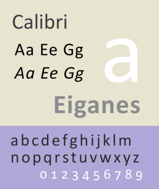
Calibri is a digital sans-serif typeface family in the humanist or modern style. It was designed by Luc(as) de Groot and released to the general public, with Microsoft Office 2007 and Windows Vista. In Office 2007, it replaced Times New Roman as the default typeface in Word and replaced Arial as the default in PowerPoint, Excel, Outlook, and WordPad. De Groot described its subtly rounded design as having "a warm and soft character". In January 2024, the font was replaced by Microsoft's new bespoke font, Aptos, as the new default Microsoft Office font, after 17 years.

<span class="mw-page-title-main">Candara</span> Humanist sans-serif typeface

Candara is a humanist sans-serif typeface designed by Gary Munch and commissioned by Microsoft. It is part of the ClearType Font Collection, a suite of fonts from various designers released with Windows Vista, all starting with the letter C to reflect that they were designed to work well with Microsoft's ClearType text rendering system. The others are Calibri, Cambria, Consolas, Corbel and Constantia.

<span class="mw-page-title-main">Constantia (typeface)</span> Serif typeface

Constantia is a serif typeface designed by John Hudson and commissioned by Microsoft. It is a transitional serif design, influenced by Eric Gill’s Perpetua design. Development of the typeface began in 2003 and it was released in 2004.

<span class="mw-page-title-main">Corbel (typeface)</span> Typeface

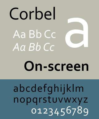
Corbel is a humanist sans-serif typeface designed by Jeremy Tankard for Microsoft. It is part of the ClearType Font Collection, a suite of fonts from various designers released with Windows Vista. All start with the letter C to reflect that they were designed to work well with Microsoft's ClearType text rendering system, a text rendering engine designed to make text clearer to read on LCD monitors. The other fonts in the same group are Calibri, Cambria, Candara, Consolas and Constantia.

Segoe is a typeface, or family of fonts, that is best known for its use by Microsoft. The company uses Segoe in its online and printed marketing materials, including recent logos for a number of products. Additionally, the Segoe UI font sub-family is used by numerous Microsoft applications, and may be installed by applications. It was adopted as Microsoft's default operating system font, and is also used on Outlook.com, Microsoft's web-based email service. On August 23, 2012, Microsoft unveiled its new corporate logo typeset in Segoe, replacing the logo it had used for the previous 25 years.

<span class="mw-page-title-main">Century Gothic</span> Sans-serif font family

Century Gothic is a digital sans-serif typeface in the geometric style, released by Monotype Imaging in 1990. It is a redrawn version of Monotype's own Twentieth Century, a copy of Bauer's Futura, to match the widths of ITC Avant Garde Gothic. It is an exclusively digital typeface that has never been manufactured as metal type.

<span class="mw-page-title-main">Bookman (typeface)</span> 1869 serif typeface

Bookman, or Bookman Old Style, is a serif typeface. A wide, legible design that is slightly bolder than most body text faces, Bookman has been used for both display typography, for trade printing such as advertising, and less commonly for body text. In advertising use it is particularly associated with the graphic design of the 1960s and 1970s, when revivals of it were very popular.

<span class="mw-page-title-main">Minion (typeface)</span> Serif typeface

Minion is a serif typeface released in 1990 by Adobe Systems. Designed by Robert Slimbach, it is inspired by late Renaissance-era type and intended for body text and extended reading. Minion's name comes from the traditional naming system for type sizes, in which minion is between nonpareil and brevier, with the type body 7pt in height. As the historically rooted name indicates, Minion was designed for body text in a classic style, although slightly condensed and with large apertures to increase legibility. Slimbach described the design as having "a simplified structure and moderate proportions." The design is slightly condensed, although Slimbach has said that this was intended not for commercial reasons so much as to achieve a good balance of the size of letters relative to the ascenders and descenders.

<span class="mw-page-title-main">Bitstream Charter</span> Serif typeface

Bitstream Charter is a serif typeface designed by Matthew Carter in 1987 for Bitstream Inc. Charter is based on Pierre-Simon Fournier’s characters, originating from the 18th century. Classified by Bitstream as a transitional-serif typeface, it also has features of a slab-serif typeface and is often classified as such.

<span class="mw-page-title-main">Malgun Gothic</span> Sans-serif typeface

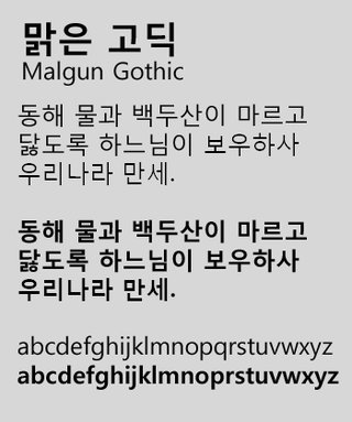
Malgun Gothic is a Korean sans-serif typeface developed by Sandoll Communications, with hinting by Monotype Imaging, as a replacement of Dotum and Gulim as the default system font for the Korean language. It was first shipped with Windows Vista and Windows Server 2008, being available to download later for Windows XP and Windows Server 2003 users. The name "malgun" means "clear" in Korean, thus making a direct translation of the font's name "Clear Gothic."

References

  1. 1 2 Bosma, Jelle (22 March 2018). "Classifying Cambria (comments on discussion thread)". Type Drawers. Retrieved 10 October 2018.
  2. "Profile of Jelle Bosma". Monotype. Archived from the original on 2014-10-31. Retrieved 2014-11-25.
  3. Levien, Raph. "Microsoft's ClearType Font Collection: A Fair and Balanced Review". Typographica. Retrieved 24 November 2014.
  4. Butterick, Matthew. "Cambria alternatives". Butterick's Practical Typography. Retrieved 24 November 2014.
  5. Rhatigan, Daniel (September 2007). "Three Typefaces for Mathematics - The development of Times 4-line Mathematics Series 569, AMS Euler, and Cambria Math" (PDF). University of Reading. Archived from the original (PDF) on December 29, 2009. Retrieved 2009-01-03.{{cite journal}}: Cite journal requires |journal= (help) See also video recording of presentation at TUG 2008 Archived 2014-08-27 at the Wayback Machine
  6. "Download Excel Viewer from Official Microsoft Download Center". Microsoft.
  7. "Download PowerPoint Viewer from Official Microsoft Download Center". Microsoft.
  8. "Download Microsoft Office Compatibility Pack for Word, Excel, and PowerPoint File Formats from Official Microsoft Download Center". Microsoft.
  9. "Download Open XML File Format Converter for Mac 1.2.1 from Official Microsoft Download Center". Microsoft. Archived from the original on 2013-05-05. Retrieved 2013-02-19.
  10. "A thank you to Google from Desktop Linux". GNOME Blog. 10 October 2013.
  11. M. Goossens (Ed.) (2008) The XeTeX Companion: TeX meets OpenType and Unicode, p. 90
  12. LuaTeX reference manual Archived 2010-07-17 at the Wayback Machine