Electra (typeface)

Last updated
Electra
ElectraSpecimen.svg
Category Serif
Classification Transitional
Designer(s) W.A. Dwiggins
Foundry Linotype
Date released1935 (roman/oblique)
1940 (cursive)
VariationsElectric
Azuza
Parkinson Electra
Poets Electra
LfA Aluminia (shown)
Also known asElante
Transitional 521

Electra is a serif typeface designed by William Addison Dwiggins and published by the Mergenthaler Linotype Company from 1935 onwards. A book face intended for body text, Dwiggins described the design as intended to be a 'modern roman type letter' with 'personality', avoiding direct revival of any historical model. He therefore chose the name Electra to suggest electricity and crisp modernity, "like metal shavings coming off a lathe". [1] [2] [3]

Contents

After a slow development process, Electra became a popular book typeface in American printing during the late metal type period. [4] After an eclipse in popularity, partly due to poor translation of the design to modern printing technologies, several revivals have been released.

Background

Electra with cursive Linotype Electra Type Specimen (34534069663).jpg
Electra with cursive

After establishing a career as a lettering artist and book designer, Dwiggins was hired as a consultant by the Mergenthaler Linotype Company in 1929 and established a partnership with its head of type design Chauncey H. Griffith, who would manage the production of all his typefaces for the rest of his career. [5] Dwiggins's first typeface was Metro, a sans-serif intended as an answer to new European faces such as Futura and Gill Sans, which were experiencing a vogue.

Electra in metal type with its original oblique. A more conventional italic was later added. Electra type specimen (8757329161).jpg
Electra in metal type with its original oblique. A more conventional italic was later added.

After Metro, Dwiggins set out to design a serif book typeface for long-form reading. His stated intention was to avoid the historical revival approach of most contemporary book faces, which imitated type designs from the Renaissance. Dwiggins marketed the design with a whimsical brochure, Emblems and Electra, in which he claimed the design to be the result of communing with the spirit of Kōbō-Daishi, the Japanese monk famous as a calligrapher and educator. [1] [6] Vincent Connare suggests that Electra's narrow, monoline serifs make it look somewhat similar to the typefaces of Pierre-Simon Fournier in the eighteenth century, and it is for this reason that it is generally classified as "transitional". [7] The swash tail of “Q” is also reminiscent of the types of John Baskerville.

In metal, Electra was offered with text figures and two different lengths of descenders; the longer of the two (favored by Dwiggins) required leading, while the shorter could be set solid. [3]

The original release of Electra did not include an italic, with Dwiggins instead choosing to offer an oblique in which the letterforms are slanted without taking on any handwriting characteristics; this was apparently influenced by the arguments of Stanley Morison, who promoted the idea as a more appropriate secondary type than a cursive italic. This did not prove popular, however, and Dwiggins designed a true italic, named "Electra Cursive", which was released in 1940. [4] From this point Electra became a popular book type in American printing: Walter Tracy described it as a "modern classic" in American bookwork, although he felt Dwiggins' italic, his first to be published as a type design, was awkwardly balanced in some characters. [4] In Britain, the war prevented Electra Cursive's release, and the typeface never attained the same popularity. [3]

Digital revivals and interpretations

Electra was digitized in 1994 by Alex Kaczun for Linotype and Adobe. Both a standard and display cut were produced in regular and boldface, although even the standard cut appears thin at typical text sizes (a common issue with early digitizations of metal type). This version uses the longer descenders from the metal version; the italic is Electra Cursive. Although for the most part an exact copy of the outlines of the metal type, the lowercase "f" is given a longer overhang, without the restrictions of the Linotype machine. The Linotype release features separate fonts for small caps and text figures, while the Adobe release incorporates these as OpenType features. [8] [9]

Bitstream digitized Electra as Transitional 521; it is the most basic of the digital offerings, with only a basic Latin character set and few typographic features. [10] The italic, which uses Electra Cursive, is available only in the regular weight. A version of this design released by Tilde has a wider range of accented and special characters, but no additional weights or features.

Compugraphic’s cold type Electra copy, Elante, is available digitally from Monotype. It uses the shorter descenders from the metal version of Electra.

Jim Parkinson has created several fonts based on the original Electra:

Poets Electra is a custom digitization drawn by Christian Schwartz and Miguel Reyes of Commercial Type for the Academy of American Poets. [16] They chose to work from the 8-point metal type of Electra in response to the project's requirement of a font to be used on the world wide web, the accommodations in physical type for very small print sizes being similar to those in digital fonts for text sizes on screen. [17] A slightly heavier version, Poets Electra No. 2, was also produced for use in the academy's official printed matter.

Cyrus Highsmith has designed several newsfaces inspired by Dwiggins's work. Of these, Prensa (1999, for La Prensa Gráfica of El Salvador) is the most directly influenced by Electra. It features a particularly restrained italic reminiscent of Electra's original oblique, using cursive letterforms that nevertheless hew more closely to the roman than to handwriting.

See also

Related Research Articles

Palatino Typeface

Palatino is the name of an old-style serif typeface designed by Hermann Zapf, initially released in 1949 by the Stempel foundry and later by other companies, most notably the Mergenthaler Linotype Company.
Optima

Optima is a humanist sans-serif typeface designed by Hermann Zapf and released by the D. Stempel AG foundry, Frankfurt, Germany in 1958.

Times New Roman Canonical serif font

Times New Roman is a serif typeface. It was commissioned by the British newspaper The Times in 1931 and conceived by Stanley Morison, the artistic adviser to the British branch of the printing equipment company Monotype, in collaboration with Victor Lardent, a lettering artist in The Times's advertising department. It has become one of the most popular typefaces of all time and is installed on most desktop computers.

Helvetica 1957 sans-serif typeface developed by Max Miedinger

Helvetica or Neue Haas Grotesk is a widely used sans-serif typeface developed in 1957 by Swiss typeface designer Max Miedinger with input from Eduard Hoffmann.

Frutiger (typeface)

Frutiger is a series of typefaces named after its Swiss designer, Adrian Frutiger. Frutiger is a humanist sans-serif typeface, intended to be clear and highly legible at a distance or at small text sizes. A very popular design worldwide, type designer Steve Matteson described its structure as "the best choice for legibility in pretty much any situation" at small text sizes, while Erik Spiekermann named it as "the best general typeface ever".

Italic type Font style characterised by cursive typeface and slanted design

In typography, italic type is a cursive font based on a stylised form of calligraphic handwriting. Owing to the influence from calligraphy, italics normally slant slightly to the right. Italics are a way to emphasise key points in a printed text, to identify many types of creative works, to cite foreign words or phrases, or, when quoting a speaker, a way to show which words they stressed. One manual of English usage described italics as "the print equivalent of underlining"; in other words, underscore in a manuscript directs a typesetter to use italic.

Univers

Univers is the name of a large sans-serif typeface family designed by Adrian Frutiger and released by his employer Deberny & Peignot in 1957. Classified as a neo-grotesque sans-serif, one based on the model of nineteenth-century German typefaces such as Akzidenz-Grotesk, it was notable for its availability from the moment of its launch in a comprehensive range of weights and widths. The original marketing for Univers deliberately referenced the periodic table to emphasise its scope.

William Addison Dwiggins

William Addison Dwiggins, was an American type designer, calligrapher, and book designer. He attained prominence as an illustrator and commercial artist, and he brought to the designing of type and books some of the boldness that he displayed in his advertising work. His work can be described as ornamented and geometric, similar to the Art Moderne and Art Deco styles of the period, using Oriental influences and breaking from the more antiquarian styles of his colleagues and mentors Updike, Cleland and Goudy.
Myriad (typeface)

Myriad is a humanist sans-serif typeface designed by Robert Slimbach and Carol Twombly for Adobe Systems. Myriad was intended as a neutral, general-purpose typeface that could fulfill a range of uses and have a form easily expandable by computer-aided design to a large range of weights and widths.

Oblique type is a form of type that slants slightly to the right, used for the same purposes as italic type. Unlike italic type, however, it does not use different glyph shapes; it uses the same glyphs as roman type, except slanted. Oblique and italic type are technical terms to distinguish between the two ways of creating slanted font styles; oblique designs may be labelled italic by companies selling fonts or by computer programs. Oblique designs may also be called slanted or sloped roman styles. Oblique fonts, as supplied by a font designer, may be simply slanted, but this is often not the case: many have slight corrections made to them to give curves more consistent widths, so they retain the proportions of counters and the thick-and-thin quality of strokes from the regular design.
Font Particular size, weight and style of a typeface

In metal typesetting, a font was a particular size, weight and style of a typeface. Each font was a matched set of type, one piece for each glyph, and a typeface consisting of a range of fonts that shared an overall design.

Bookman (typeface)

Bookman or Bookman Old Style, is a serif typeface. A wide, legible design that is slightly bolder than most body text faces, Bookman has been used for both display typography and for printing at small sizes such as in trade printing, and less commonly for body text. In advertising use it is particularly associated with the graphic design of the 1960s and 1970s, when revivals of it were very popular.
Albertus (typeface)

Albertus is a glyphic serif display typeface designed by Berthold Wolpe in the period 1932 to 1940 for the British branch of the printing company Monotype. Wolpe named the font after Albertus Magnus, the thirteenth-century German philosopher and theologian.

Goudy Old Style

Goudy Old Style is an old-style serif typeface originally created by Frederic W. Goudy for American Type Founders (ATF) in 1915.

Syntax (typeface)

Syntax comprises a family of fonts designed by Swiss typeface designer Hans Eduard Meier. Originally just a sans-serif font, it was extended with additional serif designs.
News Gothic

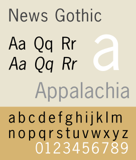
News Gothic is a sans-serif typeface in the grotesque or industrial style. It was designed by Morris Fuller Benton and released in 1908 by his employer American Type Founders (ATF). News Gothic is similar in proportion and structure to Franklin Gothic, also designed by Benton, but lighter.

Caledonia (typeface)

Caledonia is a serif typeface designed by William Addison Dwiggins in 1938 for the Mergenthaler Linotype Company and commonly used in book design. As a transitional serif design, one inspired by the Scotch Roman typefaces of the early nineteenth century, Caledonia has a contrasting design of alternating thick and thin strokes, a design that stresses the vertical axis and sharp, regular serifs on ascenders and descenders.
Jim Parkinson

Jim Parkinson is an American type designer in Oakland, California.
Cloister (typeface)

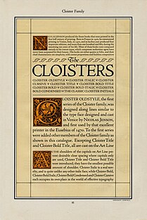
Cloister is a serif typeface that was designed by Morris Fuller Benton and published by American Type Founders from around 1913. It is loosely based on the printing of Nicolas Jenson in Venice in the 1470s, in what is now called the "old style" of serif fonts. American Type Founders presented it as an attractive but highly usable serif typeface, suitable both for body text and display use.
Metro (typeface)

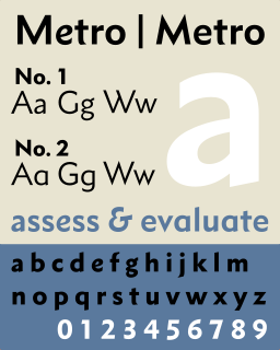
Metro is a sans-serif typeface family created by William Addison Dwiggins and released by the American Mergenthaler Linotype Company from 1929 onwards.

References

  1. 1 2 Leslie Cabarga (15 February 2004). Logo, Font & Lettering Bible. Adams Media. p. 205. ISBN   1-58180-436-9.
  2. Shaw, Paul. "William Addison Dwiggins: Jack of All Trades, Master of More than One". Linotype. Retrieved 26 December 2015.
  3. 1 2 3 Williamson, Hugh (1956). Methods of Book Design. Oxford University Press. p. 103. [Quoting a letter from Dwiggins]: an effort to produce a fast-moving face a little out of the line of "old face" or "modern". I think the name Electra suggested itself as a possible expression of electric energy and fast pace.'
  4. 1 2 3 Tracy, Walter (January 2003). Letters of Credit: A View of Type Design. D.R. Godine. pp. 174–194. ISBN   978-1-56792-240-0.
  5. Shaw, Paul. "The Evolution of Metro and its Reimagination as Metro Nova". Typographica. Retrieved 21 December 2016.
  6. Coles, Stephen. "Warm Animal Blood: Dwiggins' Mark on Contemporary Type Design". Typographica. Retrieved 4 July 2017.
  7. "The Type Designs of William Addison Dwiggins". Vincent Connare. Retrieved 4 July 2017.
  8. "Adobe Electra". MyFonts. Adobe. Retrieved 2 September 2015.
  9. "Electra Linotype". MyFonts. Linotype. Retrieved 2 September 2015.
  10. "Transitional 521". MyFonts. Retrieved 10 November 2017.
  11. "Electric". Jim Parkinson Type Design. Retrieved 10 November 2017.
  12. "Richmond". MyFonts . Retrieved 2 October 2016.
  13. "Azuza". Fonts in Use. Retrieved 10 November 2017.
  14. Parkinson, Jim. "Parkinson Electra". MyFonts. Linotype. Retrieved 2 September 2015.
  15. "Recasting Electra as Aluminia". Letterform Archive . Retrieved 10 November 2017.
  16. "Poets Electra for poets.org". Commercial Type. Retrieved 10 November 2017.
  17. "Our New Typeface: Poets Electra". Academy of American Poets. Retrieved 10 November 2017.