
The Cyrillic script is a writing system used for various languages across Eurasia and is used as the national script in various Slavic, Turkic, Mongolic, Uralic, Caucasian and Iranic-speaking countries in Southeastern Europe, Eastern Europe, the Caucasus, Central Asia, North Asia and East Asia.
The term glyph is used in typography, graphonomics and archaeology.

Palaeography (UK) or paleography is the study of historic writing systems and the deciphering and dating of historical manuscripts, including the analysis of historic handwriting. It is concerned with the forms and processes of writing; not the textual content of documents. Included in the discipline is the practice of deciphering, reading, and dating manuscripts, and the cultural context of writing, including the methods with which writing and books were produced, and the history of scriptoria.

Q, or q, is the seventeenth letter of the modern English alphabet and the ISO basic Latin alphabet. Its name in English is cue, plural cues.

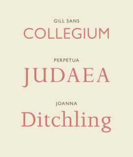
Typography is the art and technique of arranging type to make written language legible, readable and appealing when displayed. The arrangement of type involves selecting typefaces, point sizes, line lengths, line-spacing (leading), and letter-spacing (tracking), and adjusting the space between pairs of letters (kerning). The term typography is also applied to the style, arrangement, and appearance of the letters, numbers, and symbols created by the process. Type design is a closely related craft, sometimes considered part of typography; most typographers do not design typefaces, and some type designers do not consider themselves typographers. Typography also may be used as an ornamental and decorative device, unrelated to the communication of information.
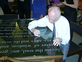
Hermann Zapf was a German type designer and calligrapher who lived in Darmstadt, Germany. He was married to the calligrapher and typeface designer Gudrun Zapf-von Hesse. Typefaces he designed include Palatino, Optima, and Zapfino.

Calligraphy is a visual art related to writing. It is the design and execution of lettering with a pen, ink brush, or other writing instrument. A contemporary calligraphic practice can be defined as "the art of giving form to signs in an expressive, harmonious, and skillful manner".
Type design is the art and process of designing typefaces. This involves drawing each letterform using a consistent style. The basic concepts and design variables are described below.

A typeface is the design of lettering that can include variations in size, weight, slope, width, and so on. Each of these variations of the typeface is a font.

In typography, italic type is a cursive font based on a stylised form of calligraphic handwriting. Owing to the influence from calligraphy, italics normally slant slightly to the right. Italics are a way to emphasise key points in a printed text, to identify many types of creative works, to cite foreign words or phrases, or, when quoting a speaker, a way to show which words they stressed. One manual of English usage described italics as "the print equivalent of underlining"; in other words, underscore in a manuscript directs a typesetter to use italic.

In writing and typography, a ligature occurs where two or more graphemes or letters are joined to form a single glyph. Examples are the characters æ and œ used in English and French, in which the letters 'a' and 'e' are joined for the first ligature and the letters 'o' and 'e' are joined for the second ligature. For stylistic and legibility reasons, 'f' and 'i' are often merged to create 'fi' ; the same is true of 's' and 't' to create 'st'. The common ampersand (&) developed from a ligature in which the handwritten Latin letters 'e' and 't' were combined.

Antiqua is a style of typeface used to mimic styles of handwriting or calligraphy common during the 15th and 16th centuries. Letters are designed to flow and strokes connect together in a continuous fashion; in this way it is often contrasted with Fraktur-style typefaces where the individual strokes are broken apart. The two typefaces were used alongside each other in the germanophone world, with the Antiqua–Fraktur dispute often dividing along ideological or political lines. After the mid-20th century, Fraktur fell out of favor and Antiqua-based typefaces became the official standard.
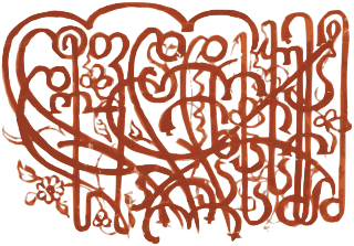
Western calligraphy is the art of writing and penmanship as practiced in the Western world, especially using the Latin alphabet.
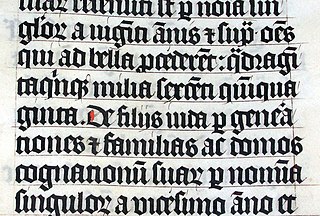
Scribal abbreviations or sigla are abbreviations used as a critical apparatus by ancient and medieval scribes writing in various languages, including Latin, Greek, Old English and Old Norse. In modern manuscript editing sigla are the symbols used to indicate the source manuscript and to identify the copyists of a work.

In orthography and typography, a homoglyph is one of two or more graphemes, characters, or glyphs with shapes that appear identical or very similar. The designation is also applied to sequences of characters sharing these properties.

Zapfino is a calligraphic typeface designed for Linotype by typeface designer Hermann Zapf in 1998. It is based on an alphabet Zapf originally penned in 1944. As a font, it makes extensive use of ligatures and character variations.

A letter is a segmental symbol of a phonemic writing system. The inventory of all letters forms the alphabet. Letters broadly correspond to phonemes in the spoken form of the language, although there is rarely a consistent, exact correspondence between letters and phonemes.
Russian cursive is a printed variant of the Russian alphabet, typically referred to as (ру́сский) рукопи́сный шрифт (rússky) rukopísny shrift, "(Russian) handwritten font". It is the handwritten form of the modern Russian Cyrillic script, used instead of the block letters seen in printed material. In addition, Russian italics for lowercase letters are often based on Russian cursive. Most handwritten Russian, especially in personal letters and schoolwork, uses the cursive alphabet. In Russian schools most children are taught from first grade how to write with this script.

Script typefaces are based upon the varied and often fluid stroke created by handwriting. They are generally used for display or trade printing, rather than for extended body text in the Latin alphabet. Some Greek alphabet typefaces, especially historically, have been a closer simulation of handwriting.
Arabic typography is the typography of letters, graphemes, characters or text in Arabic script, for example for writing Arabic, Persian, or Urdu. 16th century Arabic typography was a by-product of Latin typography with Syriac and Latin proportions and aesthetics. It lacked expertise in the three core aspects of Arabic writing: calligraphy, style and system. Calligraphy requires aesthetically skilled writing in a chosen canonical style such as naskh, nastaʿlīq or ruqʿah. System denotes the script grammar covering such rules as horizontality and stretching.
