In user interface design, a menu is a list of options presented to the user.

A checkbox is a graphical widget that allows the user to make a binary choice, i.e. a choice between one of two possible mutually exclusive options. For example, the user may have to answer 'yes' (checked) or 'no' on a simple yes/no question.

A radio button or option button is a graphical control element that allows the user to choose only one of a predefined set of mutually exclusive options. The singular property of a radio button makes it distinct from checkboxes, where the user can select and unselect any number of items.

In computer graphical user interfaces, drag and drop is a pointing device gesture in which the user selects a virtual object by "grabbing" it and dragging it to a different location or onto another virtual object. In general, it can be used to invoke many kinds of actions, or create various types of associations between two abstract objects.

Mission Control is a feature of the macOS operating system. Dashboard, Exposé, and Spaces were combined and renamed Mission Control in 2011 with the release of Mac OS X 10.7 Lion. Exposé was first previewed on June 23, 2003, at the Apple Worldwide Developers Conference as a feature of the then forthcoming Mac OS X 10.3 Panther.
A graphical widget in a graphical user interface is an element of interaction, such as a button or a scroll bar. Controls are software components that a computer user interacts with through direct manipulation to read or edit information about an application. User interface libraries such as Windows Presentation Foundation, Qt, GTK, and Cocoa, contain a collection of controls and the logic to render these.
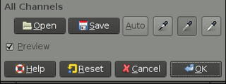
In computing, a button is a graphical control element that provides the user a simple way to trigger an event, like searching for a query at a search engine, or to interact with dialog boxes, like confirming an action.

The Option key, ⌥, is a modifier key present on Apple keyboards. It is located between the Control key and the Command key on a typical Mac keyboard. There are two Option keys on modern Mac desktop and notebook keyboards, one on each side of the space bar.
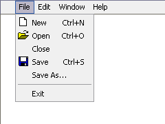
A menu bar is a graphical control element which contains drop-down menus.
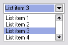
A drop-down list is a graphical control element, similar to a list box, that allows the user to choose one value from a list either by clicking or hovering over the menu. When a drop-down list is inactive, it displays a single value. When activated, it displays a list of values, from which the user may select one. When the user selects a new value, the control reverts to its inactive state, displaying the selected value. It is often used in the design of graphical user interfaces, including web design.
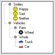
A tree view is a graphical widget within a graphical user interface (GUI) in which users can navigate and interact intuitively with concise, hierarchical data presented as nodes in a tree-like format. It can also be called an outline view.
A webform, web form or HTML form on a web page allows a user to enter data that is sent to a server for processing. Forms can resemble paper or database forms because web users fill out the forms using checkboxes, radio buttons, or text fields. For example, forms can be used to enter shipping or credit card data to order a product, or can be used to retrieve search results from a search engine.
Compared with previous versions of Microsoft Windows, features new to Windows Vista are very numerous, covering most aspects of the operating system, including additional management features, new aspects of security and safety, new I/O technologies, new networking features, and new technical features. Windows Vista also removed some others.
The Windows shell is the graphical user interface for the Microsoft Windows operating system. Its readily identifiable elements consist of the desktop, the taskbar, the Start menu, the task switcher and the AutoPlay feature. On some versions of Windows, it also includes Flip 3D and the charms. In Windows 10, the Windows Shell Experience Host interface drives visuals like the Start Menu, Action Center, Taskbar, and Task View/Timeline. However, the Windows shell also implements a shell namespace that enables computer programs running on Windows to access the computer's resources via the hierarchy of shell objects. "Desktop" is the top object of the hierarchy; below it there are a number of files and folders stored on the disk, as well as a number of special folders whose contents are either virtual or dynamically created. Recycle Bin, Libraries, Control Panel, This PC and Network are examples of such shell objects.

This article details features of the Opera web browser.

To shut down or power off a computer is to remove power from a computer's main components in a controlled way. After a computer is shut down, main components such as CPUs, RAM modules and hard disk drives are powered down, although some internal components, such as an internal clock, may retain power.

A list builder, also known as a dual list, dual listbox, disjoint listbox, list shuttle, shuttle, swaplist, transfer list and two sided multi select, is a graphical control element in which a user can select a set of text values by moving values between two list boxes, one representing selected values and the other representing unselected ones. Moving values back and forth is usually accomplished selecting values within one of the two lists and clicking buttons reading "Add" and "Remove", rather than by dragging and dropping them. Less traditionally, there may instead be an add or delete button individually next to each item. The widget can sometimes also include the ability to rearrange the selected values. There may also be buttons to add or remove all values, or a text field to filter the list.