Color or colour is the visual perceptual property deriving from the spectrum of light interacting with the photoreceptor cells of the eyes. Color categories and physical specifications of color are associated with objects or materials based on their physical properties such as light absorption, reflection, or emission spectra. By defining a color space, colors can be identified numerically by their coordinates.

Color blindness or color vision deficiency (CVD) is the decreased ability to see color or differences in color. It can impair tasks such as selecting ripe fruit, choosing clothing, and reading traffic lights. Color blindness may make some academic activities more difficult. However, issues are generally minor, and the colorblind automatically develop adaptations and coping mechanisms. People with total color blindness (achromatopsia) may also be uncomfortable in bright environments and have decreased visual acuity.

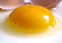
Yellow is the color between green and orange on the spectrum of light. It is evoked by light with a dominant wavelength of roughly 575–585 nm. It is a primary color in subtractive color systems, used in painting or color printing. In the RGB color model, used to create colors on television and computer screens, yellow is a secondary color made by combining red and green at equal intensity. Carotenoids give the characteristic yellow color to autumn leaves, corn, canaries, daffodils, and lemons, as well as egg yolks, buttercups, and bananas. They absorb light energy and protect plants from photo damage in some cases. Sunlight has a slight yellowish hue when the Sun is near the horizon, due to atmospheric scattering of shorter wavelengths.

The CMYK color model is a subtractive color model, based on the CMY color model, used in color printing, and is also used to describe the printing process itself. The abbreviation CMYK refers to the four ink plates used: cyan, magenta, yellow, and key (black).

A set of primary colors or primary colours consists of colorants or colored lights that can be mixed in varying amounts to produce a gamut of colors. This is the essential method used to create the perception of a broad range of colors in, e.g., electronic displays, color printing, and paintings. Perceptions associated with a given combination of primary colors can be predicted by an appropriate mixing model that reflects the physics of how light interacts with physical media, and ultimately the retina.

Magenta is a color that is variously defined as pinkish-purplish-red, reddish-purplish-pink or mauvish-crimson. On color wheels of the RGB (additive) and CMY (subtractive) color models, it is located exactly midway between red and blue. It is one of the four colors of ink used in color printing by an inkjet printer, along with yellow, black, and cyan, to make all other colors. The tone of magenta used in printing is called "printer's magenta". It is also a shade of purple.

Pleochroism is an optical phenomenon in which a substance has different colors when observed at different angles, especially with polarized light.

Gold, also called golden, is a color tone resembling the gold chemical element.

Complementary colors are pairs of colors which, when combined or mixed, cancel each other out by producing a grayscale color like white or black. When placed next to each other, they create the strongest contrast for those two colors. Complementary colors may also be called "opposite colors".
In the visual arts, color theory is the body of practical guidance for color mixing and the visual effects of a specific color combination. Color terminology based on the color wheel and its geometry separates colors into primary color, secondary color, and tertiary color. The understanding of color theory dates to antiquity. Aristotle and Claudius Ptolemy already discussed which and how colors can be produced by mixing other colors. The influence of light on color was investigated and revealed further by al-Kindi and Ibn al-Haytham (d.1039). Ibn Sina, Nasir al-Din al-Tusi, and Robert Grosseteste discovered that contrary to the teachings of Aristotle, there are multiple color paths to get from black to white. More modern approaches to color theory principles can be found in the writings of Leone Battista Alberti and the notebooks of Leonardo da Vinci. A formalization of "color theory" began in the 18th century, initially within a partisan controversy over Isaac Newton's theory of color and the nature of primary colors. From there it developed as an independent artistic tradition with only superficial reference to colorimetry and vision science.

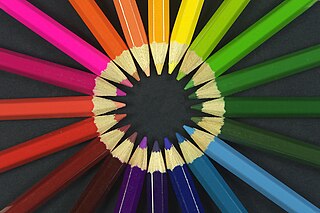
A color wheel or color circle is an abstract illustrative organization of color hues around a circle, which shows the relationships between primary colors, secondary colors, tertiary colors etc.

A tertiary color or intermediate color is a color made by mixing full saturation of one primary color with half saturation of another primary color and none of a third primary color, in a given color space such as RGB, CMYK or RYB (traditional).

Chapel Hill-Carrboro City Schools (CHCCS) is a school district which educates over 12,000 students in the southeastern part of Orange County, North Carolina. Being near three major universities as well as the Research Triangle Park, it serves one of the best educated populations in the United States. It is the school district for most of Chapel Hill and all of Carrboro, including schools from elementary through high school. It is financed through property taxes, including a city supplement, as well as state and federal funds. The administrative center is located at Lincoln Center at 750 South Merritt Mill Road. Lincoln Center is the site of the former all-black high school. Services are available for gifted, special needs, and limited English proficiency students.

Chinese culture attaches certain values to colors, like which colors are considered auspicious (吉利) or inauspicious (不利). The Chinese word for "color" is yánsè (顏色). In Classical Chinese, the character sè (色) more accurately meant "color in the face", or "emotion". It was generally used alone and often implied sexual desire or desirability. During the Tang Dynasty, the word yánsè came to mean all color. A Chinese idiom which is used to describe many colors, Wǔyánliùsè (五顏六色), can also mean colors in general.
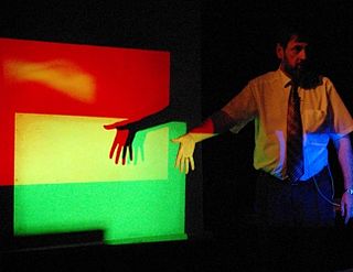
There are three types of color mixing: additive, subtractive, and average. In first two cases, mixing is typically described in terms of three primary colors and three secondary colors. Subtractive mixing with all three primaries will result in black, while additive mixing with all three primaries will result in white.
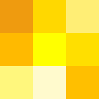
Varieties of the color yellow may differ in hue, chroma or lightness, or in two or three of these qualities. Variations in value are also called tints and shades, a tint being a yellow or other hue mixed with white, a shade being mixed with black. A large selection of these various colors is shown below.

Vase with Poppies is an 1886 oil painting created in Paris, France by Post-Impressionist Dutch artist Vincent van Gogh.

Still Life: Vase with Pink Roses was painted in 1890 by Vincent van Gogh in Saint-Rémy. At the time the work was painted Van Gogh was readying himself to leave the Saint-Rémy asylum for the quiet town of Auvers-sur-Oise outside of Paris. This and the similarly-dated Pink Roses reflect the optimism Van Gogh felt at that time about his future, both in his choice of flowers as a subject and the colors used. The painting is owned by the National Gallery of Art of Washington, D.C.