A histogram is a visual representation of the distribution of quantitative data. The term was first introduced by Karl Pearson. To construct a histogram, the first step is to "bin" the range of values— divide the entire range of values into a series of intervals—and then count how many values fall into each interval. The bins are usually specified as consecutive, non-overlapping intervals of a variable. The bins (intervals) are adjacent and are typically of equal size.

The Pareto principle states that for many outcomes, roughly 80% of consequences come from 20% of causes.

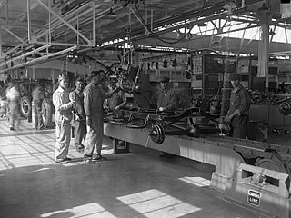
Quality control (QC) is a process by which entities review the quality of all factors involved in production. ISO 9000 defines quality control as "a part of quality management focused on fulfilling quality requirements".
Total quality management (TQM) consists of organization-wide efforts to "install and make permanent climate where employees continuously improve their ability to provide on demand products and services that customers will find of particular value." "Total" emphasizes that departments in addition to production are obligated to improve their operations; "management" emphasizes that executives are obligated to actively manage quality through funding, training, staffing, and goal setting. While there is no widely agreed-upon approach, TQM efforts typically draw heavily on the previously developed tools and techniques of quality control. TQM enjoyed widespread attention during the late 1980s and early 1990s before being overshadowed by ISO 9000, Lean manufacturing, and Six Sigma.

A chart is a graphical representation for data visualization, in which "the data is represented by symbols, such as bars in a bar chart, lines in a line chart, or slices in a pie chart". A chart can represent tabular numeric data, functions or some kinds of quality structure and provides different info.
Six Sigma (6σ) is a set of techniques and tools for process improvement. It was introduced by American engineer Bill Smith while working at Motorola in 1986.
Quality assurance (QA) is the term used in both manufacturing and service industries to describe the systematic efforts taken to assure that the product(s) delivered to customer(s) meet with the contractual and other agreed upon performance, design, reliability, and maintainability expectations of that customer. The core purpose of Quality Assurance is to prevent mistakes and defects in the development and production of both manufactured products, such as automobiles and shoes, and delivered services, such as automotive repair and athletic shoe design. Assuring quality and therefore avoiding problems and delays when delivering products or services to customers is what ISO 9000 defines as that "part of quality management focused on providing confidence that quality requirements will be fulfilled". This defect prevention aspect of quality assurance differs from the defect detection aspect of quality control and has been referred to as a shift left since it focuses on quality efforts earlier in product development and production and on avoiding defects in the first place rather than correcting them after the fact.

A bar chart or bar graph is a chart or graph that presents categorical data with rectangular bars with heights or lengths proportional to the values that they represent. The bars can be plotted vertically or horizontally. A vertical bar chart is sometimes called a column chart.
Kaoru Ishikawa was a Japanese organizational theorist and a professor in the engineering faculty at the University of Tokyo who was noted for his quality management innovations. He is considered a key figure in the development of quality initiatives in Japan, particularly the quality circle. He is best known outside Japan for the Ishikawa or cause and effect diagram, often used in the analysis of industrial processes.
In the context of software engineering, software quality refers to two related but distinct notions:
Operations management is concerned with designing and controlling the production of goods and services, ensuring that businesses are efficient in using resources to meet customer requirements.
DMAIC or define, measure, analyze, improve and control refers to a data-driven improvement cycle used for optimizing and stabilizing business processes and designs. The DMAIC improvement cycle is the core tool used to drive Six Sigma projects. However, DMAIC is not exclusive to Six Sigma and can be used as the framework for other improvement applications.
Certified Quality Engineer, often abbreviated CQE, is a certification given by the American Society for Quality (ASQ). These engineers are professionally educated in quality engineering and quality control.
Zero Defects was a management-led program to eliminate defects in industrial production that enjoyed brief popularity in American industry from 1964 to the early 1970s. Quality expert Philip Crosby later incorporated it into his "Absolutes of Quality Management" and it enjoyed a renaissance in the American automobile industry—as a performance goal more than as a program—in the 1990s. Although applicable to any type of enterprise, it has been primarily adopted within supply chains wherever large volumes of components are being purchased.

The seven basic tools of quality are a fixed set of visual exercises identified as being most helpful in troubleshooting issues related to quality. They are called basic because they are suitable for people with little formal training in statistics and because they can be used to solve the vast majority of quality-related issues.
Quality engineering is the discipline of engineering concerned with the principles and practice of product and service quality assurance and control. In software development, it is the management, development, operation and maintenance of IT systems and enterprise architectures with high quality standard.

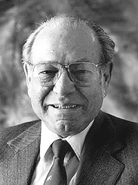
Joseph Moses Juran was a Romanian-born American engineer, management consultant and author. He was an advocate for quality and quality management and wrote several books on the topics. He was the brother of Academy Award winner Nathan Juran.
The acceptable quality limit (AQL) is the worst tolerable process average (mean) in percentage or ratio that is still considered acceptable; that is, it is at an acceptable quality level. Closely related terms are the rejectable quality limit and rejectable quality level (RQL). In a quality control procedure, a process is said to be at an acceptable quality level if the appropriate statistic used to construct a control chart does not fall outside the bounds of the acceptable quality limits. Otherwise, the process is said to be at a rejectable control level.
In quality control, multi-vari charts are a visual way of presenting variability through a series of charts. The content and format of the charts has evolved over time.
Dorian Shainin was an American quality consultant, aeronautics engineer, author, and college professor most notable for his contributions in the fields of industrial problem solving, product reliability, and quality engineering, particularly the creation and development of the "Red X" concept.

