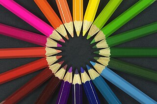
Color or colour is the visual perception based on the electromagnetic spectrum. Though color is not an inherent property of matter, color perception is related to an object's light absorption, reflection, emission spectra and interference. For most humans, colors are perceived in the visible light spectrum with three types of cone cells (trichromacy). Other animals may have a different number of cone cell types or have eyes sensitive to different wavelength, such as bees that can distinguish ultraviolet, and thus have a different color sensitivity range. Animal perception of color originates from different light wavelength or spectral sensitivity in cone cell types, which is then processed by the brain.
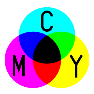
Cyan is the color between blue and green on the visible spectrum of light. It is evoked by light with a predominant wavelength between 490 and 520 nm, between the wavelengths of green and blue.
The RGB color model is an additive color model in which the red, green and blue primary colors of light are added together in various ways to reproduce a broad array of colors. The name of the model comes from the initials of the three additive primary colors, red, green, and blue.

Screen printing is a printing technique where a mesh is used to transfer ink onto a substrate, except in areas made impermeable to the ink by a blocking stencil. A blade or squeegee is moved across the screen to fill the open mesh apertures with ink, and a reverse stroke then causes the screen to touch the substrate momentarily along a line of contact. This causes the ink to wet the substrate and be pulled out of the mesh apertures as the screen springs back after the blade has passed. One colour is printed at a time, so several screens can be used to produce a multi-coloured image or design.

The CMYK color model is a subtractive color model, based on the CMY color model, used in color printing, and is also used to describe the printing process itself. The abbreviation CMYK refers to the four ink plates used: cyan, magenta, yellow, and key (black).

A set of primary colors or primary colours consists of colorants or colored lights that can be mixed in varying amounts to produce a gamut of colors. This is the essential method used to create the perception of a broad range of colors in, e.g., electronic displays, color printing, and paintings. Perceptions associated with a given combination of primary colors can be predicted by an appropriate mixing model that reflects the physics of how light interacts with physical media, and ultimately the retina.

Magenta is a purplish-red color. On color wheels of the RGB (additive) and CMY (subtractive) color models, it is located precisely midway between red and blue. It is one of the four colors of ink used in color printing by an inkjet printer, along with yellow, cyan, and black to make all the other colors. The tone of magenta used in printing, printer's magenta, is redder than the magenta of the RGB (additive) model, the former being closer to rose.
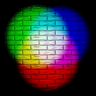
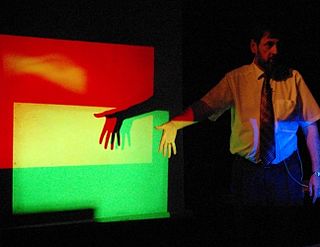
Additive color or additive mixing is a property of a color model that predicts the appearance of colors made by coincident component lights, i.e. the perceived color can be predicted by summing the numeric representations of the component colors. Modern formulations of Grassmann's laws describe the additivity in the color perception of light mixtures in terms of algebraic equations. Additive color predicts perception and not any sort of change in the photons of light themselves. These predictions are only applicable in the limited scope of color matching experiments where viewers match small patches of uniform color isolated against a grey or black background.

In color reproduction and colorimetry, a gamut, or color gamut, is a convex set containing the colors that can be accurately represented, i.e. reproduced by an output device or measured by an input device. Devices with a larger gamut can represent more colors. Similarly, gamut may also refer to the colors within a defined color space, which is not linked to a specific device. A trichromatic gamut is often visualized as a color triangle. A less common usage defines gamut as the subset of colors contained within an image, scene or video.
Color theory, or more specifically traditional color theory, is the historical body of knowledge describing the behavior of colors, namely in color mixing, color contrast effects, color harmony, color schemes and color symbolism. Modern color theory is generally referred to as Color science. While there is no clear distinction in scope, traditional color theory tends to be more subjective and have artistic applications, while color science tends to be more objective and have functional applications, such as in chemistry, astronomy or color reproduction. Color theory dates back at least as far as Aristotle's treatise On Colors. A formalization of "color theory" began in the 18th century, initially within a partisan controversy over Isaac Newton's theory of color and the nature of primary colors. By the end of the 19th century, a schism had formed between traditional color theory and color science.
Subtractive color or subtractive color mixing predicts the spectral power distribution of light after it passes through successive layers of partially absorbing media. This idealized model is the essential principle of how dyes and pigments are used in color printing and photography, where the perception of color is elicited after white light passes through microscopic "stacks" of partially absorbing media allowing some wavelengths of light to reach the eye and not others, and also in painting, whether the colors are mixed or applied in successive layers.
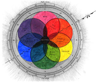
RYB is a subtractive color model used in art and applied design in which red, yellow, and blue pigments are considered primary colors. Under traditional color theory, this set of primary colors was advocated by Moses Harris, Michel Eugène Chevreul, Johannes Itten and Josef Albers, and applied by countless artists and designers. The RYB color model underpinned the color curriculum of the Bauhaus, Ulm School of Design and numerous art and design schools that were influenced by the Bauhaus, including the IIT Institute of Design, Black Mountain College, Design Department Yale University, the Shillito Design School, Sydney, and Parsons School of Design, New York.
Color printing or colour printing is the reproduction of an image or text in color.
A color model is an abstract mathematical model describing the way colors can be represented as tuples of numbers, typically as three or four values or color components. When this model is associated with a precise description of how the components are to be interpreted, taking account of visual perception, the resulting set of colors is called "color space."
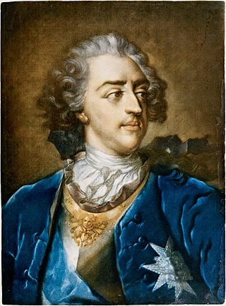
Jacob Christoph Le Blon, or Jakob Christoffel Le Blon, was a painter and engraver from Frankfurt who invented the system of three- and four-colour printing, using an RYB color model which segued into the modern CMYK system. He used the mezzotint method to engrave three or four metal plates to make prints with a wide range of colours. His methods helped form the foundation for modern colour printing.
There are three types of color mixing models, depending on the relative brightness of the resultant mixture: additive, subtractive, and average. In these models, mixing black and white will yield white, black and gray, respectively. Physical mixing processes, e.g. mixing light beams or oil paints, will follow one or a hybrid of these 3 models. Each mixing model is associated with several color models, depending on the approximate primary colors used. The most common color models are optimized to human trichromatic color vision, therefore comprising three primary colors.

A color space is a specific organization of colors. In combination with color profiling supported by various physical devices, it supports reproducible representations of color – whether such representation entails an analog or a digital representation. A color space may be arbitrary, i.e. with physically realized colors assigned to a set of physical color swatches with corresponding assigned color names, or structured with mathematical rigor. A "color space" is a useful conceptual tool for understanding the color capabilities of a particular device or digital file. When trying to reproduce color on another device, color spaces can show whether shadow/highlight detail and color saturation can be retained, and by how much either will be compromised.

Impossible colors are colors that do not appear in ordinary visual functioning. Different color theories suggest different hypothetical colors that humans are incapable of perceiving for one reason or another, and fictional colors are routinely created in popular culture. While some such colors have no basis in reality, phenomena such as cone cell fatigue enable colors to be perceived in certain circumstances that would not be otherwise.

Chromoxylography was a colour woodblock printing process, popular from the mid-19th to the early-20th century, commonly used to produce illustrations in children's books, serial pulp magazines, and cover art for yellow-back and penny dreadfuls. The art of relief engraving and chromoxylography was perfected by engravers and printers in the 19th century, most notably in Victorian London by engraver and printer Edmund Evans who was particularly good with the process, producing a wide range of hues and tones through color mixing. Chromoxylography was a complicated technique, requiring intricate engraving and printing for the best results. Less expensive products, such as covers for pulp magazines, had to be produced with few colours, often only two or three, whereas more intricate and expensive books and reproductions of paintings used as many as a dozen or more colors. For each colour used, a separate woodblock had to be carved of the image being reproduced.
The Academy Color Encoding System (ACES) is a color image encoding system created under the auspices of the Academy of Motion Picture Arts and Sciences. ACES is characterised by a color accurate workflow, with "seamless interchange of high quality motion picture images regardless of source".