Andy (typeface)

Last updated
Andy
Andy-mead-typeface-spec.svg
Category script
Classification Handwriting
Designer(s) Steve Matteson
Foundry Monotype
Date created1991 [1]
Design based onMead Bold
Also known asAndy Std, Andy-Regular

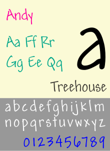
The Andy typeface (originally known as Mead font and is also known as Patrick Hand) is a childish style design by Steve Matteson and owned by Monotype Imaging. This typeface family has a controlled spontaneity feature that combines informality and legibility needed for long documents with handwriting form.

The TrueType versions of this typeface have been tuned to be highly legible at low sizes, a quality level that is called ESQ ("Enhanced Screen Quality"), a term used by the foundry. [2] [3]

Andy Bold is a casual script based on the handwriting of Steve's friend Andy Mead. Its most notable use is as the main font of all text displayed in the 2011 video game Terraria . It is also used on the cartridges for the Pokémon video games and in the closing credits of Top of the Pops spin-off, TOTP2 .

Related Research Articles

<span class="mw-page-title-main">Typography</span> Art of arranging type

Typography is the art and technique of arranging type to make written language legible, readable and appealing when displayed. The arrangement of type involves selecting typefaces, point sizes, line lengths, line-spacing (leading), and letter-spacing (tracking), as well as adjusting the space between pairs of letters (kerning). The term typography is also applied to the style, arrangement, and appearance of the letters, numbers, and symbols created by the process. Type design is a closely related craft, sometimes considered part of typography; most typographers do not design typefaces, and some type designers do not consider themselves typographers. Typography also may be used as an ornamental and decorative device, unrelated to the communication of information.

<span class="mw-page-title-main">Palatino</span> Serif typeface

Palatino is the name of an old-style serif typeface designed by Hermann Zapf, initially released in 1949 by the Stempel foundry and later by other companies, most notably the Mergenthaler Linotype Company.

<span class="mw-page-title-main">Verdana</span> Humanist sans-serif font

Verdana is a humanist sans-serif typeface designed by Matthew Carter for Microsoft Corporation, with hand-hinting done by Thomas Rickner, then at Monotype. Demand for such a typeface was recognized by Virginia Howlett of Microsoft's typography group and commissioned by Steve Ballmer. The name "Verdana" is derived from "verdant" (green) and "Ana".

In typography, a serif is a small line or stroke regularly attached to the end of a larger stroke in a letter or symbol within a particular font or family of fonts. A typeface or "font family" making use of serifs is called a serif typeface, and a typeface that does not include them is sans-serif. Some typography sources refer to sans-serif typefaces as "grotesque" or "Gothic", and serif typefaces as "roman".

<span class="mw-page-title-main">Typeface</span> Set of characters that share common design features

A typeface is a design of letters, numbers and other symbols, to be used in printing or for electronic display. Most typefaces include variations in size, weight, slope, width, and so on. Each of these variations of the typeface is a font.

<span class="mw-page-title-main">Frutiger (typeface)</span> Typeface designed by Adrian Frutiger

Frutiger is a series of typefaces named after its Swiss designer, Adrian Frutiger. Frutiger is a humanist sans-serif typeface, intended to be clear and highly legible at a distance or at small text sizes. A very popular design worldwide, type designer Steve Matteson described its structure as "the best choice for legibility in pretty much any situation" at small text sizes, while Erik Spiekermann named it as "the best general typeface ever".

<span class="mw-page-title-main">Arial</span> Neo-grotesque sans-serif typeface

Arial is a sans-serif typeface and set of computer fonts in the neo-grotesque style. Fonts from the Arial family are included with all versions of Microsoft Windows after Windows 3.1, as well as in other Microsoft programs, Apple's macOS, and many PostScript 3 printers.

<span class="mw-page-title-main">Courier (typeface)</span> Monospaced slab serif font of IBM

Courier is a monospaced slab serif typeface. Courier was created by IBM in the mid-1950s, and was designed by Howard "Bud" Kettler (1919–1999). The Courier name and typeface concept are in the public domain. Courier has been adapted for use as a computer font, and versions of it are installed on most desktop computers.

<span class="mw-page-title-main">Comic Sans</span> Sans-serif typeface family by Microsoft Corporation

Comic Sans MS is a sans-serif typeface designed by Vincent Connare and released in 1994 by Microsoft Corporation. It is a non-connecting script inspired by comic book lettering, intended for use in cartoon speech bubbles, as well as in other casual environments, such as informal documents and children's materials.

<span class="mw-page-title-main">Typography of Apple Inc.</span> Overview of typography of Apple Inc.

Apple Inc. uses a large variety of typefaces in its marketing, operating systems, and industrial design with each product cycle. These change throughout the years with Apple's change of style in their products. This is evident in the design and marketing of the company.

<span class="mw-page-title-main">Lucida</span> Typeface family designed by Charles Bigelow and Kris Holmes in 1984

Lucida is an extended family of related typefaces designed by Charles Bigelow and Kris Holmes and released from 1984 onwards. The family is intended to be extremely legible when printed at small size or displayed on a low-resolution display – hence the name, from 'lucid'.

<span class="mw-page-title-main">Eras</span> Humanist sans-serif typeface

Eras is a humanist sans-serif typeface designed by Albert Boton and Albert Hollenstein and was released by the International Typeface Corporation (ITC) in 1976. Eras is licensed by the Linotype type foundry.

<span class="mw-page-title-main">Georgia (typeface)</span> 1996 typeface by Matthew Carter

Georgia is a serif typeface designed in 1993 by Matthew Carter and hinted by Tom Rickner for Microsoft. It was intended as a serif typeface that would appear elegant but legible when printed small or on low-resolution screens. The typeface is inspired by Scotch Roman designs of the 19th century and was based on designs for a print typeface on which Carter was working when contacted by Microsoft; this would be released under the name Miller the following year. The typeface's name referred to a tabloid headline, "Alien heads found in Georgia."

<span class="mw-page-title-main">Cambria (typeface)</span> Serif font family

Cambria is a transitional serif typeface commissioned by Microsoft and distributed with Windows and Office. It was designed by Dutch typeface designer Jelle Bosma in 2004, with input from Steve Matteson and Robin Nicholas. It is intended as a serif font that is suitable for body text, that is very readable printed small or displayed on a low-resolution screen and has even spacing and proportions.

Segoe is a typeface, or family of fonts, that is best known for its use by Microsoft. The company uses Segoe in its online and printed marketing materials, including recent logos for a number of products. Additionally, the Segoe UI font sub-family is used by numerous Microsoft applications, and may be installed by applications. It was adopted as Microsoft's default operating system font beginning with Windows Vista, and is also used on Outlook.com, Microsoft's web-based email service. In August 2012, Microsoft unveiled its new corporate logo typeset in Segoe, replacing the logo it had used for the previous 25 years.

<span class="mw-page-title-main">Bookman (typeface)</span> 1869 serif typeface

Bookman, or Bookman Old Style, is a serif typeface. A wide, legible design that is slightly bolder than most body text faces, Bookman has been used for both display typography, for trade printing such as advertising, and less commonly for body text. In advertising use it is particularly associated with the graphic design of the 1960s and 1970s, when revivals of it were very popular. It is also used as the official font of Indonesian laws since 2011.

<span class="mw-page-title-main">Sabon</span> Serif typeface

Sabon is an old-style serif typeface designed by the German-born typographer and designer Jan Tschichold (1902–1974) in the period 1964–1967. It was released jointly by the Linotype, Monotype, and Stempel type foundries in 1967. The design of the roman is based on types by Claude Garamond, particularly a specimen printed by the Frankfurt printer Konrad Berner. Berner had married the widow of a fellow printer Jacques Sabon, the source of the face's name, who had bought some of Garamond's type after his death. The italics are based on types designed by a contemporary of Garamond's, Robert Granjon. It is effectively a Garamond revival, though a different name was chosen as many other modern typefaces already carry this name.

Ascender Corporation was a digital typeface foundry and software development company located in the Chicago suburb of Elk Grove Village, Illinois in the United States. It was founded in 2004 by a team of software developers, typographers, and font-industry veterans who had previously been involved in developing fonts used widely in computers, inkjet printers, phones, and other digital technology devices. On December 8, 2010, Ascender Corp. was acquired by Monotype Imaging.

<span class="mw-page-title-main">Freestyle Script</span> Typeface

Freestyle Script is an informal display script typeface that was designed by Colin Brignall in 1969 and Martin Wait in 1981, by Letraset. Freestyle Script is famously used for commercials in 1980s, birthday cards, decorative, logos and many others. The bold version was designed in 1986. The publishers of this font are Adobe, ITC, Monotype Imaging, Elsner+Flake, Esselte Corporation, Scangraphic Type, Linotype, Image Club, and Letraset. This font has few versions, namely Regular, Bold, LT, Plain, LET, EF, SB, SH, SH Reg Alt, and SB Reg Alt. Freestyle Script font supports up to 78 different languages for cursive (plain) and 33 different languages for other styles. The Cyrillic version of Freestyle Script was created in 1993, consisting of the glyphs in Latin supplement. The font has been included in MyFonts since 2000.

References

  1. "Identifont" . Retrieved 2009-10-01.
  2. "MyFonts". 12 December 2001. Retrieved 1 October 2009.
  3. "ITCfonts" . Retrieved 1 October 2009.[ permanent dead link ]

https://fontsinuse.com/uses/40163/pokemon-gotta-catch-em-all