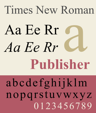
Times New Roman is a serif typeface. It was commissioned by the British newspaper The Times in 1931 and conceived by Stanley Morison, the artistic adviser to the British branch of the printing equipment company Monotype, in collaboration with Victor Lardent, a lettering artist in The Times's advertising department. It has become one of the most popular typefaces of all time and is installed on most personal computers.

Verdana is a humanist sans-serif typeface designed by Matthew Carter for Microsoft Corporation, with hand-hinting done by Thomas Rickner, then at Monotype. Demand for such a typeface was recognized by Virginia Howlett of Microsoft's typography group and commissioned by Steve Ballmer. The name "Verdana" is derived from "verdant" (green) and "Ana".
In typography, a serif is a small line or stroke regularly attached to the end of a larger stroke in a letter or symbol within a particular font or family of fonts. A typeface or "font family" making use of serifs is called a serif typeface, and a typeface that does not include them is sans-serif. Some typography sources refer to sans-serif typefaces as "grotesque" or "Gothic" and serif typefaces as "roman".

A typeface is a design of letters, numbers and other symbols, to be used in printing or for electronic display. Most typefaces include variations in size, weight, slope, width, and so on. Each of these variations of the typeface is a font.

Helvetica, also known by its original name Neue Haas Grotesk, is a widely used sans-serif typeface developed in 1957 by Swiss typeface designer Max Miedinger and Eduard Hoffmann.

Garamond is a group of many serif typefaces, named for sixteenth-century Parisian engraver Claude Garamond, generally spelled as Garamont in his lifetime. Garamond-style typefaces are popular and particularly often used for book printing and body text.

Frutiger is a series of typefaces named after its Swiss designer, Adrian Frutiger. Frutiger is a humanist sans-serif typeface, intended to be clear and highly legible at a distance or at small text sizes. A popular design worldwide, type designer Steve Matteson described its structure as "the best choice for legibility in pretty much any situation" at small text sizes, while Erik Spiekermann named it as "the best general typeface ever".

Arial is a sans-serif typeface and set of computer fonts in the neo-grotesque style. Fonts from the Arial family are included with all versions of Microsoft Windows after Windows 3.1, as well as in other Microsoft programs, Apple's macOS, and many PostScript 3 printers.

Courier is a monospaced slab serif typeface. Courier was created by IBM in the mid-1950s, and was designed by Howard "Bud" Kettler (1919–1999). The Courier name and typeface concept are in the public domain. Courier has been adapted for use as a computer font, and versions of it are installed on most desktop computers.

Comic Sans MS is a sans-serif typeface designed by Vincent Connare and released in 1994 by Microsoft Corporation. It is a non-connecting script inspired by comic book lettering, intended for use in cartoon speech bubbles, as well as in other casual environments, such as informal documents and children's materials.

Apple Inc. uses a large variety of typefaces in its marketing, operating systems, and industrial design with each product cycle. These change throughout the years with Apple's change of style in their products. This is evident in the design and marketing of the company. The current logo is a white apple with a bite out of it, which was first utilized in 2013.

Lucida is an extended family of related typefaces designed by Charles Bigelow and Kris Holmes and released from 1984 onwards. The family is intended to be extremely legible when printed at small size or displayed on a low-resolution display – hence the name, from 'lucid'.

Clearview, also known as Clearview Hwy, is the name of a humanist sans-serif typeface family for guide signs used on roads in the United States, Canada, Indonesia, the Philippines, Israel, Brazil and Sri Lanka. It was developed by independent researchers with the help of the Texas Transportation Institute and the Pennsylvania Transportation Institute, under the supervision of the Federal Highway Administration (FHWA). It was once expected to replace the FHWA typefaces in many applications, although newer studies of its effectiveness have called its benefits into question.

In metal typesetting, a font is a particular size, weight and style of a typeface. Each font is a matched set of type, with a piece for each glyph. A typeface consists of various fonts that share an overall design.

DIN 1451 is a sans-serif typeface that is widely used for traffic, administrative and technical applications.

Typefaces, fonts, and their glyphs raise intellectual property considerations in copyright, trademark, design patent, and related laws. The copyright status of a typeface and of any font file that describes it digitally varies between jurisdictions. In the United States, the shapes of typefaces are not eligible for copyright but may be protected by design patent. Typefaces can be protected in other countries, including the United Kingdom, Germany, and France, by industrial design protections that are similar to copyright or design patent in that they protect the abstract shapes. Additionally, in the US and some other countries, computer fonts, the digital instantiation of the shapes as vector outlines, may be protected by copyright on the computer code that produces them. The name of a typeface may also be protected as a trademark.
Ludwig & Mayer was a German type foundry in Frankfurt am Main, Germany. Many important designers worked for the Ludwig and Mayer type foundry, including Heinrich Jost, Karlgeorg Hoefer, Helmut Matheis, and most notably Jakob Erbar, whose Erbar Book was one of the first geometric sans-serif typefaces, predating both Paul Renner's Futura and Rudolf Koch's Kabel by some five years. Starting in 1925, Ludwig & Mayer types were distributed in the United States by Continental Type Founders Association. When the foundry ceased operations in 1984, rights to the typefaces was transmitted to the Neufville Typefoundry.

Cantarell is the default typeface supplied with the user interface of GNOME since version 3.0, replacing Bitstream Vera and DejaVu. The font was originated by Dave Crossland in 2009.
Simoncini SA was a manufacturer of linecaster matrices established by Italian type designer Francesco Simoncini shortly after the Second World War. Simoncini had worked with the Ludwig & Mayer foundry before becoming the founder and managing director of his own firm in Bologna, Italy. In 1956, he was invited by Giulio Einaudi to design a new typeface for his publishing house. Einaudi wanted a new face based on Garamond, and the result was Simoncini Garamond, loosely based on the original. It was successfully used by Einaudi, and subsequently adopted by many other publishers. Another of his typefaces, Aster, is still very popular. He designed it in 1958, and originally intended it for use in newspapers and books. Simoncini died in 1967. Digital versions of his fonts are now available through Linotype.

A display typeface is a typeface that is intended for use in display type at large sizes for titles, headings, pull quotes, and other eye-catching elements, rather than for extended passages of body text.
