Related Research Articles
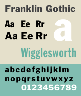
Franklin Gothic and its related faces are a large family of sans-serif typefaces in the industrial or grotesque style developed in the early years of the 20th century by the type foundry American Type Founders (ATF) and credited to its head designer Morris Fuller Benton. “Gothic” was a contemporary term meaning sans-serif.
William S. Gillies was an American artist, letterer and type designer working in New York City.

Bernhard Gothic is a family of geometric sans serif typeface designed by Lucian Bernhard in 1929 for the American Type Founders (ATF). Five variations by Bernhard were introduced over two years:

Cheltenham is a typeface for display use designed in 1896 by architect Bertram Goodhue and Ingalls Kimball, director of the Cheltenham Press. The original drawings were known as Boston Old Style and were made about 14" high. These drawings were then turned over to Morris Fuller Benton at American Type Founders (ATF) who developed it into a final design. Trial cuttings were made as early as 1899 but the face was not complete until 1902. The face was patented by Kimball in 1904. Later the basic face was spun out into an extensive type family by Morris Fuller Benton.
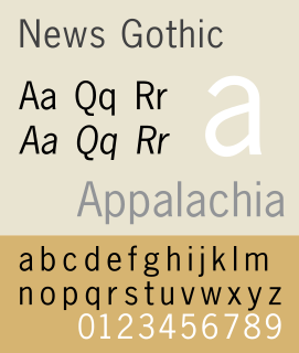
News Gothic is a sans-serif typeface in the grotesque or industrial style. It was designed by Morris Fuller Benton and released in 1908 by his employer American Type Founders (ATF). News Gothic is similar in proportion and structure to Franklin Gothic, also designed by Benton, but lighter.

Twentieth Century is a geometric sans-serif typeface designed by Sol Hess for Lanston Monotype in 1937. It was created as a competitor to the successful Futura typeface for Monotype's hot metal typesetting system. Like Futura it has a single-story 'ɑ' and a straight 'j' with no bend.

Clearface is a serif typeface designed by Morris Fuller Benton with the collaboration of his father Linn Boyd Benton, produced at American Type Founders in 1907, immediately following his preparation of Century Old Style. The bold was drawn first, in 1905, but the regular weight was the first to be released. Six variants were released between 1907 and 1911, and the design has frequently been rereleased and revived since. Clearface is a warm, curving design, showing the influence of the Arts and Crafts movement, for instance in the tilted 'e' and blobby, organic design, but not particularly based on any past period of type design and with a mixture of cursive and structured features.

Robert Hunter Middleton was an American book designer, painter, and type designer. Born in Glasgow, Scotland he came to Chicago in 1908 where he studied at the School of the Art Institute. He joined the design department of the Ludlow Typograph Company in 1923 and served as director of the department of typeface design from 1933–71. In 1944 he began operating a private press, The Cherryburn Press. He died in Chicago.
Barnhart Brothers & Spindler Type Foundry was founded as the Great Western Type Foundry in 1873. It became Barnhart Brothers & Spindler ten years later. It was a successful foundry known for innovative type design and well designed type catalogs. Oz Cooper, Will Ransom, Robert Wiebking, and Sidney Gaunt all designed for BB&S. It was bought out by American Type Founders in 1911 with the proviso that the merger would not take effect for twenty years, so that the employees would have a chance to find new work or retire over time. The foundry was finally closed in 1933.
Robert Wiebking (1870–1927) was a German-American engraver typeface designer who was known for cutting type matrices for Frederic Goudy from 1911 to 1926.
Sol Hess was an American typeface designer. After a three-year scholarship course at Pennsylvania Museum School of Industrial Design, he began at Lanston Monotype in 1902, rising to typographic manager in 1922. He was a close friend and collaborator with Monotype art director Frederic Goudy, succeeding him in that position in 1940. Hess was particularly adept at expanding type faces into whole families, allowing him to complete 85 faces for Monotype, making him America's fourth most prolific type designer. While he was with Monotype, Hess worked on commissions for many prominent users of type, including, Crowell-Collier, Sears Roebuck, Montgomery Ward, Yale University Press, World Publishing Company, and Curtis Publishing for whom he re-designed the typography of their Saturday Evening Post.
Continental Type Founders Association was founded by Melbert Brinckerhoff Cary Jr. in 1925 to distribute foundry type imported from European foundries. The influence of more modern European type design was thus felt in the United States for the first time, and American foundries responded by imitating many of the more popular faces. A.T.F.'s Paramount and Monotype's Sans Serif series are two examples of this.

The Intertype Corporation produced the Intertype, a typecasting machine closely resembling the Linotype, and using the same matrices as the Linotype. It was founded in New York in 1911 by Hermann Ridder, of Ridder Publications, as the International Typesetting Machine Company, but purchased by a syndicate for $1,650,000 in 1916 and reorganized as the Intertype Corporation.
Joseph Warren Phinney was an American printer, type designer, and business executive. Phinney began his career at the Dickinson Type Foundry in Boston where he designed type and worked in management, eventually becoming owner. He was a key player in arranging the merger of twenty-six large foundries to form the American Type Founders Company in 1892, becoming both manager of the Boston branch and head of the design department, where he oversaw the consolidation of type faces following the merger. Though his own designs were largely derivative, Phinney took a great interest in type and its history and throughout his tenure at A.T.F. he sought to preserve and protect that company's legacy, as for instance, when he oversaw the re-introduction of Binny & Ronaldson's 1796 type design, Roman No. 1, as Oxford in 1892, or when he purchased Frederick W. Goudy's first type design, Camelot, in 1896. He stayed with A.T.F. for the rest of his career, passing the role of design head to Morris Fuller Benton and becoming senior vice-president. Phinney retired shortly before the company fell upon hard times during the Great Depression and died in 1934.
Artcraft is an Old Style typeface engraved in 1912 by Robert Wiebking for Wiebking, Hardinge & Company which ran the Advance Type Foundry. It was originally called Craftsman, then Art-Craft, before finally becoming Artcraft. After Advance was sold to the Western Type Foundry in 1914, Wiebking added Artcraft Bold and Artcraft Italic. After Western was sold to Barnhart Brothers & Spindler the face was sold by both BB&S and ATF.
Samuel Winfield "Tommy" Thompson (1906–1967) was an American calligrapher, graphic artist and typeface designer. He was born Blue Point, New York. In 1944 he became the first designer to earn royalties for a type design, from Photo Lettering Inc. for his Thompson Quill Script. Previously, designers had worked in house for foundries or had sold the rights to their faces outright. He maintained a studio in Norwalk, Connecticut and was the author of several books on type and lettering.
The Inland Type Foundry was an American type foundry established in 1894 in Saint Louis, Missouri and later with branch offices in Chicago and New York City. Although it was founded to compete directly with the "type trust", and was consistently profitable, it was eventually sold to ATF.
Edwin W. Shaar was an American writer, graphic artist and typeface designer. He was an assistant art director at Lanston Monotype before becoming director of the type design program at Intertype. He also designed Phototypesetting faces.