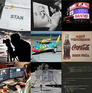
Graphic design is a profession, academic discipline and applied art whose activity consists in projecting visual communications intended to transmit specific messages to social groups, with specific objectives. Graphic design is an interdisciplinary branch of design and of the fine arts. Its practice involves creativity, innovation and lateral thinking using manual or digital tools, where it is usual to use text and graphics to communicate visually.
A graphic novel is a long-form work of sequential art. The term graphic novel is often applied broadly, including fiction, non-fiction, and anthologized work, though this practice is highly contested by comics scholars and industry professionals. It is, at least in the United States, typically distinct from the term comic book, which is generally used for comics periodicals and trade paperbacks.

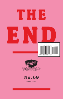
Emigre was a (mostly) quarterly magazine published from 1984 until 2005 in Berkeley, California, dedicated to visual communication, graphic design, typography, and design criticism. Produced by Rudy VanderLans and Zuzana Licko, Emigre was known for creating some of the first digital layouts and typeface designs. Exposure to Licko's typefaces through the magazine lead to the creation of Emigre Fonts in 1985.

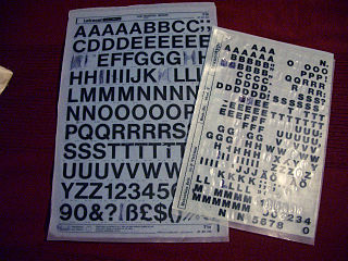
Letraset was a company known mainly for manufacturing sheets of typefaces and other artwork elements using the dry-transfer lettering method. Letraset was acquired by the Colart group and became part of its subsidiary Winsor & Newton.

Communication Arts is the largest international trade journal of visual communication. Founded in 1959 by Richard Coyne and Robert Blanchard, the magazine's coverage includes graphic design, advertising, photography, illustration, typography and interactive media. The magazine continues to be edited and published under the guidance of Coyne's son Patrick Coyne. Currently, Communication Arts publishes six issues a year and hosts six creative competitions in graphic design, advertising, photography, illustration, typography and interactive media and two websites, commarts.com and creativehotlist.com.

Paul Barnes is a graphic designer and typographer.
Graphic design careers include creative director, art director, art production manager, brand identity developer, illustrator and layout artist.

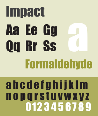
Impact is a sans-serif typeface in the industrial or grotesque style designed by Geoffrey Lee in 1965 and released by the Stephenson Blake foundry of Sheffield. It is well known for having been included in the core fonts for the Web package and distributed with Microsoft Windows since Windows 98. In the 2010s, it gained popularity for its use in image macros and other internet memes.
Photogenics is raster graphic editing software produced by Idruna Software.
The International Typeface Corporation (ITC) was a type manufacturer founded in New York in 1970 by Aaron Burns, Herb Lubalin and Edward Rondthaler. The company was one of the world's first type foundries to have no history in the production of metal type. It is now a wholly owned brand or subsidiary of Monotype Imaging.

Eye magazine is a quarterly print magazine on graphic design and visual culture.
Typographica was the name of a journal of typography and visual arts founded and edited by Herbert Spencer from 1949 to 1967. Spencer was just 25 years old when the first Typographica was issued. He also served as the editor of the journal.

Alice Twemlow is a writer, critic and educator from the United Kingdom whose work focuses on graphic design. She has been a guest critic at the Yale University School of Art, Maryland Institute College of Art (MICA), and Rhode Island School of Design (RISD). In 2006, the School of Visual Arts (SVA) in New York named Twemlow the chair and co-founder of its Master of Fine Arts in Design Criticism (D-Crit). According to her SVA biography: "Alice Twemlow writes for Eye, Design Issues, I.D., Print, New York magazine and The Architect’s Newspaper." Twemlow is also a contributor to the online publication Voice: AIGA Journal of Design. In 2012 Core77 selected her as a jury captain for the “Design Writing and Commentary” category of the Core77 Design Awards. Twemlow was head of the MA in Design Curating & Writing at Design Academy Eindhoven, 2017-2018, and is now Lector Design at the Royal Academy of Fine Arts (KABK) in The Hague, and Associate Professor at Leiden University.
Malcolm Leslie Garrett is a British graphic designer, and Creative Director of Images&Co, a communications design consultancy based in London, UK. He is Ambassador for Manchester School of Art and co-founder of the annual Design Manchester festival, which has run since 2013.
Massin, born Robert Massin, was a French graphic designer, art director, and typographer, renowned for his innovative experimentation with expressive forms of typographic composition. He stopped using his first name in the 1950s.
Rudolph de Harak, also Rudy de Harak, was an American graphic designer. De Harak was notable as a designer who covered a broad spectrum of applications with a distinctly modernist aesthetic. He was also influential as a professor of design.
Grafik was a specialist London-based magazine on graphic design and visual culture.

Compacta is a condensed sans-serif typeface designed by Fred Lambert for Letraset in 1963. It is visually similar to the typefaces Impact and Haettenschweiler, though Compacta has a distinctively square shape in comparison. Letraset was a dry transfer system, widely used by amateur or small-scale lettering projects, although many professional designers used it as well. Compacta was Letraset's first original typeface design, and proved widely popular. Rights to it were acquired by Linotype and others, leading to it becoming available in other formats such as digitally.
Edward Wright was an English painter, typographer and graphic designer.
Jan V. White (1928-2014) was an American designer, communication design consultant, and graphic design educator and writer.


