
Typography is the art and technique of arranging type to make written language legible, readable and appealing when displayed. The arrangement of type involves selecting typefaces, point sizes, line lengths, line spacing, letter spacing, and spaces between pairs of letters. The term typography is also applied to the style, arrangement, and appearance of the letters, numbers, and symbols created by the process. Type design is a closely related craft, sometimes considered part of typography; most typographers do not design typefaces, and some type designers do not consider themselves typographers. Typography also may be used as an ornamental and decorative device, unrelated to the communication of information.
A letterer is a member of a team of comic book creators responsible for drawing the comic book's text. The letterer's use of typefaces, calligraphy, letter size, and layout all contribute to the impact of the comic. The letterer crafts the comic's "display lettering": the story title lettering and other special captions and credits that usually appear on a story's first page. The letterer also writes the letters in the word balloons and draws in sound effects. Many letterers also design logos for the comic book company's various titles.

Edward Johnston, CBE was a British craftsman who is regarded, with Rudolf Koch, as the father of modern calligraphy, in the particular form of the broad-edged pen as a writing tool.

Antiqua is a style of typeface used to mimic styles of handwriting or calligraphy common during the 15th and 16th centuries. Letters are designed to flow, and strokes connect together in a continuous fashion; in this way it is often contrasted with Fraktur-style typefaces where the individual strokes are broken apart. The two typefaces were used alongside each other in the germanophone world, with the Antiqua–Fraktur dispute often dividing along ideological or political lines. After the mid-20th century, Fraktur fell out of favor and Antiqua-based typefaces became the official standard in Germany.

Milton Glaser was an American graphic designer, recognized for his designs, including the I Love New York logo; a 1966 poster for Bob Dylan; the logos for DC Comics, Stony Brook University, Brooklyn Brewery; and his graphic work on the introduction of the iconic 1969 Olivetti Valentine typewriter.

Speech balloons are a graphic convention used most commonly in comic books, comics, and cartoons to allow words to be understood as representing a character's speech or thoughts. A formal distinction is often made between the balloon that indicates speech and the one that indicates thoughts; the balloon that conveys thoughts is often referred to as a thought bubble or conversation cloud.
Raymond Larabie is a Canadian designer of TrueType and OpenType computer fonts. He owns Typodermic Fonts type foundry, which distributes both commercially licensed and shareware/freeware fonts.
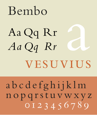
In Latin script typography, roman is one of the three main kinds of historical type, alongside blackletter and italic. Sometimes called normal, it is distinct from these two for its upright style and its simplicity.

Rail Alphabet is a neo-grotesque sans-serif typeface designed by Jock Kinneir and Margaret Calvert for signage on the British Rail network. First used at Liverpool Street station, it was then adopted by the Design Research Unit (DRU) as part of their comprehensive 1965 rebranding of the company. It was later used by other public bodies in the United Kingdom.
Hoefler&Co. (H&Co) is a digital type foundry in Woburn, Massachusetts, founded by type designer Jonathan Hoefler. H&Co designs typefaces for clients and for retail on its website.

Rudolf Koch was a German type designer, professor, and a master of lettering, calligraphy, typography and illustration. Commonly known for his typefaces created for the Klingspor Type Foundry, his most widely used typefaces include Neuland and Kabel.

House Industries is a type foundry and design studio based in Yorklyn, Delaware. The company was created in the 1990s in Wilmington, Delaware by co-founders Andy Cruz and Rich Roat. The company is best known for its typeface creations, which have appeared on television, in film and on commercial products.

DIN 1451 is a sans-serif typeface that is widely used for traffic, administrative and technical applications.

Script typefaces are based on the varied and often fluid stroke created by handwriting. They are generally used for display or trade printing, rather than for extended body text in the Latin alphabet. Some Greek alphabet typefaces, especially historically, have been a closer simulation of handwriting.

Letter cutting is a form of inscriptional architectural lettering closely related to monumental masonry and stone carving, often practised by artists, sculptors, and typeface designers. Rather than traditional stone carving, where images and symbols are the dominant features, in letter cutting the unique skill is "meticulous setting out and skilled cutting of the lettering style, in terms of design, angle and depth of the lettering".
Letter carvers see the drawing and carving of letters as a particular craft in itself, allied to but distinct from masonry and carving in general. Most letter carvers are both designers and carvers. Typefaces designed for printing are rarely satisfactory when carved into stone, so most letter carvers design their own letterforms.

The Klim Type Foundry is a digital type foundry operated by Kris Sowersby, a New Zealand typeface designer. Klim was founded in 2005 and is currently based in Wellington. Klim produces retail typefaces, custom typefaces and custom lettering and logotypes. Sowersby has garnered many international awards for his typefaces.
Ben Oda was a Japanese-American letterer for comic books and comic strips.

A display typeface is a typeface that is intended for use in display type at large sizes for titles, headings, pull quotes, and other eye-catching elements, rather than for extended passages of body text.

In typography, a fat face letterform is a serif typeface or piece of lettering in the Didone or modern style with an extremely bold design. Fat face typefaces appeared in London around 1805–1810 and became widely popular; John Lewis describes the fat face as "the first real display typeface."
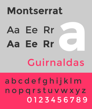
Montserrat is a geometric sans-serif typeface designed by Argentine graphic designer Julieta Ulanovsky and released in 2011. It was inspired by posters, signs and painted windows from the first half of the twentieth century, seen in the historic Montserrat neighbourhood of Buenos Aires.