
Palatino is an old-style serif typeface designed by Hermann Zapf, initially released in 1949 by the Stempel foundry and later by other companies, most notably the Mergenthaler Linotype Company.

Optima is a humanist sans-serif typeface designed by Hermann Zapf and released by the D. Stempel AG foundry, Frankfurt, West Germany in 1958.

Futura is a geometric sans-serif typeface designed by Paul Renner and released in 1927. It was designed as a contribution on the New Frankfurt-project. It is based on geometric shapes, especially the circle, similar in spirit to the Bauhaus design style of the period. It was developed as a typeface by the Bauer Type Foundry, in competition with Ludwig & Mayer's seminal Erbar typeface of 1926.

Gill Sans is a humanist sans-serif typeface designed by Eric Gill and released by the British branch of Monotype from 1928 onwards.

Franklin Gothic and its related faces are a large family of sans-serif typefaces in the industrial or grotesque style developed in the early years of the 20th century by the type foundry American Type Founders (ATF) and credited to its head designer Morris Fuller Benton. "Gothic" was a contemporary term meaning sans-serif.

In typography, a slab serif typeface is a type of serif typeface characterized by thick, block-like serifs. Serif terminals may be either blunt and angular (Rockwell), or rounded (Courier). Slab serifs were introduced in the early nineteenth century.
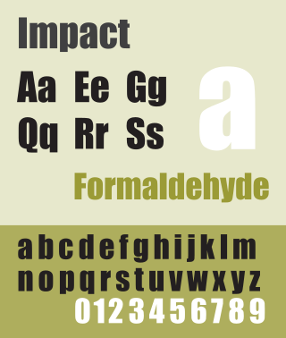
Impact is a sans-serif typeface in the industrial or grotesque style designed by Geoffrey Lee in 1965 and released by the Stephenson Blake foundry of Sheffield. It is well known for having been included in the core fonts for the Web package and distributed with Microsoft Windows since Windows 98. In the 2010s, it gained popularity for its use in image macros and other internet memes.
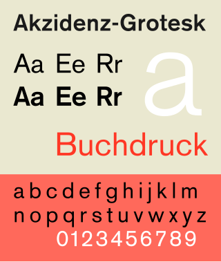
Akzidenz-Grotesk is a sans-serif typeface family originally released by the Berthold Type Foundry of Berlin. "Akzidenz" indicates its intended use as a typeface for commercial print runs such as publicity, tickets and forms, as opposed to fine printing, and "grotesque" was a standard name for sans-serif typefaces at the time.

Clarendon is the name of a slab serif typeface that was released in 1845 by Thorowgood and Co. of London, a letter foundry often known as the Fann Street Foundry. The original Clarendon design is credited to Robert Besley, a partner in the foundry, and was originally engraved by punchcutter Benjamin Fox, who may also have contributed to its design. Many copies, adaptations and revivals have been released, becoming almost an entire genre of type design.

Kabel is a geometric sans-serif typeface that was designed by the German designer Rudolf Koch and released by the Klingspor foundry from 1927 onward.

Windsor is a serif typeface created by Elisha Pechey (1831-1902) and released by the Stephenson Blake type foundry. It is intended for use such as display and in headings rather than for body text.

News Gothic is a sans-serif typeface designed by Morris Fuller Benton, and was released in 1908 by his employer American Type Founders (ATF). The typeface is similar in proportion and structure to Franklin Gothic, also designed by Benton, but lighter.

Stephenson Blake is an engineering company based in Sheffield, England. The company was active from the early 19th century as a type founder, remaining until the 1990s as the last active type foundry in Britain, since when it has diversified into specialist engineering.

The Bauhaus typeface design is based on Herbert Bayer's 1925 experimental Universal typeface and the Bauhaus aesthetic overall.
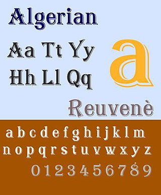
Algerian is a decorative serif digital font family, originally produced in the early 20th century by British foundry Stephenson, Blake and Co. The design for the typeface is owned by Linotype, while the name 'Algerian' is a trademark of the International Typeface Corporation.

In typography, Erbar or Erbar-Grotesk is a sans-serif typeface in the geometric style, one of the first designs of this kind released as type. Designer Jakob Erbar's aim was to design a printing type which would be free of all individual characteristics, possess thoroughly legible letter forms, and be a purely typographic creation. His conclusion was that this could only work if the type form was developed from a fundamental element, the circle. Erbar-Grotesk was developed in stages; Erbar wrote that he had originally sketched out the design in 1914 but had been prevented from working on it due to the war. The original version of Erbar was released in 1926, following Erbar's "Phosphor" titling capitals of 1922 which are very similar in design.
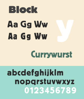
Berthold Block is a sans-serif typeface released by the H. Berthold foundry in the early twentieth century and intended for display use. Block has a chunky design suitable for headings, with short descenders allowing tight linespacing and rounded corners. It is sometimes simply called "Block". Font design expert Stephen Coles describes it as "a soft but substantial display face with compact dimensions and an organic appearance…[it] isn’t meant for body copy." The Klingspor Museum credits it to Hermann Hoffmann, who managed type design for Berthold.
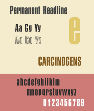
Permanent Headline is a bold, highly compressed sans-serif typeface in the neo-grotesque style. It was designed by Karlgeorg Hoefer for the type foundry Ludwig & Mayer in Frankfurt am Main. It was released from 1964 and later issued by a range of companies in phototypesetting and digital versions.

Granby is a sans-serif typeface designed and released by the Stephenson Blake type foundry of Sheffield from 1930.

The Stephenson Blake Grotesque fonts are a series of sans-serif typefaces created by the type foundry Stephenson Blake of Sheffield, England, mostly around the beginning of the twentieth century.

