
Palatino is the name of an old-style serif typeface designed by Hermann Zapf, initially released in 1949 by the Stempel foundry and later by other companies, most notably the Mergenthaler Linotype Company.
Bitstream Inc. was a type foundry that produced digital typefaces. It was founded in 1981 by Matthew Carter and Mike Parker among others. It was located in Marlborough, Massachusetts. The font business, including MyFonts, was acquired by Monotype Imaging in March 2012. The remainder of the business, responsible for Pageflex and Bolt Browser, was spun off to a new entity named Marlborough Software Development Holdings Inc. It was later renamed Pageflex, Inc following a successful management buyout in December 2013.

Times New Roman is a serif typeface. It was commissioned by the British newspaper The Times in 1931 and conceived by Stanley Morison, the artistic adviser to the British branch of the printing equipment company Monotype, in collaboration with Victor Lardent, a lettering artist in The Times's advertising department. It has become one of the most popular typefaces of all time and is installed on most desktop computers.

In typography and lettering, a sans-serif, sans serif, gothic, or simply sans letterform is one that does not have extending features called "serifs" at the end of strokes. Sans-serif typefaces tend to have less stroke width variation than serif typefaces. They are often used to convey simplicity and modernity or minimalism.

Helvetica or Neue Haas Grotesk is a widely used sans-serif typeface developed in 1957 by Swiss typeface designer Max Miedinger and Eduard Hoffmann.
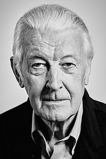
Matthew Carter is a British type designer. A 2005 New Yorker profile described him as 'the most widely read man in the world' by considering the amount of text set in his commonly used fonts.
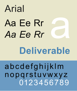
Arial is a sans-serif typeface and set of computer fonts in the neo-grotesque style. Fonts from the Arial family are included with all versions of Microsoft Windows from Windows 3.1 on, some other Microsoft software applications, Apple's macOS and many PostScript 3 computer printers. The typeface was designed in 1982, by Robin Nicholas and Patricia Saunders, for Monotype Typography. Each of its characters has the same width as that character in the popular typeface Helvetica; the purpose of this design is to allow a document designed in Helvetica to be displayed and printed with the intended line-breaks and page-breaks without a Helvetica license.

Univers is the name of a large sans-serif typeface family designed by Adrian Frutiger and released by his employer Deberny & Peignot in 1957. Classified as a neo-grotesque sans-serif, one based on the model of nineteenth-century German typefaces such as Akzidenz-Grotesk, it was notable for its availability from the moment of its launch in a comprehensive range of weights and widths. The original marketing for Univers deliberately referenced the periodic table to emphasise its scope.
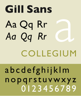
Gill Sans is a humanist sans-serif typeface designed by Eric Gill and released by the British branch of Monotype from 1928 onwards.

Johnston is a sans-serif typeface designed by and named after Edward Johnston. The typeface was commissioned in 1913 by Frank Pick, commercial manager of the Underground Electric Railways Company of London, as part of his plan to strengthen the company's corporate identity. Johnston was originally created for printing, but it rapidly became used for the enamel station signs of the Underground system as well.
Raymond Larabie is a Canadian designer of TrueType and OpenType computer fonts. He owns Typodermic Fonts, which distributes both commercially licensed and shareware/freeware fonts.

A type foundry is a company that designs or distributes typefaces. Before digital typography, type foundries manufactured and sold metal and wood typefaces for hand typesetting, and matrices for line-casting machines like the Linotype and Monotype, for letterpress printers. Today's digital type foundries accumulate and distribute typefaces created by type designers, who may either be freelancers operating their own independent foundry, or employed by a foundry. Type foundries may also provide custom type design services.
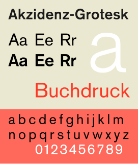
Akzidenz-Grotesk is a sans-serif typeface family originally released by the Berthold Type Foundry of Berlin. "Akzidenz" indicates its intended use as a typeface for commercial print runs such as publicity, tickets and forms, as opposed to fine printing, and "grotesque" was a standard name for sans-serif typefaces at the time.
Max Miedinger was a Swiss typeface designer, best known for creating the Neue Haas Grotesk typeface in 1957, renamed Helvetica in 1960. Marketed as a symbol of cutting-edge Swiss technology, Helvetica achieved immediate global success.
Neo Sans and Neo Tech are the typefaces designed by the British type designer Sebastian "Seb" Lester. The typefaces were released by Monotype Corporation on April 19, 2004. The design concept called for a versatile, futuristic typeface that didn't look "crude, gimmicky or ephemeral".
Ron Carpenter is an English typographer. He was trained as a cartographer and later became a typeface designer. He works for independent font foundry, Dalton Maag.

Nokia Pure is a typeface designed by London-based type foundry Dalton Maag for Nokia. It was designed primarily for use in digital media, in Nokia devices, and mobile environments. It has been the company's main typeface since its introduction. Its designers include Vincent Connare, creator of the classic font Comic Sans.

Dalton Maag is an independent font foundry with offices in London, UK, and São Paulo, Brazil. It designs fonts for use in corporate identities, logos, and other text uses. Dalton Maag has a library of 30 retail fonts as of 2016 and offers custom font creation and modification services to its clients.
Nadine Chahine is a Lebanese type designer working as the CEO at I Love Typography Ltd and the Director at ArabicType Ltd. From 2005 till 2015 she worked as the Arabic Specialist at Linotype and Monotype Imaging and from 2015 to 2018 as the UK Type Director and Legibility Expert at Monotype UK. She designed Arabic versions of the popular typefaces Helvetica, Frutiger, and Zapfino. Her typeface Koufiya was the first to include a simultaneously designed matching Arabic and Latin parts.
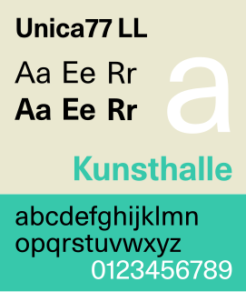
Unica or Haas Unica is a neo-grotesque sans-serif typeface developed at Haas Type Foundry in the late 1970s and originally released in 1980. Initiated as a project that sought to combine the strengths of both Helvetica and Univers, it had the misfortune of being released for phototypesetting just as the technology was being made obsolete by desktop publishing, and subsequent corporate mergers and a copyright dispute kept a digital version off the market. In 2015, two digital revivals were released: one by the rights holders, and the other with the blessing of the team that originally developed it.
