
Verdana is a humanist sans-serif typeface designed by Matthew Carter for Microsoft Corporation, with hand-hinting done by Thomas Rickner, then at Monotype. Demand for such a typeface was recognized by Virginia Howlett of Microsoft's typography group and commissioned by Steve Ballmer. The name "Verdana" is derived from "verdant" (green) and "Ana".

In typography and lettering, a sans-serif, sans serif, gothic, or simply sans letterform is one that does not have extending features called "serifs" at the end of strokes. Sans-serif typefaces tend to have less stroke width variation than serif typefaces. They are often used to convey simplicity and modernity or minimalism. For the purposes of type classification, sans-serif designs are usually divided into these major groups: § Grotesque and § Neo-grotesque, § Geometric, § Humanist and § Other or mixed.

Helvetica, also known by its original name Neue Haas Grotesk, is a widely used sans-serif typeface developed in 1957 by Swiss typeface designer Max Miedinger and Eduard Hoffmann.

Arial is a sans-serif typeface and set of computer fonts in the neo-grotesque style. Fonts from the Arial family are included with all versions of Microsoft Windows after Windows 3.1, as well as in other Microsoft programs, Apple's macOS, and many PostScript 3 printers.

Apple Inc. uses a large variety of typefaces in its marketing, operating systems, and industrial design with each product cycle. These change throughout the years with Apple's change of style in their products. This is evident in the design and marketing of the company.

Trebuchet MS is a humanist sans-serif typeface that Vincent Connare designed for Microsoft Corporation in 1996. Trebuchet MS was the font used for the window titles in the Windows XP default theme, succeeding MS Sans Serif and Tahoma. Released free of charge by Microsoft as part of their core fonts for the Web package, it remained one of the most popular body text fonts on webpages as of 2009.
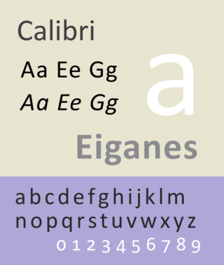
Calibri is a digital sans-serif typeface family in the humanist or modern style. It was designed by Luc(as) de Groot in 2002–2004 and released to the general public in 2007, with Microsoft Office 2007 and Windows Vista. In Office 2007, it replaced Times New Roman as the default typeface in Word and replaced Arial as the default in PowerPoint, Excel, Outlook, and WordPad. De Groot described its subtly rounded design as having "a warm and soft character".

Roboto is a neo-grotesque sans-serif typeface family developed by Google as the system font for its mobile operating system Android, and released in 2011 for Android 4.0 "Ice Cream Sandwich".

In typography, a slab serif typeface is a type of serif typeface characterized by thick, block-like serifs. Serif terminals may be either blunt and angular (Rockwell), or rounded (Courier). Slab serifs were introduced in the early nineteenth century.

Paul Barnes is a graphic designer and typographer. He has designed several new typefaces.

In metal typesetting, a font is a particular size, weight and style of a typeface. Each font is a matched set of type, with a piece for each glyph. A typeface consists of various fonts that share an overall design.
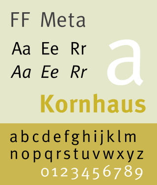
FF Meta is a humanist sans-serif typeface family designed by Erik Spiekermann and released in 1991 through his FontFont library. According to Spiekermann, FF Meta was intended to be a "complete antithesis of Helvetica", which he found "boring and bland". It originated from an unused commission for the Deutsche Bundespost. Throughout the 1990s, FF Meta was embraced by the international design community with Spiekermann and E. M. Ginger writing that it had been dubiously praised as the Helvetica of the 1990s.

Christian Schwartz is an American type designer. He has been awarded the German Design Award and the Prix Charles Peignot.
Neutraface is a geometric sans-serif typeface designed by Christian Schwartz for House Industries, an American digital type foundry. It was influenced by the work of architect Richard Neutra and was developed with the assistance of Neutra's son and former partner, Dion Neutra.
Guardian Egyptian is a slab-serif typeface commissioned by Mark Porter for the UK newspaper The Guardian and designed by Paul Barnes and Christian Schwartz between 2004 and 2005 and published by their company Commercial Type.
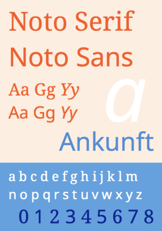
Noto is a font family comprising over 100 individual fonts, which are together designed to cover all the scripts encoded in the Unicode standard. As of October 2016, Noto fonts cover all 93 scripts defined in Unicode version 6.1, although fewer than 30,000 of the nearly 75,000 CJK unified ideographs in version 6.0 are covered. In total, Noto fonts cover over 77,000 characters, which is around half of the 149,186 characters defined in Unicode 15.0.
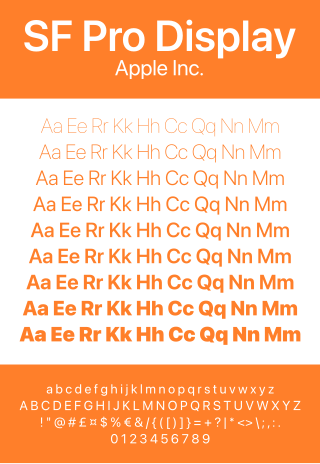
San Francisco is a neo-grotesque typeface made by Apple Inc. It was first released to developers on November 18, 2014. It is the first new typeface designed at Apple in nearly twenty years and has been inspired by Helvetica and DIN.
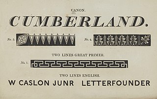
Egyptian is a typeface created by the Caslon foundry of Salisbury Square, London around or probably slightly before 1816, that is the first general-purpose sans-serif typeface in the Latin alphabet known to have been created.
Graphik is a neo-grotesque sans-serif typeface designed by Christian Schwartz and published by Commercial Type in 2009. It is currently used as Accenture's, Snap Inc.'s, and Sprint's official typeface. Eighteen styles are included with macOS.