This article has multiple issues. Please help improve it or discuss these issues on the talk page . (Learn how and when to remove these template messages)
|
This article has multiple issues. Please help improve it or discuss these issues on the talk page . (Learn how and when to remove these template messages)
|
The Compatil typefaces were developed from 1999 to 2001 at Linotype Library GmbH. The name was derived from the word "compatible" and represents an intelligent and modular type system.
The project was led by Bruno Steinert, Managing Director of Linotype GmbH, Bad Homburg. Professor Olaf Leu and his analysis team at Mainz University of Applied Sciences [1] . They composed an extensive range of requirements that Linotype Library’s team of experts incorporated into their new creation, extending and developing the concept as their work progressed. Silja Bilz and Professor Reinhard Haus were responsible for the project design and concept.
On 2004-12-07, Linotype announced Compatil 6.0, which introduced italic fonts for all families. [2] The italic fonts have an 11-degree lean angle.
In 2005, the typeface families of Compatil were extended with the addition of true cursive typefaces.
The typeface is used in printing newspapers and financial reports.
It was used in 2002 Business-to-Business Awards. [3]

Palatino is the name of an old-style serif typeface designed by Hermann Zapf, initially released in 1949 by the Stempel foundry and later by other companies, most notably the Mergenthaler Linotype Company.
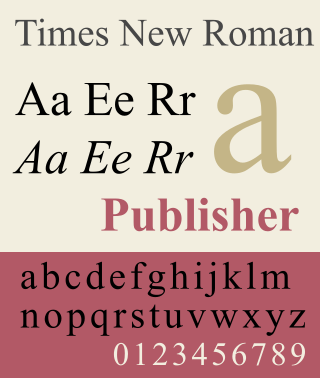
Times New Roman is a serif typeface. It was commissioned by the British newspaper The Times in 1931 and conceived by Stanley Morison, the artistic adviser to the British branch of the printing equipment company Monotype, in collaboration with Victor Lardent, a lettering artist in The Times's advertising department. It has become one of the most popular typefaces of all time and is installed on most personal computers.
The Mergenthaler Linotype Company is a corporation founded in the United States in 1886 to market the Linotype machine, a system to cast metal type in lines (linecaster) invented by Ottmar Mergenthaler. It became the world's leading manufacturer of book and newspaper typesetting equipment; outside North America, its only serious challenger for book typesetting was the Anglo-American Monotype Corporation.

A typeface is a design of letters, numbers and other symbols, to be used in printing or for electronic display. Most typefaces include variations in size, weight, slope, width, and so on. Each of these variations of the typeface is a font.

Garamond is a group of many serif typefaces, named for sixteenth-century Parisian engraver Claude Garamond, generally spelled as Garamont in his lifetime. Garamond-style typefaces are popular and particularly often used for book printing and body text.

Frutiger is a series of typefaces named after its Swiss designer, Adrian Frutiger. Frutiger is a humanist sans-serif typeface, intended to be clear and highly legible at a distance or at small text sizes. A popular design worldwide, type designer Steve Matteson described its structure as "the best choice for legibility in pretty much any situation" at small text sizes, while Erik Spiekermann named it as "the best general typeface ever".

Arial is a sans-serif typeface and set of computer fonts in the neo-grotesque style. Fonts from the Arial family are included with all versions of Microsoft Windows after Windows 3.1, as well as in other Microsoft programs, Apple's macOS, and many PostScript 3 printers.

Univers is a large sans-serif typeface family designed by Adrian Frutiger and released by his employer Deberny & Peignot in 1957. Classified as a neo-grotesque sans-serif, one based on the model of nineteenth-century German typefaces such as Akzidenz-Grotesk, it was notable for its availability from the moment of its launch in a comprehensive range of weights and widths. The original marketing for Univers deliberately referenced the periodic table to emphasise its scope.

William Addison Dwiggins, was an American type designer, calligrapher, and book designer. He attained prominence as an illustrator and commercial artist, and he brought to the designing of type and books some of the boldness that he displayed in his advertising work. His work can be described as ornamented and geometric, similar to the Art Moderne and Art Deco styles of the period, using Oriental influences and breaking from the more antiquarian styles of his colleagues and mentors Updike, Cleland and Goudy.
Monotype Imaging Holdings Inc., founded as Lanston Monotype Machine Company in 1887 in Philadelphia by Tolbert Lanston, is an American company that specializes in digital typesetting and typeface design for use with consumer electronics devices. Incorporated in Delaware and headquartered in Woburn, Massachusetts, the company has been responsible for many developments in printing technology—in particular the Monotype machine, which was a fully mechanical hotmetal typesetter, that produced texts automatically, all single type. Monotype was involved in the design and production of many typefaces in the 20th century. Monotype developed many of the most widely used typeface designs, including Times New Roman, Gill Sans, Arial, Bembo and Albertus.

Myriad is a humanist sans-serif typeface designed by Robert Slimbach and Carol Twombly for Adobe Systems. Myriad was intended as a neutral, general-purpose typeface that could fulfill a range of uses and have a form easily expandable by computer-aided design to a large range of weights and widths.

Caslon is the name given to serif typefaces designed by William Caslon I (c. 1692–1766) in London, or inspired by his work.

In metal typesetting, a font is a particular size, weight and style of a typeface. Each font is a matched set of type, with a piece for each glyph. A typeface consists of various fonts that share an overall design.

Bookman, or Bookman Old Style, is a serif typeface. A wide, legible design that is slightly bolder than most body text faces, Bookman has been used for both display typography, for trade printing such as advertising, and less commonly for body text. In advertising use it is particularly associated with the graphic design of the 1960s and 1970s, when revivals of it were very popular. It is also used as the official font of Indonesian laws since 2011.

Cheltenham is a typeface for display use designed in 1896 by architect Bertram Goodhue and Ingalls Kimball, director of the Cheltenham Press. The original drawings were known as Boston Old Style and were made about 14" high. These drawings were then turned over to Morris Fuller Benton at American Type Founders (ATF) who developed it into a final design. Trial cuttings were made as early as 1899 but the face was not complete until 1902. The face was patented by Kimball in 1904. Later the basic face was spun out into an extensive type family by Morris Fuller Benton.

Sabon is an old-style serif typeface designed by the German-born typographer and designer Jan Tschichold (1902–1974) in the period 1964–1967. It was released jointly by the Linotype, Monotype, and Stempel type foundries in 1967. The design of the roman is based on types by Claude Garamond, particularly a specimen printed by the Frankfurt printer Konrad Berner. Berner had married the widow of a fellow printer Jacques Sabon, the source of the face's name, who had bought some of Garamond's type after his death. The italics are based on types designed by a contemporary of Garamond's, Robert Granjon. It is effectively a Garamond revival, though a different name was chosen as many other modern typefaces already carry this name.

Syntax comprises a family of fonts designed by Swiss typeface designer Hans Eduard Meier. Originally just a sans-serif font, it was extended with additional serif designs.

News Gothic is a sans-serif typeface designed by Morris Fuller Benton, and was released in 1908 by his employer American Type Founders (ATF). The typeface is similar in proportion and structure to Franklin Gothic, also designed by Benton, but lighter.
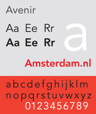
Avenir is a geometric sans-serif typeface designed by Adrian Frutiger in 1987 and released in 1988 by Linotype GmbH.
Walter Valentine Tracy RDI was an English type designer, typographer and writer.