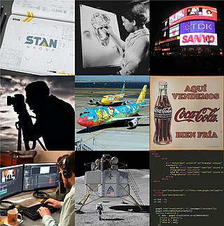
Graphic design is a profession, academic discipline and applied art whose activity consists in projecting visual communications intended to transmit specific messages to social groups, with specific objectives. Graphic design is an interdisciplinary branch of design and of the fine arts. Its practice involves creativity, innovation and lateral thinking using manual or digital tools, where it is usual to use text and graphics to communicate visually.

A glyph is any kind of purposeful mark. In typography, a glyph is "the specific shape, design, or representation of a character". It is a particular graphical representation, in a particular typeface, of an element of written language. A grapheme, or part of a grapheme, or sometimes several graphemes in combination can be represented by a glyph.

Typography is the art and technique of arranging type to make written language legible, readable and appealing when displayed. The arrangement of type involves selecting typefaces, point sizes, line lengths, line-spacing (leading), and letter-spacing (tracking), as well as adjusting the space between pairs of letters (kerning). The term typography is also applied to the style, arrangement, and appearance of the letters, numbers, and symbols created by the process. Type design is a closely related craft, sometimes considered part of typography; most typographers do not design typefaces, and some type designers do not consider themselves typographers. Typography also may be used as an ornamental and decorative device, unrelated to the communication of information.
A raster graphics editor is a computer program that allows users to create and edit images interactively on the computer screen and save them in one of many raster graphics file formats such as JPEG, PNG, and GIF.
The question mark? is a punctuation mark that indicates an interrogative clause or phrase in many languages.
In typography, a serif is a small line or stroke regularly attached to the end of a larger stroke in a letter or symbol within a particular font or family of fonts. A typeface or "font family" making use of serifs is called a serif typeface, and a typeface that does not include them is sans-serif. Some typography sources refer to sans-serif typefaces as "grotesque" or "Gothic", and serif typefaces as "roman".

A typeface is a design of letters, numbers and other symbols, to be used in printing or for electronic display. Most typefaces include variations in size, weight, slope, width, and so on. Each of these variations of the typeface is a font.

In typography, a dingbat is an ornament, specifically, a glyph used in typesetting, often employed to create box frames, or as a dinkus. Some of the dingbat symbols have been used as signature marks or used in bookbinding to order sections.
Graphics are visual images or designs on some surface, such as a wall, canvas, screen, paper, or stone, to inform, illustrate, or entertain. In contemporary usage, it includes a pictorial representation of data, as in design and manufacture, in typesetting and the graphic arts, and in educational and recreational software. Images that are generated by a computer are called computer graphics.
Uniscribe is the Microsoft Windows set of services for rendering Unicode-encoded text, supporting complex text layout. It is implemented in the dynamic link library USP10.DLL. Uniscribe was released with Windows 2000 and Internet Explorer 5.0. In addition, the Windows CE platform has supported Uniscribe since version 5.0.

In art and design, negative space is the empty space around and between the subject(s) of an image. Negative space may be most evident when the space around a subject, not the subject itself, forms an interesting or artistically relevant shape, and such space occasionally is used to artistic effect as the "real" subject of an image.

Richard Church Thompson was an American illustrator and cartoonist best known for his syndicated comic strip Cul de Sac and the illustrated poem "Make the Pie Higher". He was given the Reuben Award for Outstanding Cartoonist of the Year for 2010.

In a written or published work, an initial capital is a letter at the beginning of a word, a chapter, or a paragraph that is larger than the rest of the text. The word is derived from the Latin initialis, which means standing at the beginning. An initial is often several lines in height and in older books or manuscripts are known as "inhabited" initials. Certain important initials, such as the Beatus initial or "B" of Beatus vir... at the opening of Psalm 1 at the start of a vulgate Latin. These specific initials in an illuminated manuscript were also called initiums.

Modern typographers view typography as a craft with a very long history tracing its origins back to the first punches and dies used to make seals and coinage currency in ancient times. The basic elements of typography are at least as old as civilization and the earliest writing systems—a series of key developments that were eventually drawn together into one systematic craft. While woodblock printing and movable type had precedents in East Asia, typography in the Western world developed after the invention of the printing press by Johannes Gutenberg in the mid-15th century. The initial spread of printing throughout Germany and Italy led to the enduring legacy and continued use of blackletter, roman, and italic types.

In typography, a margin is the area between the main content of a page and the page edges. The margin helps to define where a line of text begins and ends. When a page is justified the text is spread out to be flush with the left and right margins. When two pages of content are combined next to each other, the space between the two pages is known as the gutter. The top and bottom margins of a page are also called "head" and "foot", respectively. The term "margin" can also be used to describe the edge of internal content, such as the right or left edge of a column of text.

Graphic communication as the name suggests is communication using graphic elements. These elements include symbols such as glyphs and icons, images such as drawings and photographs, and can include the passive contributions of substrate, colour and surroundings. It is the process of creating, producing, and distributing material incorporating words and images to convey data, concepts, and emotions.
HarfBuzz is a software development library for text shaping, which is the process of converting Unicode text to glyph indices and positions. The newer version, New HarfBuzz (2012–), targets various font technologies while the first version, Old HarfBuzz (2006–2012), targeted only OpenType fonts.

A fleuron (;), also known as printers' flower, is a typographic element, or glyph, used either as a punctuation mark or as an ornament for typographic compositions. Fleurons are stylized forms of flowers or leaves; the term derives from the Old French: floron ("flower"). Robert Bringhurst in The Elements of Typographic Style calls the forms "horticultural dingbats". A commonly-encountered fleuron is the ❦, the floral heart or hedera. It is also known as an aldus leaf.


