
Typography is the art and technique of arranging type to make written language legible, readable and appealing when displayed. The arrangement of type involves selecting typefaces, point sizes, line lengths, line spacing, letter spacing, and spaces between pairs of letters. The term typography is also applied to the style, arrangement, and appearance of the letters, numbers, and symbols created by the process. Type design is a closely related craft, sometimes considered part of typography; most typographers do not design typefaces, and some type designers do not consider themselves typographers. Typography also may be used as an ornamental and decorative device, unrelated to the communication of information.

Palatino is an old-style serif typeface designed by Hermann Zapf, initially released in 1949 by the Stempel foundry and later by other companies, most notably the Mergenthaler Linotype Company. Palatino is optimised for legitibility with open counters, balanced proportions, moderate stroke contrast and flared serifs.

Type design is the art and process of designing typefaces. This involves drawing each letterform using a consistent style. The basic concepts and design variables are described below.

In typography and lettering, a sans-serif, sans serif, gothic, or simply sans letterform is one that does not have extending features called "serifs" at the end of strokes. Sans-serif typefaces tend to have less stroke width variation than serif typefaces. They are often used to convey simplicity and modernity or minimalism. For the purposes of type classification, sans-serif designs are usually divided into these major groups: § Grotesque, § Neo-grotesque, § Geometric, § Humanist, and § Other or mixed.
In typography, a serif is a small line or stroke regularly attached to the end of a larger stroke in a letter or symbol within a particular font or family of fonts. A typeface or "font family" making use of serifs is called a serif typeface, and a typeface that does not include them is sans-serif. Some typography sources refer to sans-serif typefaces as "grotesque" or "Gothic" and serif typefaces as "roman".

A typeface is a design of letters, numbers and other symbols, to be used in printing or for electronic display. Most typefaces include variations in size, weight, slope, width, and so on. Each of these variations of the typeface is a font.

Arial is a sans-serif typeface in the neo-grotesque style. Fonts from the Arial family are included with all versions of Microsoft Windows after Windows 3.1, as well as in other Microsoft programs, Apple's macOS, and many PostScript 3 printers. In Office 2007, Arial was replaced by Calibri as the default typeface in PowerPoint, Excel, and Outlook.

Futura is a geometric sans-serif typeface designed by Paul Renner and released in 1927. It was designed as a contribution on the New Frankfurt-project. It is based on geometric shapes, especially the circle, similar in spirit to the Bauhaus design style of the period. It was developed as a typeface by the Bauer Type Foundry, in competition with Ludwig & Mayer's seminal Erbar typeface of 1926.

Emigre, Inc., doing business as Emigre Fonts, is a digital type foundry based in Berkeley, California, that was founded in 1985 by husband-and-wife team Rudy VanderLans and Zuzana Licko. The type foundry grew out of Emigre magazine, a publication founded by VanderLans and two Dutch friends who met in San Francisco, CA in 1984. Note that unlike the word émigré, Emigre is officially spelled without accents.

Gill Sans is a humanist sans-serif typeface designed by Eric Gill and released by the British branch of Monotype from 1928 onwards.
Zuzana Licko is a Slovak-born American type designer and visual artist known for co-founding Emigre Fonts, a digital type foundry in Berkeley, CA. She has designed and produced numerous digital typefaces including the popular Mrs Eaves, Modula, Filosofia, and Matrix. As a corresponding interest she also creates ceramic sculptures and jacquard weavings.

Kabel is a geometric sans-serif typeface that was designed by the German designer Rudolf Koch and released by the Klingspor foundry from 1927 onward.
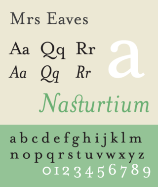
Mrs Eaves is a transitional serif typeface designed by Zuzana Licko in 1996. It is a variant of Baskerville, which was designed in Birmingham, England, in the 1750s. Mrs Eaves adapts Baskerville for use in display contexts, such as headings and book blurbs, through the use of a low x-height and a range of unusual combined characters or ligatures.

Joanna is a serif typeface designed by Eric Gill (1882–1940) from 1930 to 1931 that was named for one of his daughters. Gill chose Joanna for setting An Essay on Typography, a book by Gill on his thoughts on typography, typesetting and page design. He described it as "a book face free from all fancy business".
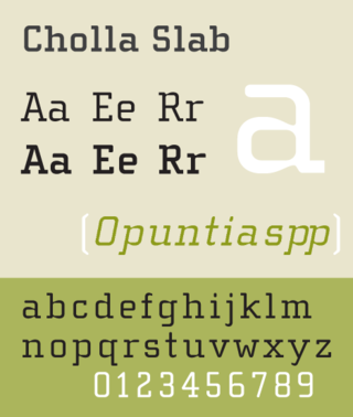
Cholla Slab is a geometric slab-serif variant of a larger typeface family called Cholla designed by Sibylle Hagmann in the period 1998–1999 for the Art Center College of Design. Cholla is licensed by the Emigre foundry. The typeface is named for a group of cactus species indigenous to the Mojave Desert.
Paul Scott Makela was a graphic designer, multimedia designer and type designer. Among other work, he was especially noted for the design of Dead History, a postmodern typeface that combined features of a rounded sans serif typeface and a crisp neo-classical serif typeface. With the emergence of the personal computer in the mid-1980s, Makela was among the first to explore digital programs such as Photoshop and Adobe Illustrator. As a result, he created an idiosyncratic, original and highly controversial design aesthetic. In particular, his disregard for clean, modernist, problem-solving design agendas—synonymous with contemporary corporate graphic design—caused much debate among powerful, old-guard designers such as Massimo Vignelli, Paul Rand, and Henry Wolf.
Edward Fella is an American graphic designer, artist and educator. He created the OutWest typeface in 1993. His work is held in the collection of the Cooper-Hewitt, National Design Museum, the Brauer Museum of Art, and the Museum of Modern Art. He was the recipient of the 2007 AIGA Medal. He was also the recipient of a Chrysler Award in 1997. Curt Cloninger called Fella "the contemporary master of hand-drawn typography."
Evert Bloemsma was a Dutch photographer, graphic designer, type designer, and art school educator.
John Downer is an American sign painter, typeface and logo designer. Downer began his career as a painter of signs. Among his best-known digital fonts are Iowan Old Style, Roxy, Triplex Italic, and Brothers.
East Asian typography is the application of typography to the writing systems used for the Chinese, Japanese, Korean, and Vietnamese languages. Scripts represented in East Asian typography include Chinese characters, kana, and hangul.
