Diotima (typeface)

Last updated
Diotima
Diotima specimen.png
Category Serif
Display
Designer(s) Gudrun Zapf-von Hesse
Foundry Stempel
Linotype
Date released c. 1951

Diotima is a serif typeface designed by Gudrun Zapf-von Hesse and published by Stempel. [lower-alpha 1] [1]

In typography, a serif is a small line or stroke regularly attached to the end of a larger stroke in a letter or symbol within a particular font or family of fonts. A typeface or "font family" making use of serifs is called a serif typeface, and a typeface that does not include them is a sans-serif one. Some typography sources refer to sans-serif typefaces as "grotesque" or "Gothic", and serif typefaces as "roman".

Typeface set of characters that share common design features

In typography, a typeface is a set of one or more fonts each composed of glyphs that share common design features. Each font of a typeface has a specific weight, style, condensation, width, slant, italicization, ornamentation, and designer or foundry. For example, "ITC Garamond Bold Condensed Italic" means the bold, condensed-width, italic version of ITC Garamond. It is a different font from "ITC Garamond Condensed Italic" and "ITC Garamond Bold Condensed", but all are fonts within the same typeface, "ITC Garamond". ITC Garamond is a different typeface from "Adobe Garamond" or "Monotype Garamond". There are thousands of different typefaces in existence, with new ones being developed constantly.

Gudrun Zapf von Hesse is a German typographer, calligrapher and book-binder. She is the 1991 winner of the Frederic W. Goudy Award. She has also designed several fonts.

Contents

Diotima has a relatively slender and wide design, light in colour and suitable for purposes such as decorative printing and headings rather than for body text. [2] [3] [4] Aspects of the roman recall Roman square capitals such as those on the Column of Trajan, such as the 'M' with no upper serifs (it has serifs in italic). The italic lower-case is relatively calligraphic in design with a 'single-story' 'g'. The design is named for the philosopher Diotima of Mantinea, perhaps appropriately highlighting its status as one of the few typefaces designed by a woman up to this point.

Type color an element of typography that describes how dense or heavy the text appears on the page, not to be confused with the color of the text

Type color is an element of typography that describes how dense or heavy the text appears on the page. Finding the correct balance of type color and white space can make text more easily readable. The term type color should not be confused with the usual meaning of color,, instead it has more to do with the blackness or boldness of the text on the page. A bold font creates more contrast on the page, therefore creates more emphasis. Using a bold font is therefore one way that type color can be adjusted.

Roman square capitals ancient Roman style of writing

Roman square capitals, also called capitalis monumentalis, inscriptional capitals, elegant capitals and capitalis quadrata, are an ancient Roman form of writing, and the basis for modern capital letters.

Italic type font style characterized by cursive typeface and slanted design

In typography, italic type is a cursive font based on a stylized form of calligraphic handwriting. Owing to the influence from calligraphy, italics normally slant slightly to the right. Italics are a way to emphasise key points in a printed text, to identify many types of creative works, or, when quoting a speaker, a way to show which words they stressed. One manual of English usage described italics as "the print equivalent of underlining".

Diotima was released in the roman or regular style around 1951 and the italic around 1953, although Zapf-von Hesse had been working on the design for some years by this point. [5] [6] [7] The design was her first full typeface. [8] Her husband, Hermann Zapf, used it for typesetting their wedding announcement. [9]

Roman type typeface that originates from ancient Rome

In Latin script typography, roman is one of the three main kinds of historical type, alongside blackletter and italic. Roman type was modelled from a European scribal manuscript style of the 15th century, based on the pairing of inscriptional capitals used in ancient Rome with Carolingian minuscules developed in the Holy Roman Empire.

Hermann Zapf German type-designer, calligrapher, author and artist

Hermann Zapf was a German type designer and calligrapher who lived in Darmstadt, Germany. He was married to the calligrapher and typeface designer Gudrun Zapf-von Hesse. Typefaces he designed include Palatino, Optima and Zapfino.

As was common for work by Stempel at this time, the original release was crafted by the punchcutter August Rosenberger. Stempel later released Ariadne-Initialen (Ariadne Initials), a set of swash capitals to complement it. The design was later reissued by Linotype.

Punchcutting

Punchcutting is a craft used in traditional typography to cut letter punches in steel as the first stage of making metal type. Steel punches in the shape of the letter would be used to stamp matrices into copper, which were locked into a mould shape to cast type. Cutting punches and casting type was the first step of traditional typesetting. The cutting of letter punches was a highly skilled craft requiring much patience and practice. Often the designer of the type would not be personally involved in the cutting.
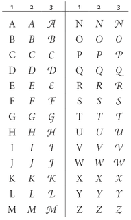
Swash (typography) a typographical flourish found on some letterforms, particularly in italics

A swash is a typographical flourish, such as an exaggerated serif, terminal, tail, entry stroke, etc., on a glyph. The use of swash characters dates back to at least the 16th century, as they can be seen in Ludovico Vicentino degli Arrighi's La Operina, which is dated 1522. As with italic type in general, they were inspired by the conventions of period handwriting. Arrighi's designs influenced designers in Italy and particularly in France.

Mergenthaler Linotype Company type foundry

The Mergenthaler Linotype Company is a corporation founded in the United States in 1886 to market the Linotype machine, a system to cast metal type in lines (linecaster) invented by Ottmar Mergenthaler. It became the world's leading manufacturer of book and newspaper typesetting equipment; outside North America, its only serious challenger for book production was the Anglo-American Monotype Corporation. It also offered phototypesetting and digital products before being taken over by Monotype Imaging in 2006.

In 2001, San Francisco Public Library held an exhibition on Hermann and Gudrun Zapf's work, showcasing early specimens of Diotima. [10]

San Francisco Public Library public library system of the city of San Francisco, California

The San Francisco Public Library is the public library system of the city of San Francisco. The Main Library is located at Civic Center, at 100 Larkin Street. The library system has won several awards, such as Library Journal's Library of the Year award in 2018. The library is well-funded due to the city's dedicated Library Preservation Fund that was established by a 1994 ballot measure, which was subsequently renewed until 2022 by a ballot measure in 2007.

Digitisations

Diotima was digitised early on in the period of digital fonts, with releases by Linotype (which had inherited the rights from Stempel) and Adobe.

In 2008-9, Zapf-von Hesse and Akira Kobayashi of Linotype released Diotima Classic, a new interpretation. It is in light, regular, bold and heavy weights and italics. [11] Linotype described the 'regular' weight as corresponding to the metal type after ink spread, and the light as analogous to the previous digital version (that shown right). [12] The bold and heavy weights were new additions. The width was somewhat reduced in roman and widened in italic. [1]

Related Research Articles

Palatino typeface

Palatino is the name of an old-style serif typeface designed by Hermann Zapf, initially released in 1949 by the Stempel foundry and later by other companies, most notably the Mergenthaler Linotype Company.

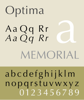
Optima typeface

Optima is a humanist sans-serif typeface designed by Hermann Zapf and released by the D. Stempel AG foundry, Frankfurt, Germany.

Garamond typeface family

Garamond is a group of many old-style serif typefaces, named for sixteenth-century Parisian engraver Claude Garamond. Garamond-style typefaces are popular and often used, particularly for printing body text and books.

Frutiger (typeface) typeface

Frutiger is a series of typefaces named after its Swiss designer, Adrian Frutiger. Frutiger is a humanist sans-serif typeface, intended to be clear and highly legible at a distance or at small text sizes. A very popular design worldwide, type designer Steve Matteson described its structure as "the best choice for legibility in pretty much any situation" at small text sizes, while Erik Spiekermann named it as "the best general typeface ever".

Univers typeface

Univers is the name of a large sans-serif typeface family designed by Adrian Frutiger and released by his employer Deberny & Peignot in 1957. Classified as a neo-grotesque sans-serif, one based on the model of nineteenth-century German typefaces such as Akzidenz-Grotesk, it was notable for its availability from the moment of its launch in a comprehensive range of weights and widths. The original marketing for Univers deliberately referenced the periodic table to emphasise its scope.

William Addison Dwiggins, was an American type designer, calligrapher, and book designer. He attained prominence as an illustrator and commercial artist, and he brought to the designing of type and books some of the boldness that he displayed in his advertising work. His work can be described as ornamented and geometric, similar to the Art Moderne and Art Deco styles of the period, using Oriental influences and breaking from the more antiquarian styles of his colleagues and mentors Updike, Cleland and Goudy.

Antiqua (typeface class)

Antiqua ) is a style of typeface used to mimic styles of handwriting or calligraphy common during the 15th and 16th centuries. Letters are designed to flow and strokes connect together in a continuous fashion; in this way it is often contrasted with Fraktur-style typefaces where the individual strokes are broken apart. The two typefaces were used alongside each other in the germanophone world, with the Antiqua–Fraktur dispute often dividing along ideological or political lines. After the mid-20th century, Fraktur fell out of favor and Antiqua-based typefaces became the official standard.

Zapfino typeface

Zapfino is a calligraphic typeface designed for Linotype by typeface designer Hermann Zapf in 1998. It is based on an alphabet Zapf originally penned in 1944. As a font, it makes extensive use of ligatures and character variations.

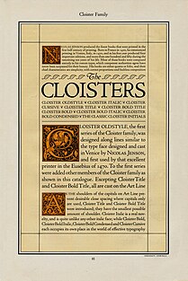
Kabel (typeface) typeface

Kabel is a sans-serif typeface designed by German designer Rudolf Koch, and released by the Klingspor foundry from 1927 onwards.

Trajan (typeface) typeface

Trajan is a serif typeface designed in 1989 by Carol Twombly for Adobe.

Goudy Old Style typeface

Goudy Old Style is an old-style serif typeface originally created by Frederic W. Goudy for American Type Founders (ATF) in 1915.

Sabon typeface

Sabon is an old-style serif typeface designed by the German-born typographer and designer Jan Tschichold (1902–1974) in the period 1964–1967. It was released jointly by the Linotype, Monotype, and Stempel type foundries in 1967. The design of the roman is based on types by Claude Garamond, particularly a specimen printed by the Frankfurt printer Konrad Berner. Berner had married the widow of a fellow printer Jacques Sabon, the source of the face's name, who had bought some of Garamond's type after his death. The italics are based on types designed by a contemporary of Garamond's, Robert Granjon. It is effectively a Garamond revival, though a different name was chosen as many other modern typefaces already carry this name.

Syntax (typeface)

Syntax comprises a family of fonts designed by Swiss typeface designer Hans Eduard Meier. Originally just a sans-serif font, it was extended with additional serif designs.

Stempel Type Foundry German type foundry

D. Stempel AG was a German typographic foundry founded by David Stempel (1869–1927), in Frankfurt am Main, Germany. Many important font designers worked for the Stempel foundry, including Hans Bohn, Warren Chappell, F. H. Ehmcke, Friedrich Heinrichsen, Hanns Th. Hoyer, F. W. Kleukens, Erich Meyer, Hans Möhring, Hiero Rhode, Wilhelm Schwerdtner, Herbert Thannhaeuser, Martin Wilke, Rudolf Wolf, Victor Hammer, Hermann Zapf, and Gudrun Zapf von Hesse. With the introduction of Memphis in 1929, the foundry was the first to cast modern slab serif typefaces.

Electra (typeface) serif typeface

Electra is a serif typeface designed by William Addison Dwiggins and published by the Mergenthaler Linotype Company from 1935 onwards. A book face intended for body text, Dwiggins described the design as intended to be a 'modern roman type letter' with 'personality', avoiding direct revival of any historical model. He therefore chose the name Electra to suggest electricity and crisp modernity, "like metal shavings coming off a lathe".

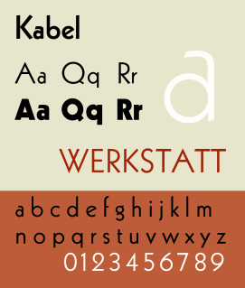
Cloister (typeface) tipeface

Cloister is a serif typeface that was designed by Morris Fuller Benton and published by American Type Founders from around 1913. It is loosely based on the printing of Nicolas Jenson in Venice in the 1470s, in what is now called the "old style" of serif fonts. American Type Founders presented it as an attractive but highly usable serif typeface, suitable both for body text and display use.

URW Grotesk

URW Grotesk is a large sans-serif typeface family designed by Hermann Zapf for URW in the mid-1980s.

References

  1. 1 2 Shaw, Paul. "Diotima Classic". Print . Retrieved 15 June 2016.
  2. Macmillan, Neil (2006). An A-Z of Type Designers. Yale University Press. p. 189. ISBN   0-300-11151-7.
  3. Jaspert, W. P.; Berry, W. Turner; Johnson, Alfred Forbes (1970). The Encyclopaedia of Type Faces (4 ed.). London: Blandford Press. p. 70.
  4. "Diotima Antiqua". Linotype. Retrieved 15 June 2016.
  5. "Diotima Classic – Gudrun Zapf von Hesse recreates a post-war favorite". Linotype. Retrieved 15 June 2016.
  6. Shaw, Paul. "Zapfiana no. 4: The Typefaces of Gudrun Zapf-von Hesse". Paul Shaw Letter Design. Retrieved 15 June 2016.
  7. "Unseen Hands: Women Printers, Binders and Book Designers". Princeton University Library . Retrieved 15 June 2016.
  8. Hesse, Gudrun Zapf von; Batty, Mark (2002). Gudrun Zapf von Hesse: bindings, handwritten books, type faces, examples of lettering and drawings (English language ed., deluxe ed.). West New York, N.J.: Mark Batty. pp. 9–10. ISBN   9780971568723.
  9. Haley, Allan (1990). ABC's of type. New York: Watson-Guptill Publications. pp. 81–3. ISBN   9780823000531.
  10. Taylor, Susie. "Calligraphic Type Design in the Digital Age: Honoring Friends". San Francisco Public Library . Retrieved 15 June 2016.
  11. "Klassiker in neuem Gewand" (PDF). Desktop Dialog: Das Publishing-Magazin. Retrieved 15 June 2016.
  12. "Diotima Classic". Linotype. Retrieved 15 June 2016.
  1. Zapf-von Hesse married her husband Hermann Zapf in 1951, around the time Diotima was first released. Her married name is used throughout this article for consistency.