The social science of economics makes extensive use of graphs to better illustrate the economic principles and trends it is attempting to explain. Those graphs have specific qualities that are not often found (or are not often found in such combinations) in other sciences.
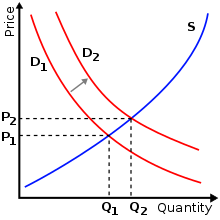
The supply and demand model describes how prices vary as a result of a balance between product availability and demand. The graph depicts an increase (that is, right-shift) in demand from D1 to D2 along with the consequent increase in price and quantity required to reach a new equilibrium point on the supply curve (S).
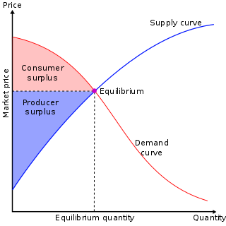
A common and specific example is the supply-and-demand graph shown at right. This graph shows supply and demand as opposing curves, and the intersection between those curves determines the equilibrium price. An alteration of either supply or demand is shown by displacing the curve to either the left (a decrease in quantity demanded or supplied) or to the right (an increase in quantity demanded or supplied); this shift results in new equilibrium price and quantity. Economic graphs are presented only in the first quadrant of the Cartesian plane when the variables conceptually can only take on non-negative values (such as the quantity of a product that is produced). Even though the axes refer to numerical variables, specific values are often not introduced if a conceptual point is being made that would apply to any numerical examples.
More generally, there is usually some mathematical model underlying any given economic graph. For instance, the commonly used supply-and-demand graph has its underpinnings in general price theory—a highly mathematical discipline.
Choice of axes for dependent and independent variables
An example of real GDP (y) plotted against time (x). Often time is denoted as t instead of x.The IS curve moves to the right if spending plans at any potential interest rate go up, causing the new equilibrium to have higher interest rates (i) and expansion in the "real" economy (real GDP, or Y).
In most mathematical contexts, the independent variable is placed on the horizontal axis and the dependent variable on the vertical axis. For example, if f(x) is plotted against x, conventionally x is plotted horizontally and the value of the function is plotted vertically. This placement is often, but not always, reversed in economic graphs. For example, in the supply-demand graph at the top of this page, the independent variable (price) is plotted on the vertical axis, and the dependent variable (quantity supplied or demanded), whose value depends on price, is plotted horizontally.
However, when time is the independent variable, and values of some other variable are plotted as a function of time, normally the independent variable time is plotted horizontally, as in the line graph to the right.
Yet other graphs may have one curve for which the independent variable is plotted horizontally and another curve for which the independent variable is plotted vertically. For example, in the IS-LM graph shown here, the IS curve shows the amount of the dependent variable spending (Y) as a function of the independent variable the interest rate (i), while the LM curve shows the value of the dependent variable, the interest rate, that equilibrates the money market as a function of the independent variable income (which equals expenditure on an economy-wide basis in equilibrium). Since the two different markets (the goods market and the money market) take as given different independent variables and determine by their functioning different dependent variables, necessarily one curve has its independent variable plotted horizontally and the other vertically.
Related Research Articles
Microeconomics is a branch of mainstream economics that studies the behavior of individuals and firms in making decisions regarding the allocation of scarce resources and the interactions among these individuals and firms. Microeconomics focuses on the study of individual markets, sectors, or industries as opposed to the national economy as a whole, which is studied in macroeconomics.
In microeconomics, supply and demand is an economic model of price determination in a market. It postulates that, holding all else equal, in a competitive market, the unit price for a particular good, or other traded item such as labor or liquid financial assets, will vary until it settles at a point where the quantity demanded will equal the quantity supplied, resulting in an economic equilibrium for price and quantity transacted. The concept of supply and demand forms the theoretical basis of modern economics.
In mainstream economics, economic surplus, also known as total welfare or total social welfare or Marshallian surplus, is either of two related quantities:
IS–LM model, or Hicks–Hansen model, is a two-dimensional macroeconomic tool that shows the relationship between interest rates and assets market. The intersection of the "investment–saving" (IS) and "liquidity preference–money supply" (LM) curves models "general equilibrium" where supposed simultaneous equilibria occur in both the goods and the asset markets. Yet two equivalent interpretations are possible: first, the IS–LM model explains changes in national income when the price level is fixed in the short-run; second, the IS–LM model shows why an aggregate demand curve can shift. Hence, this tool is sometimes used not only to analyse economic fluctuations but also to suggest potential levels for appropriate stabilisation policies.
A phase diagram in physical chemistry, engineering, mineralogy, and materials science is a type of chart used to show conditions at which thermodynamically distinct phases occur and coexist at equilibrium.
A chart is a graphical representation for data visualization, in which "the data is represented by symbols, such as bars in a bar chart, lines in a line chart, or slices in a pie chart". A chart can represent tabular numeric data, functions or some kinds of quality structure and provides different info.
In economics, elasticity measures the responsiveness of one economic variable to a change in another. If the price elasticity of the demand of something is -2, a 10% increase in price causes the quantity demanded to fall by 20%. Elasticity in economics provides an understanding of changes in the behavior of the buyers and sellers with price changes. There are two types of elasticity for demand and supply, one is inelastic demand and supply and other one is elastic demand and supply.
In economics, economic equilibrium is a situation in which economic forces such as supply and demand are balanced and in the absence of external influences the values of economic variables will not change. For example, in the standard text perfect competition, equilibrium occurs at the point at which quantity demanded and quantity supplied are equal.
In economics, the marginal cost is the change in the total cost that arises when the quantity produced is incremented, the cost of producing additional quantity. In some contexts, it refers to an increment of one unit of output, and in others it refers to the rate of change of total cost as output is increased by an infinitesimal amount. As Figure 1 shows, the marginal cost is measured in dollars per unit, whereas total cost is in dollars, and the marginal cost is the slope of the total cost, the rate at which it increases with output. Marginal cost is different from average cost, which is the total cost divided by the number of units produced.
In macroeconomics, aggregate demand (AD) or domestic final demand (DFD) is the total demand for final goods and services in an economy at a given time. It is often called effective demand, though at other times this term is distinguished. This is the demand for the gross domestic product of a country. It specifies the amount of goods and services that will be purchased at all possible price levels. Consumer spending, investment, corporate and government expenditure, and net exports make up the aggregate demand.
In economics, average cost (AC) or unit cost is equal to total cost (TC) divided by the number of units of a good produced :
A demand curve is a graph depicting the inverse demand function, a relationship between the price of a certain commodity and the quantity of that commodity that is demanded at that price. Demand curves can be used either for the price-quantity relationship for an individual consumer, or for all consumers in a particular market.
In economics, an inverse demand function is the mathematical relationship that expresses price as a function of quantity demanded.
In economics, demand is the quantity of a good that consumers are willing and able to purchase at various prices during a given time. The relationship between price and quantity demand is also called the demand curve. Demand for a specific item is a function of an item's perceived necessity, price, perceived quality, convenience, available alternatives, purchasers' disposable income and tastes, and many other options.
In economics, supply is the amount of a resource that firms, producers, labourers, providers of financial assets, or other economic agents are willing and able to provide to the marketplace or to an individual. Supply can be in produced goods, labour time, raw materials, or any other scarce or valuable object. Supply is often plotted graphically as a supply curve, with the price per unit on the vertical axis and quantity supplied as a function of price on the horizontal axis. This reversal of the usual position of the dependent variable and the independent variable is an unfortunate but standard convention.
In mathematics, the elasticity or point elasticity of a positive differentiable function f of a positive variable at point a is defined as
The AD–AS or aggregate demand–aggregate supply model is a macroeconomic model that explains price level and output through the relationship of aggregate demand (AD) and aggregate supply (AS).
A plot is a graphical technique for representing a data set, usually as a graph showing the relationship between two or more variables. The plot can be drawn by hand or by a computer. In the past, sometimes mechanical or electronic plotters were used. Graphs are a visual representation of the relationship between variables, which are very useful for humans who can then quickly derive an understanding which may not have come from lists of values. Given a scale or ruler, graphs can also be used to read off the value of an unknown variable plotted as a function of a known one, but this can also be done with data presented in tabular form. Graphs of functions are used in mathematics, sciences, engineering, technology, finance, and other areas.
In mathematical dynamics, discrete time and continuous time are two alternative frameworks within which variables that evolve over time are modeled.
John Hicks's 1937 paper Mr. Keynes and the "Classics"; a suggested interpretation is the most influential study of the views presented by J. M. Keynes in his General Theory of Employment, Interest, and Money of February 1936. It gives "a potted version of the central argument of the General Theory" as an equilibrium specified by two equations which dominated Keynesian teaching until Axel Leijonhufvud published a critique in 1968. Leijonhufvud's view that Hicks misrepresented Keynes's theory by reducing it to a static system was in turn rejected by many economists who considered much of the General Theory to be as static as Hicks portrayed it.
This page is based on this Wikipedia article Text is available under the CC BY-SA 4.0 license; additional terms may apply. Images, videos and audio are available under their respective licenses.