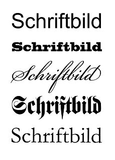
In typography and lettering, a sans-serif, sans serif, gothic, or simply sans letterform is one that does not have extending features called "serifs" at the end of strokes. Sans-serif fonts tend to have less line width variation than serif fonts. In most print, they are often used for headings rather than for body text. They are often used to convey simplicity and modernity or minimalism.

Frutiger is a series of typefaces named after its Swiss designer, Adrian Frutiger. Frutiger is a humanist sans-serif typeface, intended to be clear and highly legible at a distance or at small text sizes. A very popular design worldwide, type designer Steve Matteson described its structure as "the best choice for legibility in pretty much any situation" at small text sizes, while Erik Spiekermann named it as "the best general typeface ever".

Univers is the name of a large sans-serif typeface family designed by Adrian Frutiger and released by his employer Deberny & Peignot in 1957. Classified as a neo-grotesque sans-serif, one based on the model of nineteenth-century German typefaces such as Akzidenz-Grotesk, it was notable for its availability from the moment of its launch in a comprehensive range of weights and widths. The original marketing for Univers deliberately referenced the periodic table to emphasise its scope.

Adrian Johann Frutiger was a Swiss typeface designer who influenced the direction of type design in the second half of the 20th century. His career spanned the hot metal, phototypesetting and digital typesetting eras. Until his death, he lived in Bremgarten bei Bern.

Georgia is a serif typeface designed in 1993 by Matthew Carter and hinted by Tom Rickner for the Microsoft Corporation. It was intended as a serif font that would appear elegant but legible printed small or on low-resolution screens. The font is inspired by Scotch Roman designs of the 19th century and was based on designs for a print typeface in the same style Carter was working on when contacted by Microsoft; this would be released under the name Miller the following year. The typeface's name referred to a tabloid headline claiming "Alien heads found in Georgia."
Deberny & Peignot was a French type foundry, created by the 1923 merger of G. Peignot & Fils and Deberny & Cie. It was bought by the Haas Type Foundry (Switzerland) in 1972, which in turn was merged into D. Stempel AG in 1985, then into Linotype GmbH in 1989, and is now part of Monotype Corporation.

In typography, a counter is the area of a letter that is entirely or partially enclosed by a letter form or a symbol. The stroke that creates such a space is known as a "bowl". Letters containing closed counters include A, B, D, O, P, Q, R, a, b, d, e, g, o, p, and q. Letters containing open counters include c, f, h, i, s etc. The digits 0, 4, 6, 8, and 9 also possess a counter. An aperture is the opening between an open counter and the outside of the letter.
Oblique type is a form of type that slants slightly to the right, used for the same purposes as italic type. Unlike italic type, however, it does not use different glyph shapes; it uses the same glyphs as roman type, except slanted. Oblique and italic type are technical terms to distinguish between the two ways of creating slanted font styles; oblique designs may be labelled italic by companies selling fonts or by computer programs. Oblique designs may also be called slanted or sloped roman styles. Oblique fonts, as supplied by a font designer, may be simply slanted, but this is often not the case: many have slight corrections made to them to give curves more consistent widths, so they retain the proportions of counters and the thick-and-thin quality of strokes from the regular design.

NPS Rawlinson Roadway is an old style serif typeface currently used on the United States National Park Service's road signs. It was created by Terminal Design to replace Clarendon. Type designer James Montalbano named the typeface after his wife's surname, as her father worked for the Forest Service.

Copperplate Gothic is a typeface designed by Frederic W. Goudy and released by American Type Founders (ATF) in 1901.

In metal typesetting, a font was a particular size, weight and style of a typeface. Each font was a matched set of type, one piece for each glyph, and a typeface consisting of a range of fonts that shared an overall design.

Didot is a group of typefaces named after the famous French printing and type producing Didot family. The classification is known as modern, or Didone.

Bell Centennial is an realist sans-serif typeface designed by Matthew Carter in the period 1975–78. The typeface was commissioned by AT&T as a proprietary type to replace their then current directory typeface Bell Gothic on the occasion of AT&T’s one hundredth anniversary. Carter was working for the Mergenthaler Linotype Company which now licenses the face for general public use.
In typography, the Vox-ATypI classification makes it possible to classify typefaces into general classes. Devised by Maximilien Vox in 1954, it was adopted in 1962 by the Association Typographique Internationale (ATypI) and in 1967 as a British Standard, as British Standards Classification of Typefaces, which is a very basic interpretation and adaptation/modification of the earlier Vox-ATypI classification.

Avenir is a sans-serif typeface designed by Adrian Frutiger and released in 1988 by Linotype GmbH.
Égyptienne or L'Égyptienne may refer to:

A reverse-contrast letterform is a typeface or custom lettering in which the stress is reversed from the norm: instead of the vertical lines being the same width or thicker than horizontals, which is normal in Latin-alphabet writing and especially printing, the horizontal lines are the thickest. The result is a dramatic effect, in which the letters seem to have been printed the wrong way round. Originally invented in the early nineteenth century as attention-grabbing novelty display designs, modern font designer Peter Biľak, who has created a design in the genre, has described them as "a dirty trick to create freakish letterforms that stood out."

Méridien is a serif typeface designed by Adrian Frutiger and released by Deberny & Peignot in 1957 for its phototypesetting system.


