
The Fann Street Foundry was a type foundry (a company that designs or distributes typefaces) located on Fann Street, City of London.
The Fann Street Foundry was a type foundry (a company that designs or distributes typefaces) located on Fann Street, City of London.
In 1794, Robert Thorne (1754-1820) acquired the type foundry of the late Thomas Cottrell based in Nevil's Court, and moved it to 11 Barbican, and then in 1802 to a former brewery in Fann Street, and renamed it the Fann Street Foundry. On his death in 1820, the business was bought by William Thorowgood with the help of money he had won in a lottery. [1] [2] Thorowgood was the first to use the term "Grotesque" to describe a Sans-Serif typeface and to design one in lowercase with his Seven Line Grotesque. [3]
In 1838, the typographer Robert Besley was taken into partnership by William Thorowgood at the Fann Street Foundry. [1] He created Clarendon in 1845, the first typeface registered under the Ornamental Designs Act of 1842, and retired from the business in 1861, becoming Lord Mayor of London in 1869. [4] [2] [5]
In 1842, Charles Reed co-founded the firm of Tyler & Reed, printers and typefounders. He became a partner in the Fann Street Foundry in 1861 (which after that became known as Reed & Fox). The Fann Street business formed the basis for his own typefounding business, Sir Charles Reed & Sons, which had an office at 33 Aldersgate Street. [6] [7]
In 1881, following his father's death, the author and typefounder, Talbot Baines Reed, became head of the Fann Street Foundry. [8] By then, he had begun his monumental History of the Old English Letter Foundries, published in 1887, which was hailed as the standard work on the subject. Talbot Baines Reed died in 1893, aged only 41. [9]


Fann Street Foundry closed in 1906, after which its designs passed to the Sheffield-based Stephenson Blake. [10] Founded in 1818, Stephenson Blake was the last active type foundry in the UK at its closure in 2005. [11]

In typography and lettering, a sans-serif, sans serif, gothic, or simply sans letterform is one that does not have extending features called "serifs" at the end of strokes. Sans-serif typefaces tend to have less stroke width variation than serif typefaces. They are often used to convey simplicity and modernity or minimalism. For the purposes of type classification, sans-serif designs are usually divided into these major groups: § Grotesque, § Neo-grotesque, § Geometric, § Humanist, and § Other or mixed.

Gill Sans is a humanist sans-serif typeface designed by Eric Gill and released by the British branch of Monotype from 1928 onwards.

William Caslon I, also known as William Caslon the Elder, was an English typefounder. The distinction and legibility of his type secured him the patronage of the leading printers of the day in England and on the continent. His typefaces transformed English type design and first established an English national typographic style.

In typography, a slab serif typeface is a type of serif typeface characterized by thick, block-like serifs. Serif terminals may be either blunt and angular (Rockwell), or rounded (Courier). Slab serifs were introduced in the early nineteenth century.

Didone is a genre of serif typeface that emerged in the late 18th century and was the standard style of general-purpose printing during the 19th century. It is characterized by:

Sir Charles Reed FSA was a British politician who served as Member of Parliament for Hackney and for St Ives, Chairman of the London School Board, Director and Trustee of the original Abney Park Cemetery Joint Stock Company, Chairman of the Bunhill Fields Preservation Committee, associate of George Peabody, lay Congregationalist, and owner of a successful commercial type-founding business in London. He was elected a Fellow of the Society of Antiquaries, and was knighted by the Queen at Windsor Castle in 1874. As a pastime he collected autographed letters and keys.

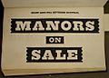
Clarendon is the name of a slab serif typeface that was released in 1845 by Thorowgood and Co. of London, a letter foundry often known as the Fann Street Foundry. The original Clarendon design is credited to Robert Besley, a partner in the foundry, and was originally engraved by punchcutter Benjamin Fox, who may also have contributed to its design. Many copies, adaptations and revivals have been released, becoming almost an entire genre of type design.

Talbot Baines Reed was an English writer of boys' fiction who established a genre of school stories that endured into the mid-20th century. Among his best-known work is The Fifth Form at St. Dominic's. He was a regular and prolific contributor to The Boy's Own Paper (B.O.P.), in which most of his fiction first appeared. Through his family's business, Reed became a prominent typefounder, and wrote a standard work on the subject: History of the Old English Letter Foundries.

Stephenson Blake is an engineering company based in Sheffield, England. The company was active from the early 19th century as a type founder, remaining until the 1990s as the last active type foundry in Britain, since when it has diversified into specialist engineering.
Robert Besley (1794–1876) was an English typographer, creator of the Clarendon typeface in 1845, and the Lord Mayor of London in 1869.
Edmund Fry (1754–1835) was an English type-founder.

Vincent Figgins was a British typefounder based in London, who cast and sold metal type for printing. After an apprenticeship with typefounder Joseph Jackson, he established his own type foundry in 1792. His company was extremely successful and, with its range of modern serif faces and display typefaces, had a strong influence on the styles of British printing in the nineteenth century. A successor company continued to make type until the 1970s.
Memphis is a slab-serif typeface designed by Rudolf Wolf and released in 1929 by the Stempel Type Foundry.

Fann Street is a street in the City of London, England.
Robert Thorne was a British type founder and typographer. An apprentice to Thomas Cottrell, who had been an employee of William Caslon, Thorne later acquired Cottrell's type foundry. He was successful in business and left a fortune of £25,000 on his death in 1820. Thorne is buried at Holloway Road Cemetery, where his tomb is extant.

A reverse-contrast or reverse-stress letterform is a design in which the stress is reversed from the norm: a typeface or custom lettering where the horizontal lines are the thickest. This is the reverse of the vertical lines being the same width or thicker than horizontals, which is normal in Latin-alphabet writing and especially printing. The result is a dramatic effect, in which the letters seem to have been printed the wrong way round. The style invented in the early nineteenth century as attention-grabbing novelty display designs. Modern font designer Peter Biľak, who has created a design in the genre, has described them as "a dirty trick to create freakish letterforms that stood out."

Miller & Richard was a type foundry based in Edinburgh that designed and manufactured metal type. It operated from 1809 to 1952.

The Stephenson Blake Grotesque fonts are a series of sans-serif typefaces created by the type foundry Stephenson Blake of Sheffield, England, mostly around the beginning of the twentieth century.

In typography, a fat face letterform is a serif typeface or piece of lettering in the Didone or modern style with an extremely bold design. Fat face typefaces appeared in London around 1805–1810 and became widely popular; John Lewis describes the fat face as "the first real display typeface."
The Caslon type foundry was a type foundry in London which cast and sold metal type. It was founded by the punchcutter and typefounder William Caslon I, probably in 1720. For most of its history it was based at Chiswell Street, Islington, was the oldest type foundry in London, and the most prestigious.