
Typography is the art and technique of arranging type to make written language legible, readable and appealing when displayed. The arrangement of type involves selecting typefaces, point sizes, line lengths, line-spacing (leading), and letter-spacing (tracking), as well as adjusting the space between pairs of letters (kerning). The term typography is also applied to the style, arrangement, and appearance of the letters, numbers, and symbols created by the process. Type design is a closely related craft, sometimes considered part of typography; most typographers do not design typefaces, and some type designers do not consider themselves typographers. Typography also may be used as an ornamental and decorative device, unrelated to the communication of information.

Verdana is a humanist sans-serif typeface designed by Matthew Carter for Microsoft Corporation, with hand-hinting done by Thomas Rickner, then at Monotype. Demand for such a typeface was recognized by Virginia Howlett of Microsoft's typography group and commissioned by Steve Ballmer. The name "Verdana" is based on verdant, and Ana.

In typography and lettering, a sans-serif, sans serif, gothic, or simply sans letterform is one that does not have extending features called "serifs" at the end of strokes. Sans-serif typefaces tend to have less stroke width variation than serif typefaces. They are often used to convey simplicity and modernity or minimalism.

A typeface is the design of lettering that can include variations in size, weight, slope, width, and so on. Each of these variations of the typeface is a font.
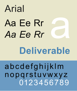
Arial, sometimes marketed or displayed in software as Arial MT, is a sans-serif typeface and set of computer fonts in the neo-grotesque style. Fonts from the Arial family are packaged with all versions of Microsoft Windows from Windows 3.1 onwards, some other Microsoft software applications, Apple's macOS and many PostScript 3 computer printers. The typeface was designed in 1982, by Robin Nicholas and Patricia Saunders, for Monotype Typography. It was created to be metrically identical to the popular typeface Helvetica, with all character widths identical, so that a document designed in Helvetica could be displayed and printed correctly without having to pay for a Helvetica license.

Univers is the name of a large sans-serif typeface family designed by Adrian Frutiger and released by his employer Deberny & Peignot in 1957. Classified as a neo-grotesque sans-serif, one based on the model of nineteenth-century German typefaces such as Akzidenz-Grotesk, it was notable for its availability from the moment of its launch in a comprehensive range of weights and widths. The original marketing for Univers deliberately referenced the periodic table to emphasise its scope.

Tahoma is a humanist sans-serif typeface that Matthew Carter designed for Microsoft Corporation. Microsoft first distributed it, along with Carter's Verdana, as a standard font in the initial release of Windows 95.

Lucida is an extended family of related typefaces designed by Charles Bigelow and Kris Holmes and released from 1984 onwards. The family is intended to be extremely legible when printed at small size or displayed on a low-resolution display – hence the name, from 'lucid'.
The font family selection in (X)HTML, CSS, and derived systems specifies a list of prioritized fonts and generic family names; in conjunction with correlating font properties, this list determines the particular font face used to render characters. The family selection is available in two forms: in the deprecated (X)HTML <font>...</font> element with its face attribute, and in the CSS font-family property.
A computer font is implemented as a digital data file containing a set of graphically related glyphs. A computer font is designed and created using a font editor. A computer font specifically designed for the computer screen, and not for printing, is a screen font.

In typography, small caps are lowercase characters typeset with glyphs that resemble uppercase letters (capitals) but reduced in height and weight, close to the surrounding lowercase letters or text figures. This is technically not a case-transformation, but a substitution of glyphs, although the effect is often approximated by case-transformation and scaling. Small caps are used in running text as a form of emphasis that is less dominant than all uppercase text, and as a method of emphasis or distinctiveness for text alongside or instead of italics, or when boldface is inappropriate. For example, the text "Text in small caps" appears as Text in small caps in small caps. Small caps can be used to draw attention to the opening phrase or line of a new section of text, or to provide an additional style in a dictionary entry where many parts must be typographically differentiated.
The PANOSE System is a method for classifying typefaces solely on their visual characteristics, developed by Benjamin Bauermeister. It can be used to identify an unknown font from a sample image or to match a known font to its closest visual neighbor from a font pool. The word "PANOSE" is composed of letters taken from the six classes in which the creator of the system organized the Latin alphabet.

In metal typesetting, a font is a particular size, weight and style of a typeface. Each font is a matched set of type, with a piece for each glyph. A typeface consists of a range of such fonts that shared an overall design.
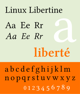
Linux Libertine is a digital typeface created by the Libertine Open Fonts Project, which aims to create free and open alternatives to proprietary typefaces such as Times New Roman. It is developed with the free font editor FontForge and is licensed under the GNU General Public License and the SIL Open Font License.
Apple's Macintosh computer supports a wide variety of fonts. This support was one of the features that initially distinguished it from other systems.

Liberation is the collective name of four TrueType font families: Liberation Sans, Liberation Sans Narrow, Liberation Serif, and Liberation Mono. These fonts are metrically compatible with the most popular fonts on the Microsoft Windows operating system and the Microsoft Office software package, for which Liberation is intended as a free substitute. The fonts are default in LibreOffice.

Web typography refers to the use of fonts on the World Wide Web. When HTML was first created, font faces and styles were controlled exclusively by the settings of each web browser. There was no mechanism for individual Web pages to control font display until Netscape introduced the font element in 1995, which was then standardized in the HTML 3.2 specification. However, the font specified by the font element had to be installed on the user's computer or a fallback font, such as a browser's default sans-serif or monospace font, would be used. The first Cascading Style Sheets specification was published in 1996 and provided the same capabilities.

Noto is a font family comprising over 100 individual fonts, which are together designed to cover all the scripts encoded in the Unicode standard. As of October 2016, Noto fonts cover all 93 scripts defined in Unicode version 6.1, although fewer than 30,000 of the nearly 75,000 CJK unified ideographs in version 6.0 are covered. In total, Noto fonts cover nearly 64,000 characters, which is under half of the 144,762 characters defined in Unicode 14.0.
A duospaced font is a fixed-width font whose letters and characters occupy either of two integer multiples of a specified, fixed horizontal space. Traditionally, this means either a single or double character width, although the term has also been applied to fonts using fixed character widths with another simple ratio between them.